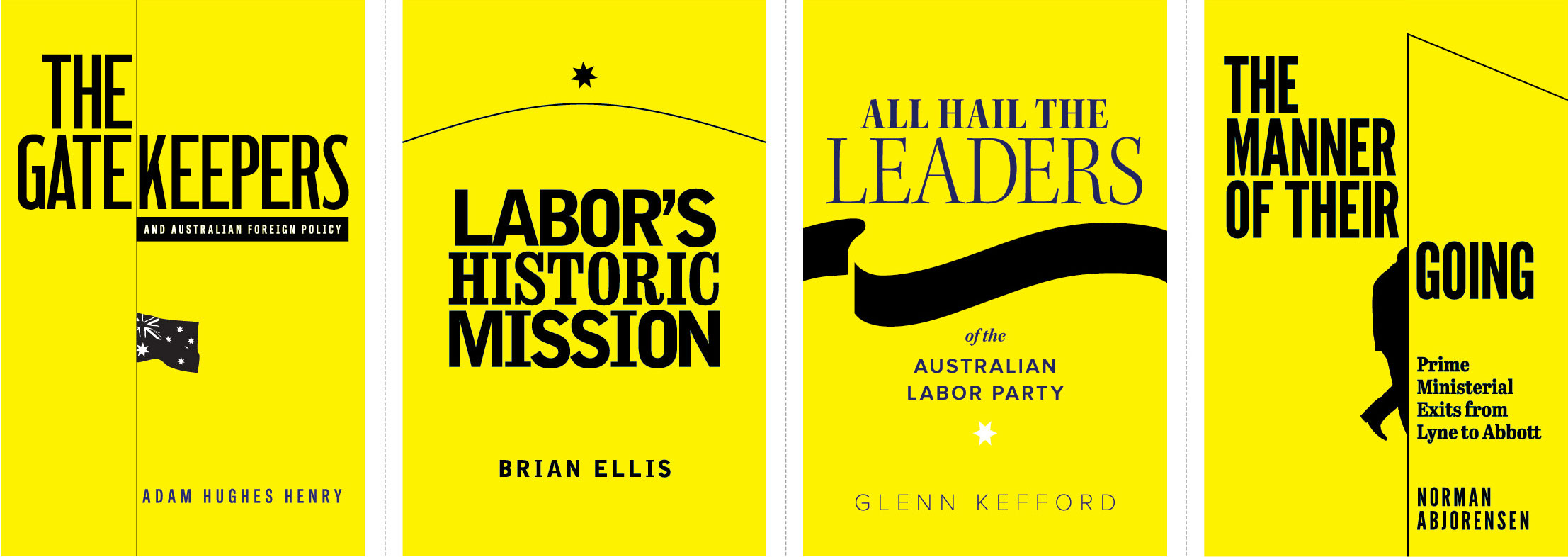
Four covers for the same publisher, each under the same imprint. All yellow backgrounds, strong, simple typography, minimal image content. There is much to be said for paring design back to its absolute essentials. Less clutter, less distraction, more emphasis on the content and the beauty of typography. Typefaces used include League Gothic, Clarendon Bold Condensed and Bell Gothic Black.
PO Box 72
Eltham
+61 412 622 138
design + layout + print solutions + ebooks

Tips for authors, promotional ideas, design resources and more.
Information and tips, focusing on publishing, publicity, promotional ideas, author profiles, design resources and more.

