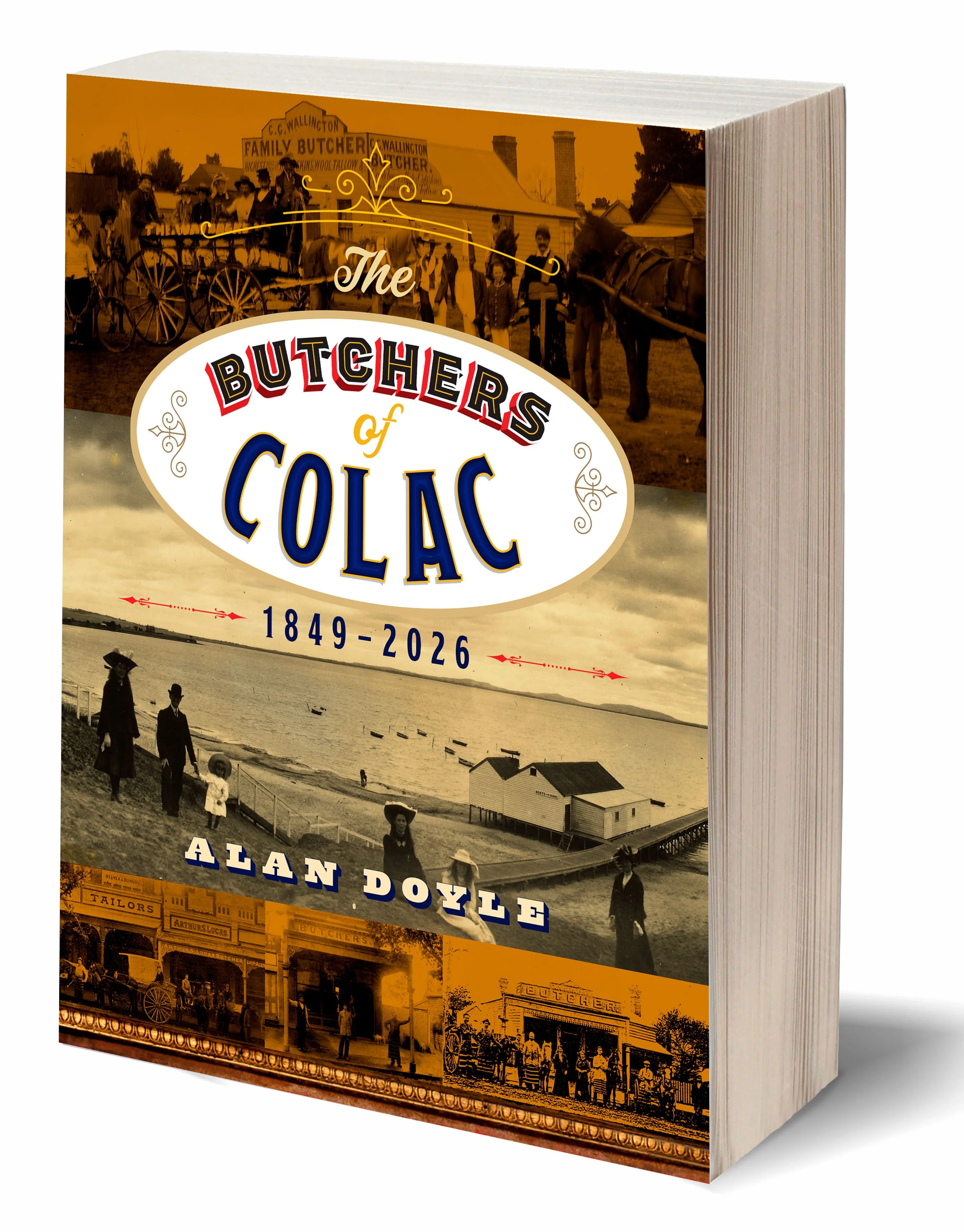
Alan Doyle’s very specific local history has found an enthusiastic audience at a book launch in Colac. The following post is from the Colac and District Family History Group:
𝗙𝗿𝗼𝗺 𝗦𝗮𝘄𝗱𝘂𝘀𝘁 𝗙𝗹𝗼𝗼𝗿𝘀 𝘁𝗼 𝗙𝗮𝗺𝗶𝗹𝘆 𝗦𝘁𝗼𝗿𝗶𝗲𝘀 — 𝗔 𝗪𝗼𝗻𝗱𝗲𝗿𝗳𝘂𝗹 𝗟𝗮𝘂𝗻𝗰𝗵 𝗳𝗼𝗿 𝗕𝘂𝘁𝗰𝗵𝗲𝗿𝘀 𝗼𝗳 𝗖𝗼𝗹𝗮𝗰 𝟭𝟴𝟰𝟵–𝟮𝟬𝟮𝟲
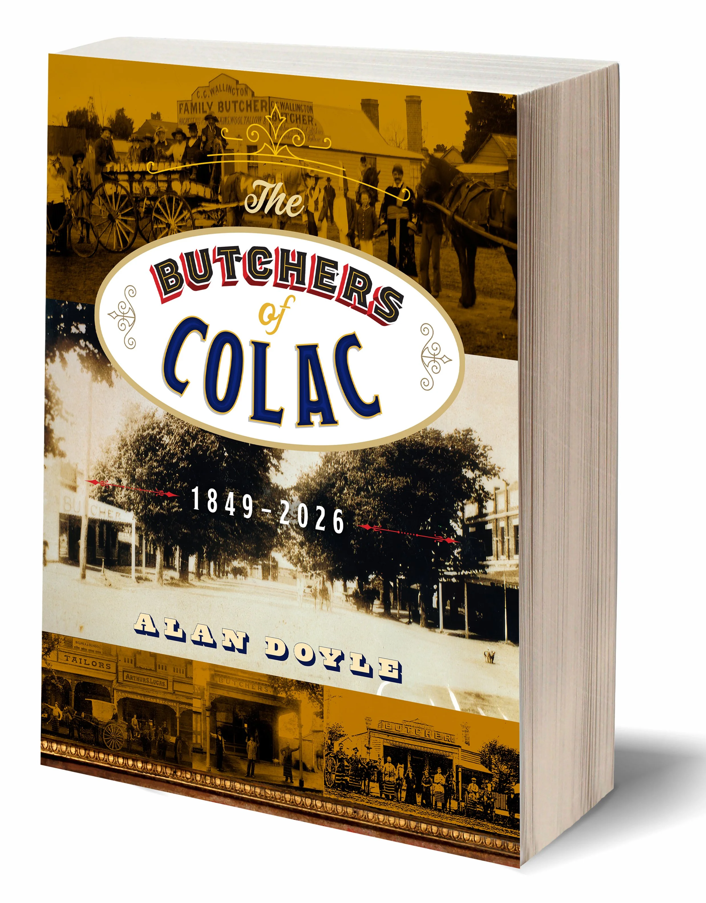
Five years of research, countless phone calls, interviews, photographs and stories… and now the first print run has sold out. More copies of Butchers of Colac 1849–2026 will be available soon.
It was a wonderful afternoon at the History Centre as members, friends, butchers past and present, and their families gathered for the launch of Alan Doyle’s remarkable book.
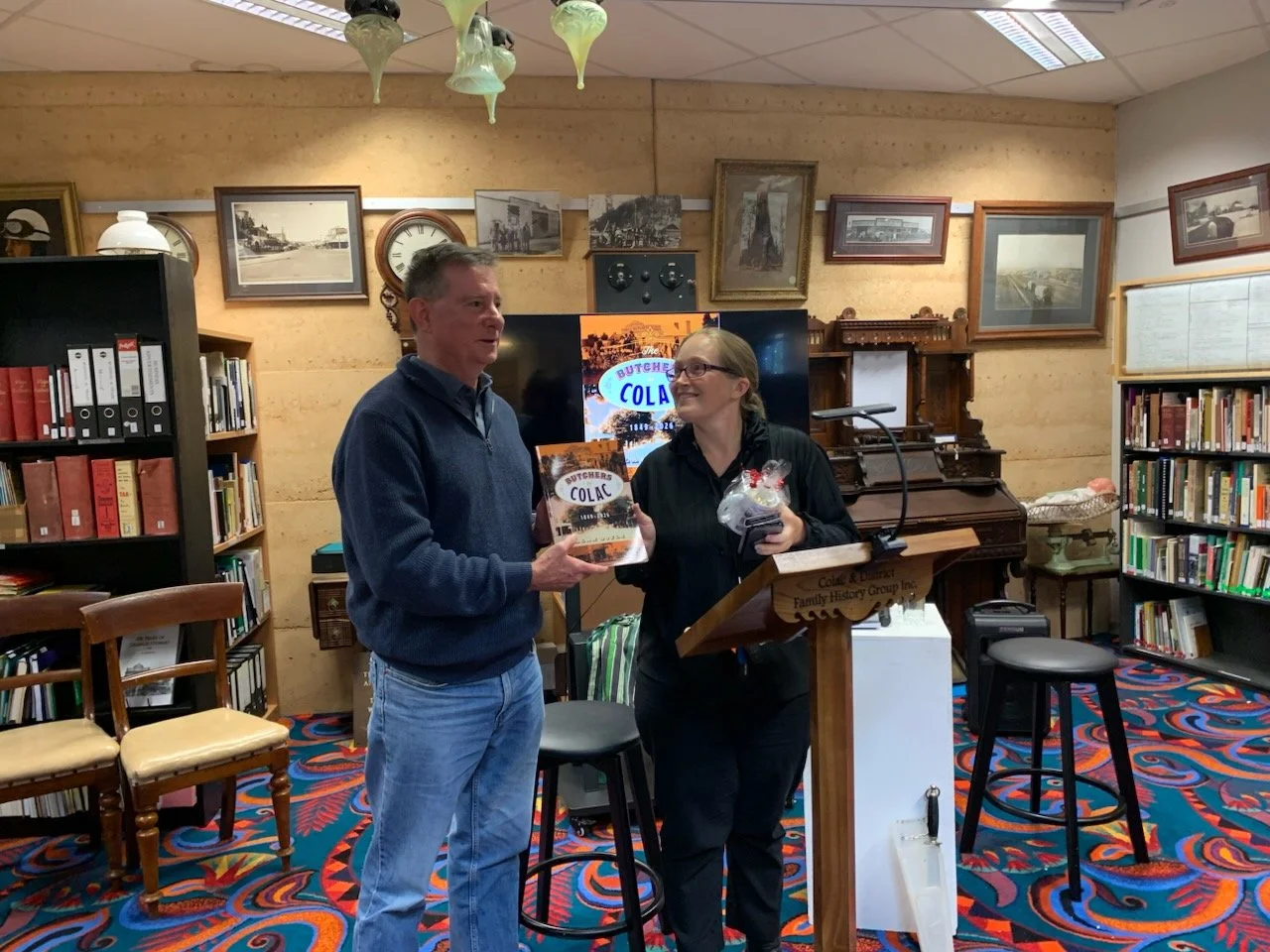
Amy Baudinette, President of the Colac Chamber of Commerce, officially launched the book, speaking warmly about the hard work of small businesses and the importance of preserving local histories before they are lost.
Robyn Currie then joined Alan “In Conversation”, exploring why he chose Colac’s butchers as his subject, the five years of research involved, and the memorable stories uncovered along the way.
Over afternoon tea, memories came flooding back — the sawdust on the floor, the worn chopping block, the butcher rhythmically sharpening his knives while carrying on a conversation, then the familiar clang and rattle as they dropped back into the metal pouch at his waist.
More than just a history of butcher shops, this beautiful book captures the people, personalities and traditions that shaped Colac for generations.
Photographs: Alan Doyle and Robyn Currie "in conversation" discuss the process of researching and writing the book
Amy Baudinette, President Colac Chamber of Commerce - officially launches the book
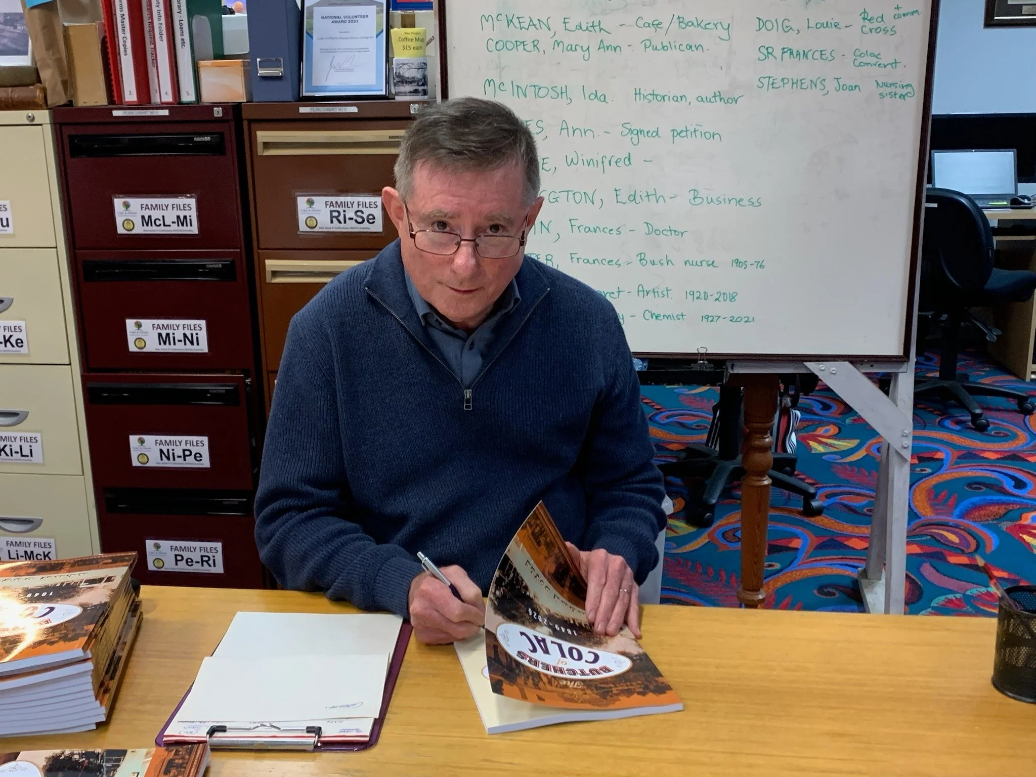
Alan signing one of the last copies of his book. If you missed out the good news is that there are going to be more books printed.