Typesetting is crucial in book design because it determines how readers engage with the text and absorb information. A well-designed layout enhances readability, making it easier for readers to focus without distractions. When accessibility is prioritized, books become more inclusive, catering to individuals with visual impairments, dyslexia or other reading challenges.
The Importance of Accessible Typesetting
Accessible typesetting refers to the practice of designing text layouts in a way that accommodates as wide a range of readers as possible, including those with visual impairments — which affect at least 2.2 billion people worldwide — and dyslexia. The approach ensures all readers can enjoy your writing without unnecessary strain or discomfort.
Proper font choices, spacing and alignment can significantly impact how smoothly a reader moves through a page. Focusing on accessibility and readability allows authors and book designers to create a more enjoyable experience that immerses readers in the content.
In fact, this type of customization in book design can be vital for authors who hope to drive a loyal following, as 71% of customers expect personalization when deciding on a purchase. This expectation extends to reading materials, where font choices that are directly chosen with a variety of physical abilities in mind can greatly enhance individual reading experiences.
1. Choose an Accessible Typeface
Choosing between serif and sans-serif fonts is essential, especially in print and digital formats. Serif fonts — like Garamond and Georgia — have small strokes at the ends of letters, which help guide the reader’s eye along a line of text. Research suggests that serif fonts can lead to slightly faster reading speeds, particularly in longer-form content like books.
On the other hand, sans-serif fonts, with their clean and simple letterforms, are often easier to read on screens. Regardless of style, font size also matters — 12-point is generally considered large enough for comfortable reading without straining the eyes.
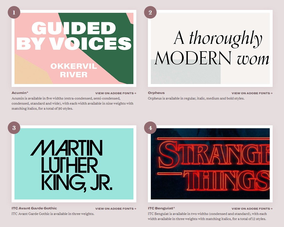
Authors and book designers should avoid decorative or overly stylized fonts, as these can make text harder to decipher and reduce overall readability. Prioritizing classic, well-designed typefaces ensures a smoother reading experience for all audiences.
2. Optimize Line Spacing and Margins
Proper line spacing can greatly influence readability as it helps readers move effortlessly from one line to the next. Tight spacing can make text feel cluttered, while too much space disrupts the reading flow. Generous margins also prevent paragraphs from feeling cramped and give the eyes room to rest.
Moreover, white space guides the reader’s focus and makes content easier to digest. A well-structured page encourages readers to stay engaged. Balancing spacing, margins and white space creates an inviting, stress-free reading experience.
3. Ensure Proper Line Length and Paragraph Width
The ideal line length for readability falls between 45 and 75 characters per line, striking the right balance between comfort and efficiency. When lines are too long, the eye has to work harder to track from the end of one line to the beginning of the next, leading to fatigue and slower reading speeds. On the other hand, shorter lines create frequent breaks in the reading flow, which makes the text feel choppy and disconnected.
Adjusting paragraph width based on the format is crucial. Print layouts can afford slightly wider columns, while digital content benefits from narrower widths to accommodate different screen sizes. Optimizing line length lets authors and book designers engage readers without unnecessary strain.
4. Use Hierarchy and Contrast for Readability
Font size, bolding and italics guide readers through content and improve readability. Larger font sizes make the text easier to process while bolding highlights key points without disrupting the low. Italics can add emphasis but should be used sparingly to avoid visual clutter. A well-structured hierarchy with clear headers and subheaders makes navigation seamless, especially for readers with cognitive impairments or low vision.
Headings break up information into digestible sections, which makes content easier to scan. High contrast between text and background is just as important. Dark text on a light background (or vice versa) enhances visibility, reduces eye strain and ensures an inclusive reading experience for all audiences.
5. Avoid Justified Text and Hyphenation Overuse
Left-aligned text is easier to read than justified text because it maintains consistent spacing between words. Full justification — while visually neat — often creates uneven letter and word spacing. This leads to what’s known as “rivers” of white space running down the page. This inconsistency complicates distinguishing between individual words, slows reading speed and causes unnecessary strain.
Excessive hyphenation — often used to balance justified text — further disrupts the reading flow by forcing the reader to pause and piece words together across line breaks. A better approach is to use left-aligned, ragged-right text, which maintains natural spacing and avoids awkward word breaks. If justification is necessary, adjusting word spacing within a reasonable range can help improve readability without sacrificing aesthetics.
Creating an Inclusive and Engaging Reading Experience
Thoughtful typesetting transforms a book from simply readable to truly engaging. This makes it easier for readers to absorb and enjoy the content without distractions. Prioritizing accessibility lets authors and designers create a more inclusive experience that reaches a broader audience and immerses readers from start to finish.
Eleanor Hecks is a writer and web designer who is passionate about helping other writers grow their online presence. Her work can be found on her site Designerly, as well as publications such as IndependentPublishing.com and I Need a Book Cover.


