A Guest Post kindly supplied by Desiree Villena:
Everyone knows that, if you want your book to sell, you need to hire a great cover designer. But many people don’t think about how important your book’s interior design is, as well. I’ve seen too many books, both self-published and traditionally published, that have clearly skimped when it comes to formatting, and as a design nerd, it makes me so sad.
But there’s much more at stake than just hurting artistic souls — think of the practical considerations. You may not realize it, but typography can have a big effect on a reader’s reaction to your book, whether they consciously notice the fonts or not. So today, I’m going to break down the five most important reasons why book typography matters for every book — including yours.
1. Professionalism
While the cover is easily the first thing readers will notice when they’re deciding whether to pick up your book, the typography is the first thing they’ll notice once they open it up. So it’s important that you make a good impression. Seeing a professional cover and a sloppy interior is like meeting someone in person and realizing that their profile picture was a lie.
If you ever doubt the impact that a font can have on your professional reputation, consider this: would you be more inclined to trust someone whose resume was printed in Times New Roman, or Comic Sans?
Similarly, your book will be judged on what kind of font it’s printed in. Perhaps not consciously — not many people can point to a book and go, “Oh, that’s in Garamond,” or “That looks like Caslon” — but the wrong font will make something feel off about the book.
But what makes something the “wrong” font? That’s where the other factors come into play.
2. Genre expectations
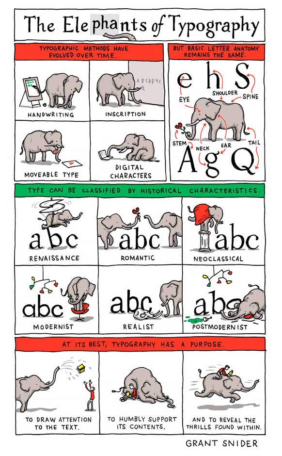
This is one of those things that you’ve probably never consciously noticed before, but once you do, you can’t not notice it. Different genres tend to be published in different types of fonts, and you want your font to reflect the contents of the story as much as your cover and title do.
For example, a quick survey of my personal library shows me that speculative fiction uses a lot of Palatino, whereas YA contemporaries are often published in softer, more “playful” fonts like Century Book or Bembo. You can also never really go wrong with Garamond, the most “bookish” looking font of them all. But it’s not always necessarily the perfect font, either.
And don’t forget about typography on chapter headings! Age ranges and genres follow trends here, too, with YA and middle grade among the most creative, and literary fiction setting a high standard for refined understatement.
3. Readability
Of course all fonts are technically readable if they contain all the letters of the alphabet. Unlike handwriting, the letter A will appear the same no matter how tired you are when you hit the key on your keyboard. But the truth is some fonts are just easier to read than others. It’s why we usually publish books in serif fonts instead of sans-serif, and it’s why we make the letters bigger in kids’ books than in novels for adults.
Here, it’s important to consider function over form. Font size, line spacing, and margins are all key factors to making sure that the font you’ve chosen will read well to your target audience.
Some fonts just have a natural size they look best at, but will that make your book too slim or too chunky? If you’re targeting older readers, is the font too thin and “fussy” to be read without squinting? The more you take into account, the better your book will be.
4. Fatigue
Readability plays into this, but it’s important enough that I feel it’s worth a separate mention. Because one of the downsides of poor readability is that readers are likely to tire of reading your work sooner — or even develop eyestrain.
Let’s face it: a lot of things demand our attention these days. From work to families to keeping the house in order to the sweet siren song of social media, it can be hard to find time to read at all. The last thing you want to do is make your book cause physical discomfort. There’s nothing more likely to make people to put it down — and perhaps never pick it back up again.
Good typography, on the other hand, is comfortable on the eyes, and can play a surprisingly significant role in whether readers perceive your book as a slog or a joy to read. That’s why it’s crucial to choose your font wisely.
5. Reader mood
You know the genre expectations we talked about before? A big part of the reason those exist is because different fonts subconsciously convey different “moods.”
These are most noticeable in splashy fonts that you’d use more in titles than in text blocks — a futuristic sci-fi font, an elegant hand-lettering font — but even the fonts you’d format a whole book in can have an impact. Some are stuffy, some soothing, and some just kind of dull. It’s important for your designer to keep these differences in mind and understand how the font of the chapter headings works together with the font of the story, in order to create a professional product.
Remember: choosing good typography is a bit of an art, yes, but it’s also a marketing choice. And marketing is a subtle game. Everything from the layout of your local grocery store to the color of your laundry detergent bottle has an impact on people’s buying choices. Why should books be any different?
Desiree Villena is a writer with Reedsy, a marketplace that connects self-publishing authors with the world’s best editors, designers, and marketers. She's very passionate about helping aspiring authors reach their dreams, and enjoys reading and writing short stories in her spare time.


