A client recently emailed to inform us that a pack of Antarctic explorer-themed cards designed at WorkingType Studio made it all the way to the first one-day commercial flight over the south pole. Presumably, he was too busy gazing at the forbidding scenery below to play Texas holdem with other adventurers…
How to Write a Good Cover Design Brief
The benefit of a good cover design is that it has the potential to turn a curious or potential buyer into a purchaser. For the author, a striking book cover is the most powerful marketing tool which can mean the difference between the success or failure of a book.
Approaching a designer
When considering having a cover design created by a professional graphic artist the author must have a clear idea of what would be the ideal finished product. However, that is not to say that the designer's flair should be constrained. By paying for expertise in graphic design, a certain amount of freedom is granted to the artist to be 'creative'. Constant communication throughout the design process will mean that feedback can be exchanged which should allow for the author to receive a finished cover design that will be fit for purpose and not merely what the designer wanted to produce.
It should be remembered that the role of a 'brief' should be to provide succinct instructions while allowing the designer the freedom to be creative. A creative brief will provide a useful framework in which the designer can work within margins without having creativity compromised. The author should provide guidance only, regular and honest feedback will be the secret to developing a successful cover design. The author must make clear to the designer any information regarding items which 'must' appear in the design.
For the designer to be able to use his creative skills to the full it will be necessary for the author to provide a precis or synopsis of the contents of the book to allow the designer to 'get a feel' for the content and style of the work. The genre and target audience should be discussed to enable the designer to select the correct styles and fonts for the cover. The demographic, gender and age of the target audience should be made clear. If the book is part of a series, the author should provide details of fonts, colour schemes and any famous logos as part of branding already in use. Precise details of sizes, resolutions and file formats should be provided to the designer to allow for continuity in the finished product.
Dealing with technical issues
Throughout the process of designing the cover, it will be important for the author to remain in contact with the designer. At this stage it will be necessary for the size of the cover to be discussed along with its utilization; will it be used as an e-book cover, for a traditional printed book or both. This information will be necessary as the designer will need to know the dimensions and the amount of space there is to work with.
The wise writer will utilize the designer’s expertise, creativity and experience to produce the most appropriate artwork for the book cover. Try not to be too rigid in requirements and give the designer freedom to work without the author indulging in micro-management of the project. There are various colors and fonts which will appeal to the different reader groups and genres. Give any information concerning specifying colors or any preferred fonts. These elements will set the tone of the cover and should reflect the content of the work as close as possible. Constant communication between author and designer can build trust and bring about high-quality results.
By looking at other, similar books already published it will be possible to understand what colour schemes, images and fonts are used on the most successful titles. As previously mentioned, a carefully crafted cover can turn potential purchasers into buyers, particularly in the case of e-books, where the cover is the thing that will, hopefully, attract the interest of potential buyers.
Conclusion
When consulting a graphic designer to provide a cover for a book the designer must be given a complete oversight of what the subject matter and content of the book concerns. This would be achieved in an ideal world by the designer reading the complete text, unfortunately, it is generally impractical. The author should therefore provide a synopsis of the text contained in the book to allow the designer to get 'a feel' for the project.
The author and designer must agree on terms regarding consultation during the development of the cover so that any modifications can be made before the project has advanced too far. There must be a very high level of trust between the two parties if the project is to be a total success. When evaluating the progress of the project, the author should be 'firm but fair' in any criticism of the work provided by the designer. Conversely, when the work is considered to be of a high standard and entirely acceptable to the author, praise should be forthcoming and positive feedback given regarding working with the designer.
Providing the designer with an accurate precis of the subject matter, offering support and assistance during the process and allowing the designer to 'do his job' will result in a final cover which will be a huge asset. The promotion and ultimate sales of the book will benefit and it will be a useful addition to the portfolio of the designer. This will be a win-win situation for all concerned.
Author Bio: Kieran Fallon is the owner of a Dublin Graphic Design Agency Éire Graphic Design. We are here to help your organisation become more memorable through designing striking logos, eye-grabbing flyers, posters that pop, exciting animated emails and dynamic lightweight digital advertising campaigns – always backed by flexible and insightful support.
Scripted Response — Three Posters
Noted editor and author Euan Mitchell commissioned three posters for screenplays he entered into American scriptwriting competitions. The above posters are the final drafts. Happily, he has received several awards for his scripts.
Cover Designs — Irradiated White House and the Secret Life of Words
A sinister mushroom cloud, the White House gently glowing in the radioactive light, a menacing submarine — what more could a reader want?
Another radioactive cloud, skippy, Sanuel Johnson and a medieval scholar — the first time they have all appeared on one cover…
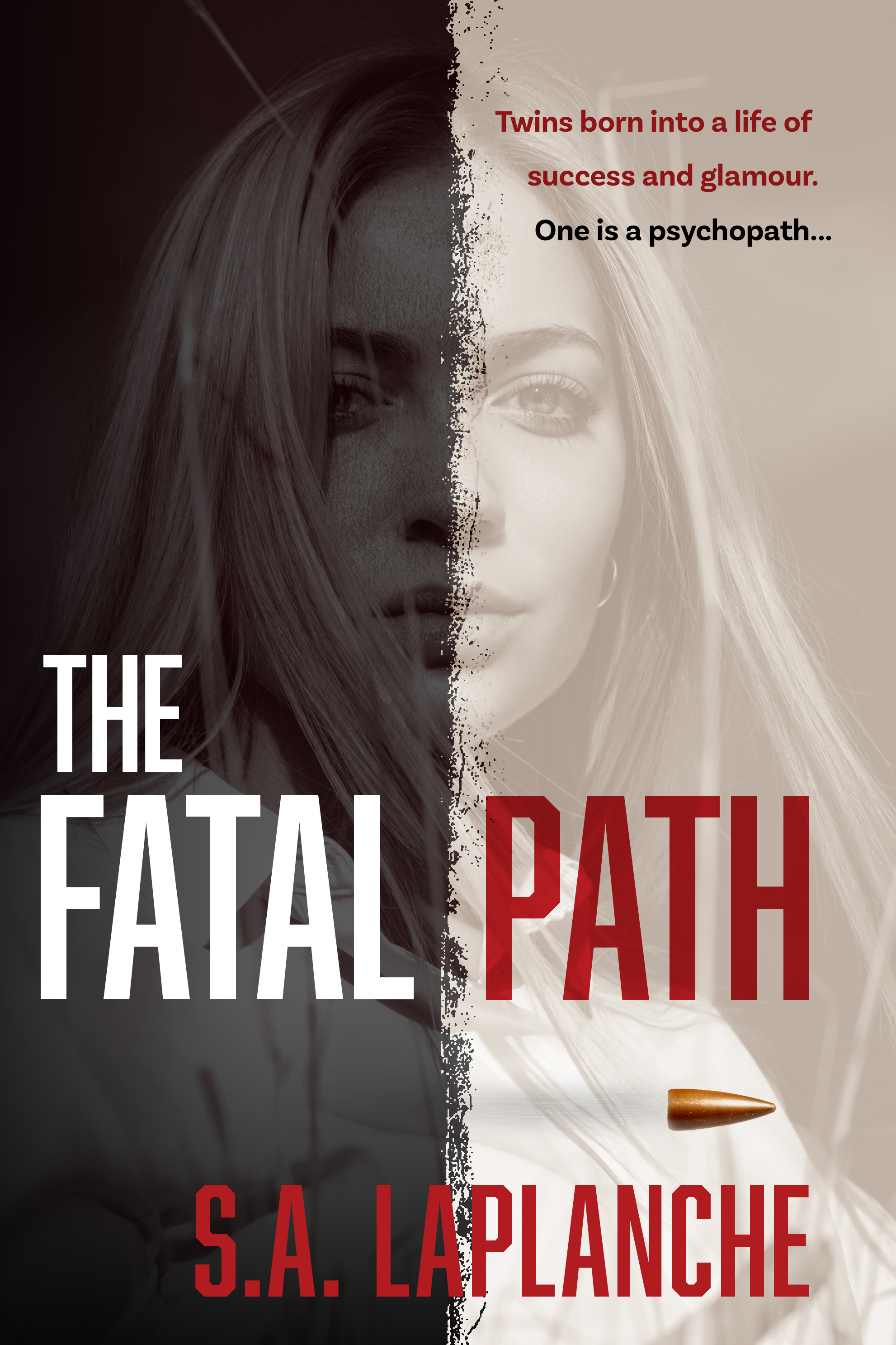
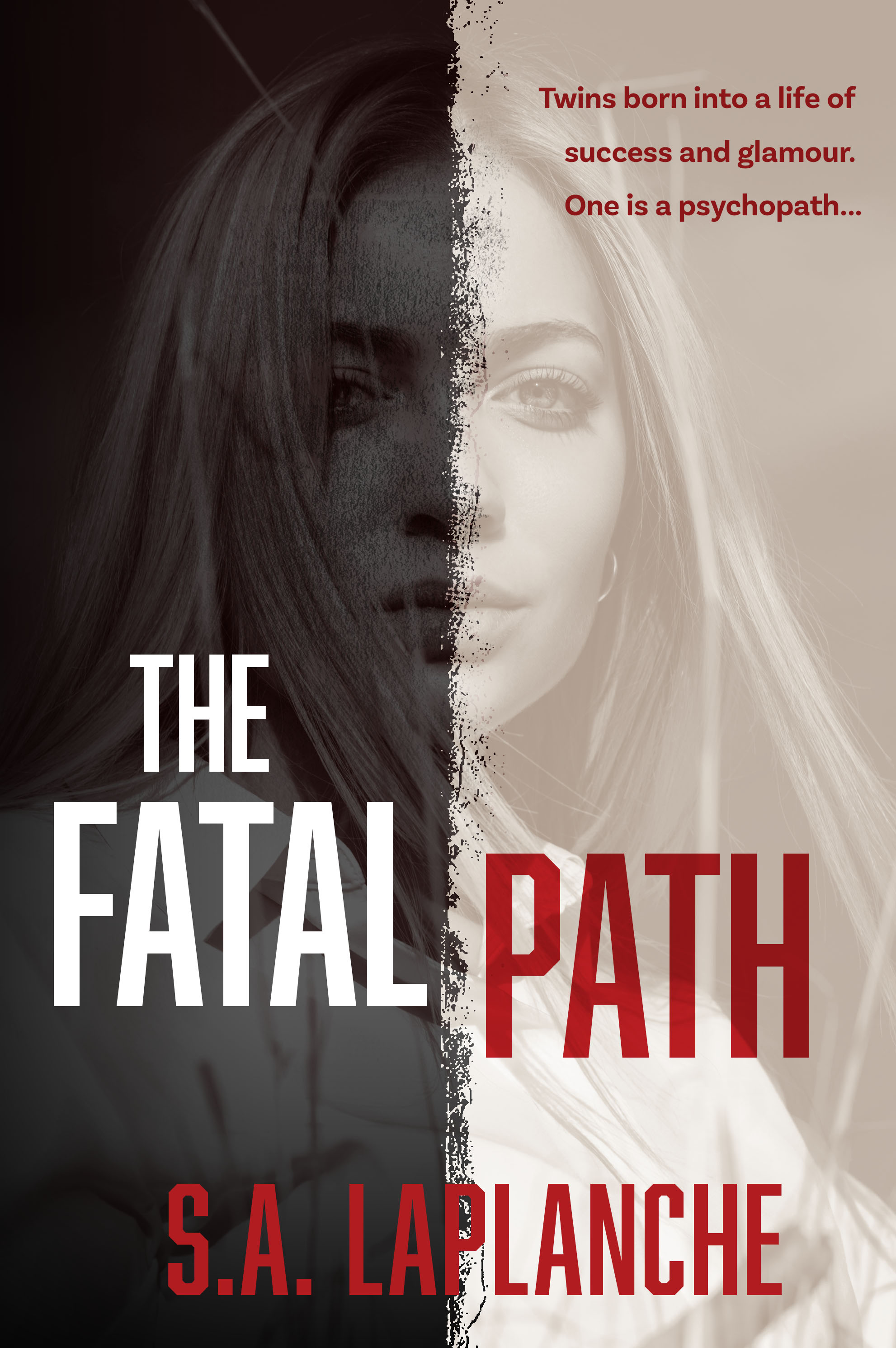
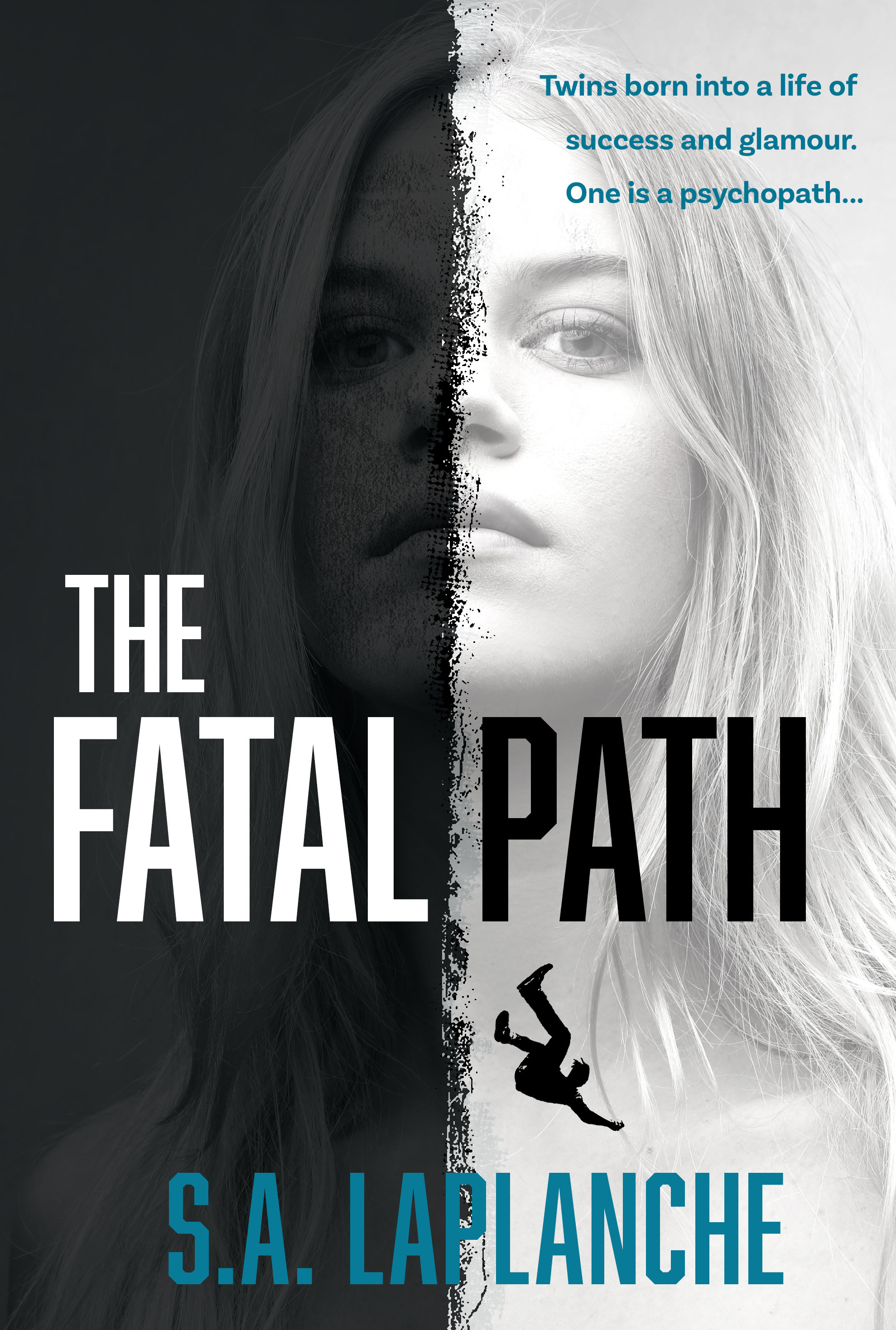
Fatal Path Cover — More Iterations
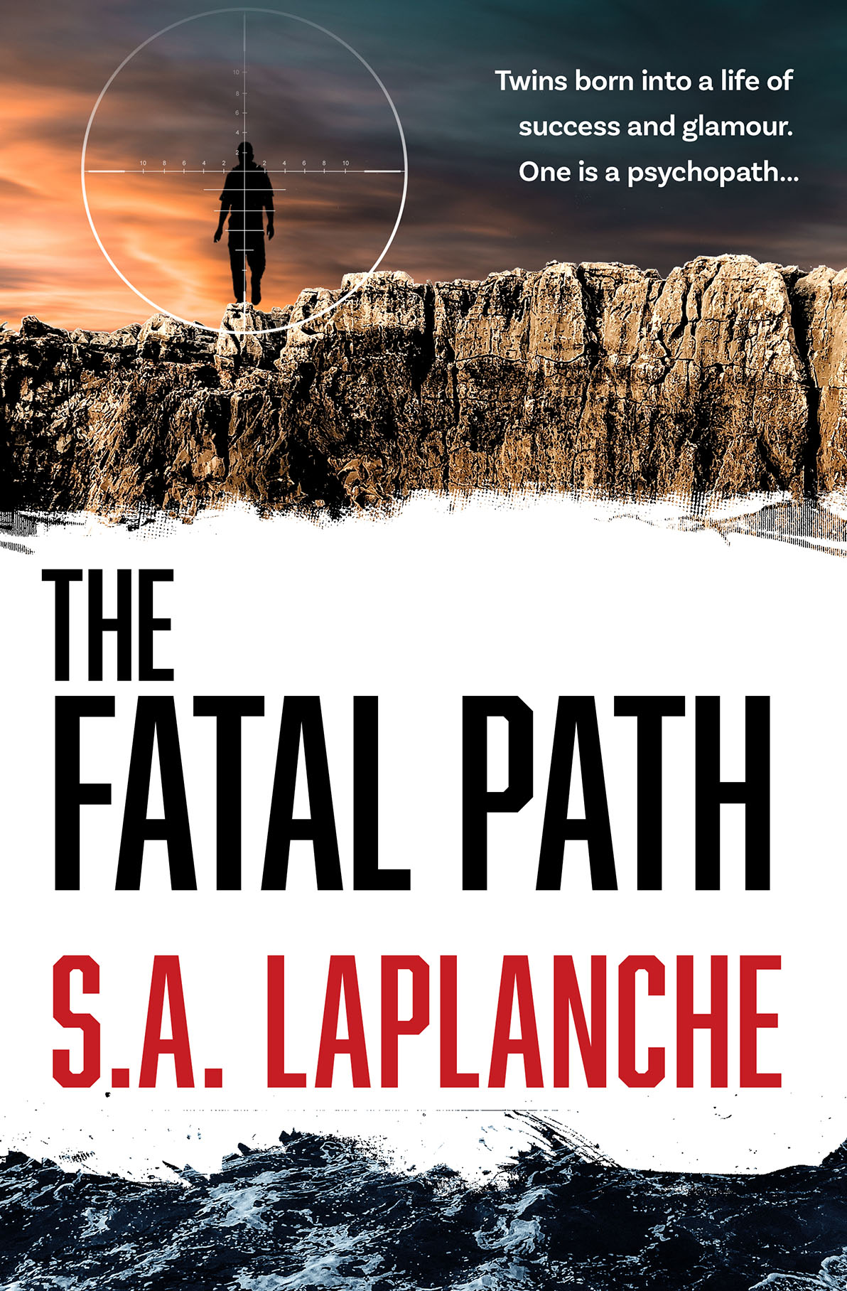
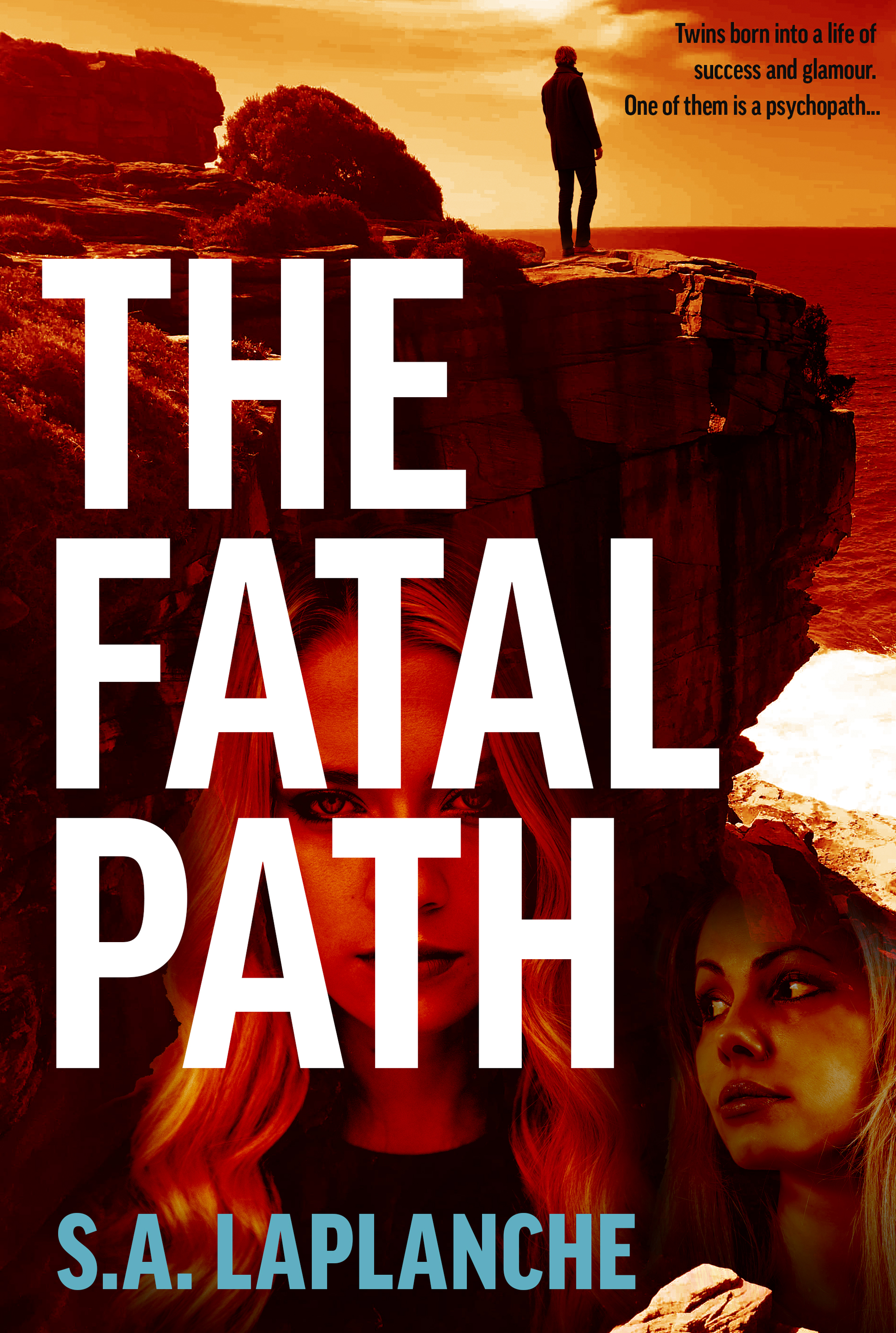
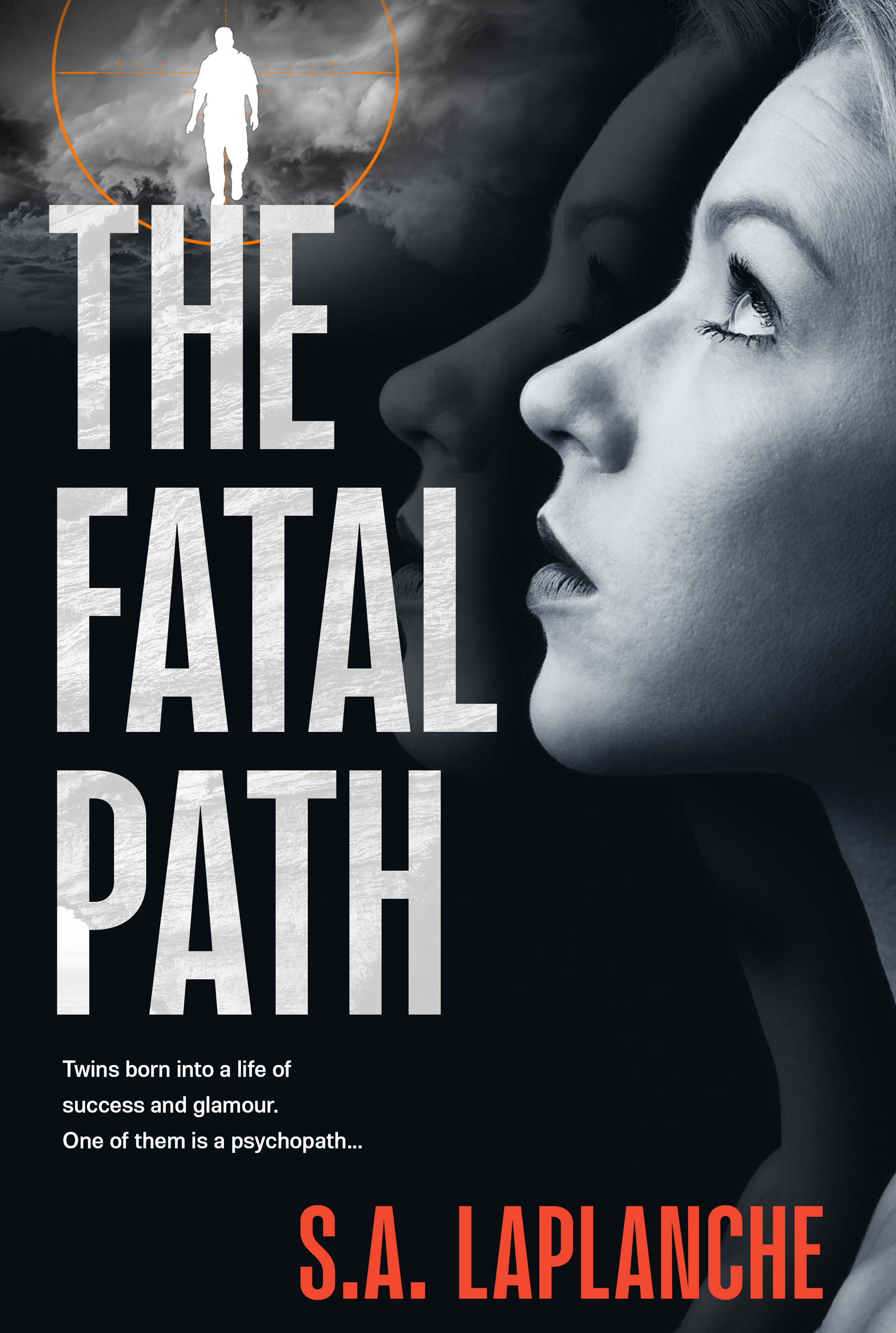
An update on an earlier post — two more iterations on this cover. Sometimes it is a long and winding road to a final cover…
Go Go Logos
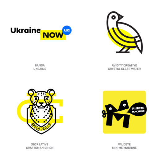
Logos continue to evolve apace in the mainly digital design world. Some attractive trends, some pretty ugly, as showcased here.
The Big Bucks in Design... Uber's redesign
Uber, everyone’s favourite “move fast and break things” startup/world consuming corporate giant, has just installed a new look. How much of it is effective and how much is marketing doublespeak and gobbledygook, I will leave to you to decide. But rest assured that the designers have been paid handsomely for their work. Uber Move is quite a pretty typeface family, though.
Epic Fiction and Domestic Dramas — Book Cover Design
Thomas and Rose spans the globe and many decades, while Memoirs of a Stay at Home Dad charts the efforts of one dad to raise his children and deal with the changing roles of men. The Thomas and Rose cover uses the sharply cut and elegant Orpheus Pro for the title, and the Stay at Home Dad sports the rough and warm finesse of Five Boroughs.
Creative Mornings Melbourne
Serial founder of interesting design-based companies (Swiss Miss, to-do app Teux Deux, and Tattly, Tina Roth Eisenberg is also behind the global design talks known as Creative Mornings.
Melbourne has its own series, so if you're interested in designers talking about designy things (there's a different theme every month), then consider going along. At the price of free, how could you miss it? In a section impishly titled "convince your boss", the organisers advance the following argument:
Maps from the Spymasters
The CIA has recently released a large number of formerly classified maps. According to accompanying notes, "The mission of the Cartography Center is to provide a full range of maps, geographic analysis, and research in support of the Agency, the White House, senior policymakers, and the IC at large." In an era of digital online maps and very detaile satellite photography, it is interesting to view these hand-compiled attempts to summarise all known information about a particular area. Many of the maps are rather well designed and aesthetically pleasing.
Thriller from the Wimmera — Book Cover
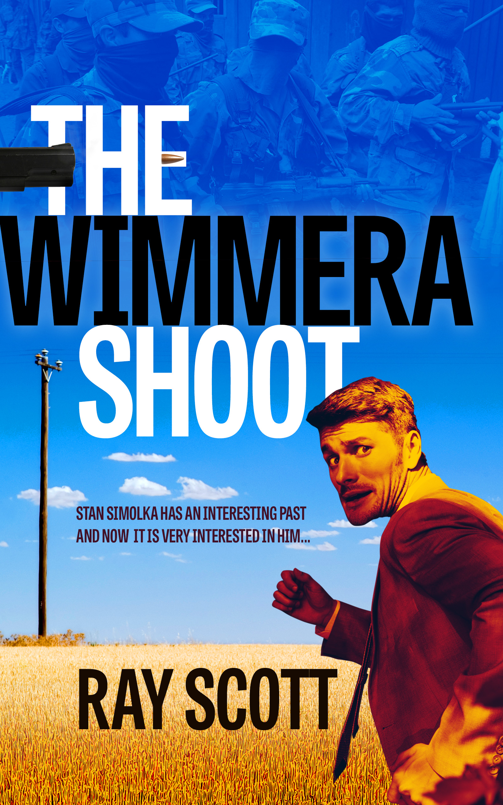
Ray Scott writes hard-bitten thrillers with plenty of action and skulduggery. His latest effort gets going in the sunny Wimmera, with a salesman facing hitmen from his murky past. With a touch of North by Northwest, we depicted a rather worried man against a field of wheat and a merciless blue sky. Typeface used: Tablet Gothic Compressed.
Your Name Here — The Zen of a Blank Product
Department of There's an Internet Business for Everything: Yellow Images sells blank products ready for you to superimpose your own brand/product. There's something so soothing about a plain object not covered in all of the cruft designers are paid to create.
A Deadly Institution — Book Cover Design
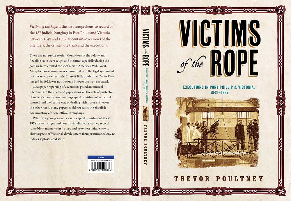
A cover design for a book discussing judicial executions in Victoria, Australia.
Read moreAncient Egyptian Saga — Book Cover
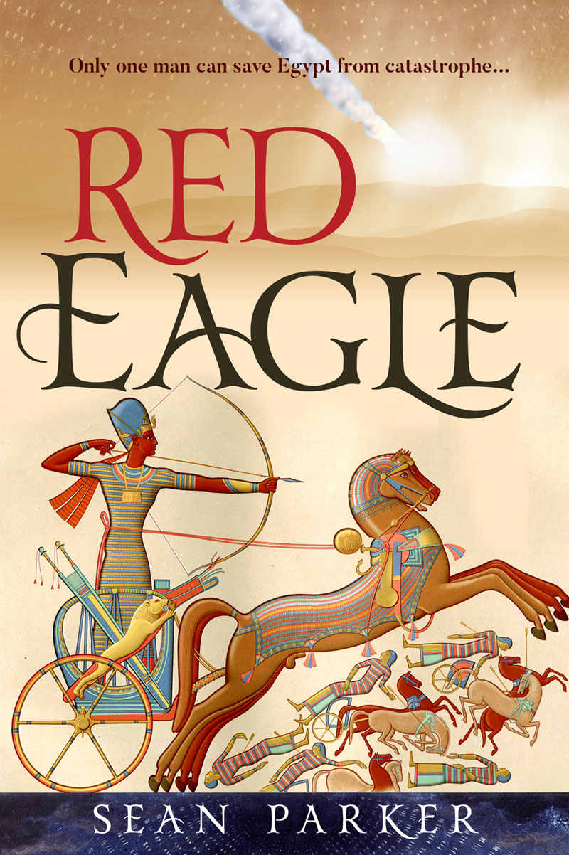
A great catastrophe is afoot in this sweeping saga set in Ancient Egypt. We used a beautiful 19th century illustration with vivid saturated colours and combined it with a hint of the Egyptian desert and a meteorite trail (essential to the plot). Title type set in Yana.
Landscape Design Solutions flyer
Christian Jenkins designs amazing outdoor living spaces for his clients across Victoria. He wanted a brochure to showcase his recent work and introduce his design philosophy. We kept the layout very clean, the focus on his design and the wide variety of possible themes and solutions.
Type Lovers United
The creator of this website doesn't post often, but when he does, he makes up for the lack of quantity with sheer quality. He has an eye for interesting new type design plus a deep knowledge of design history. His enthusiasm is infectious. Well worth visiting for ideas and inspiration, unexpected combinations of type and strange tales from the dawn of typography.
Font Use Across the Internet
Despite the advent of web-served type, Arial is still Queen of the Internet. 616,000 of the Web's top million websites use this rather unexceptional typeface. Fontreach gives an useful snapshot of font use.There are several old standards originally commissioned by Microsoft, a few freebies served by Google and finally, further down the list, some interesting new typeface designs.
Everything, All at Once — A Timeline of Our Planet
This fascinating and graphically striking website maps historical articles on Wikipedia onto a timeline. Viewers can confine themselves to the tiny span of Earth's history that features the human race, or zoom out to the unimaginable expanses of geological time. Incredibly, the project was put together by (very smart) college students.
Visual Communication — A Cover Concept
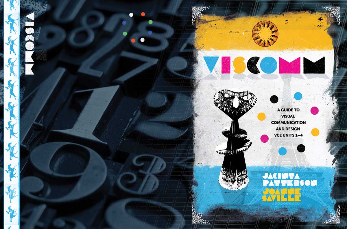
A cover concept for a Visual Communications textbook for Cambridge University Press. I used an old experimental French typeface for the title — each letter is as minimal as possible, but still quite readable. The strange object featured at centre left on the front cover is a student artwork. This concept didn't make the final cut, but it was my personal favourite.
A Fifty Year Old Mystery — Book Cover
In January 1966, the three children of Grant and Nancy Beaumont were kidnapped from an Adelaide beach, never to be seen again. The Missing Beaumont Children minutely and carefully chronicles both the agony of their parents and the subsequent investigations, some serious, others farcical. The tragic subject matter called for a subdued and respectful treatment. Typefaces used are Veneer and P22 Typewriter.