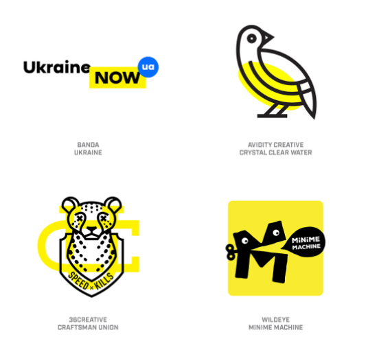
Logos continue to evolve apace in the mainly digital design world. Some attractive trends, some pretty ugly, as showcased here.
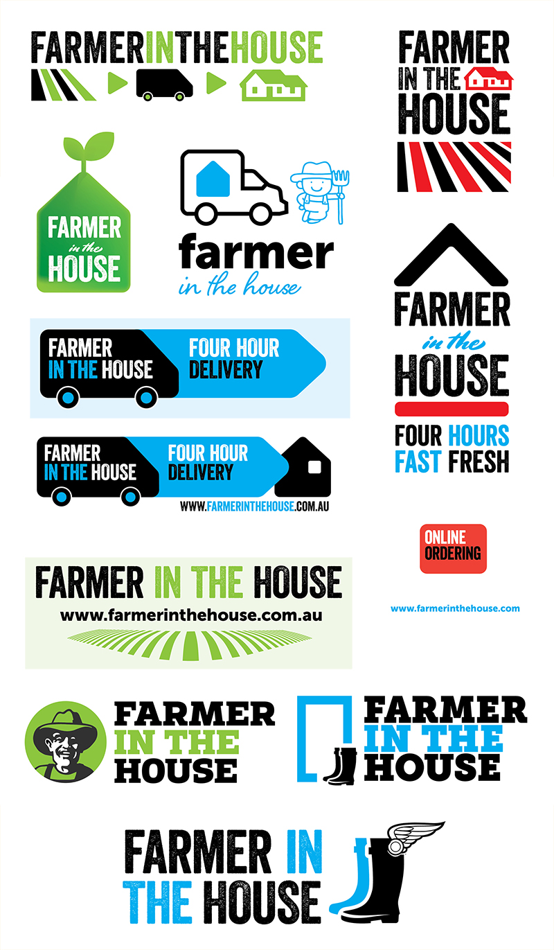
Farmer in the House — the amazing vanishing client
Some design projects were not meant to be. The rough concepts below for a farm-to-home fresh food delivery startup never went beyond the initial stage. The startup quickly ran out of funds, staff went unpaid, and the founder departed the sunburnt country just ahead of his very unhappy creditors. However, not every venture capitalist is kin to Arthur Daley — a second startup (qodeo.com) has been the exact opposite — a reliable client for many years.
Trends in Logo Design and Iconography
Logo obsessive Bill Gardiner spends a lot of time time thinking about icons, symbols and logos. He has distilled that thought into a very long post on the state of this particular art, reflecting particularly on the growing ascendancy of mobile viewing platforms.
Gardiner believes that icons and image based languages will become an important element of communication, perhaps displacing written language to some extent.
Perhaps the most enjoyable part of his post is the breakdown of logo design trends into categories such as: dot-tips, contours, sparkles, pick-up sticks, colouring, circle breaks and so on. Designers tend to move in packs, and even if they strive for originality, can't fight the gravitational pull of influence.
Country Music from the Heart
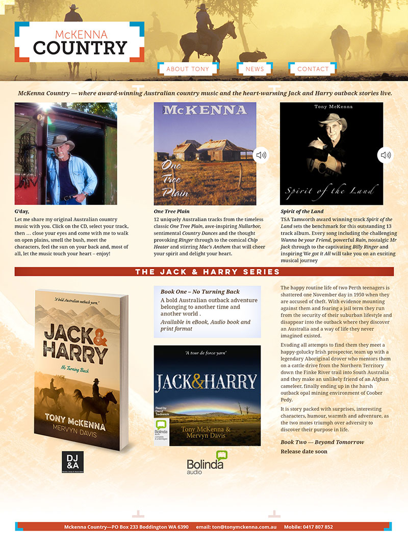
Musician Tony McKenna wanted a mockup of his website that he could take to a developer for implementation. We designed a logo and related header bar, and worked with a three column grid and colour scheme drawn from the landscapes loved by our client.