Five New Cover Artworks
The usual range of topics, with typefaces ranging from Alternate Gothic to Molde to Bourton Layered and ITC Avant Garde.
Cover to Cover to Cover
We have been working on the usual variety of book covers, covering everything from world championship athletes to an 18th century convict fleet. We strive for impact, high contrast and uncluttered design.
June 2020 new cover designs
A variety of new cover designs dealing with a broad range of subject matter.
A New Series for Peter Ralph
Writer of financial thrillers Peter Ralph is embarking on a new series featuring Josh Kennelly, a character first introduced in Fog City Fraud. The first book, Deadly Bequests is “set in New Orleans and is a scam about the elderly getting fleeced via their wills.”. The second book is The Guardians . Josh “receives a crazy call from a veteran of the Afghanistan war claiming that his father has been kidnapped by a guardian. Reluctantly, Josh gets involved and discovers the guardianship industry where judges, guardians, lawyers, and doctors, look after themselves, but not their wards. The forces that he’s trying to expose are all-powerful. Has he bitten off more than he can chew?”
We designed all three books to have a consistent identity and repeated elements.
It's the Gas, Gas, Gas — Book Cover Design
Dr. Harald Osel works in the global oil and gas industry and has written four remarkably detailed volumes on the industry he knows and loves. We designed covers for all four volumes of his magnum opus and typeset the text. Every aspect from exploration to extraction and transport is covered, along with issues of environmental preservation and clean energy. Published by Aurora Publishing. We maintained common design elements for al four covers and used images that reflected the topic covered by the specific volume. Typeface used on the covers: Proxima Nova (various weights and widths).
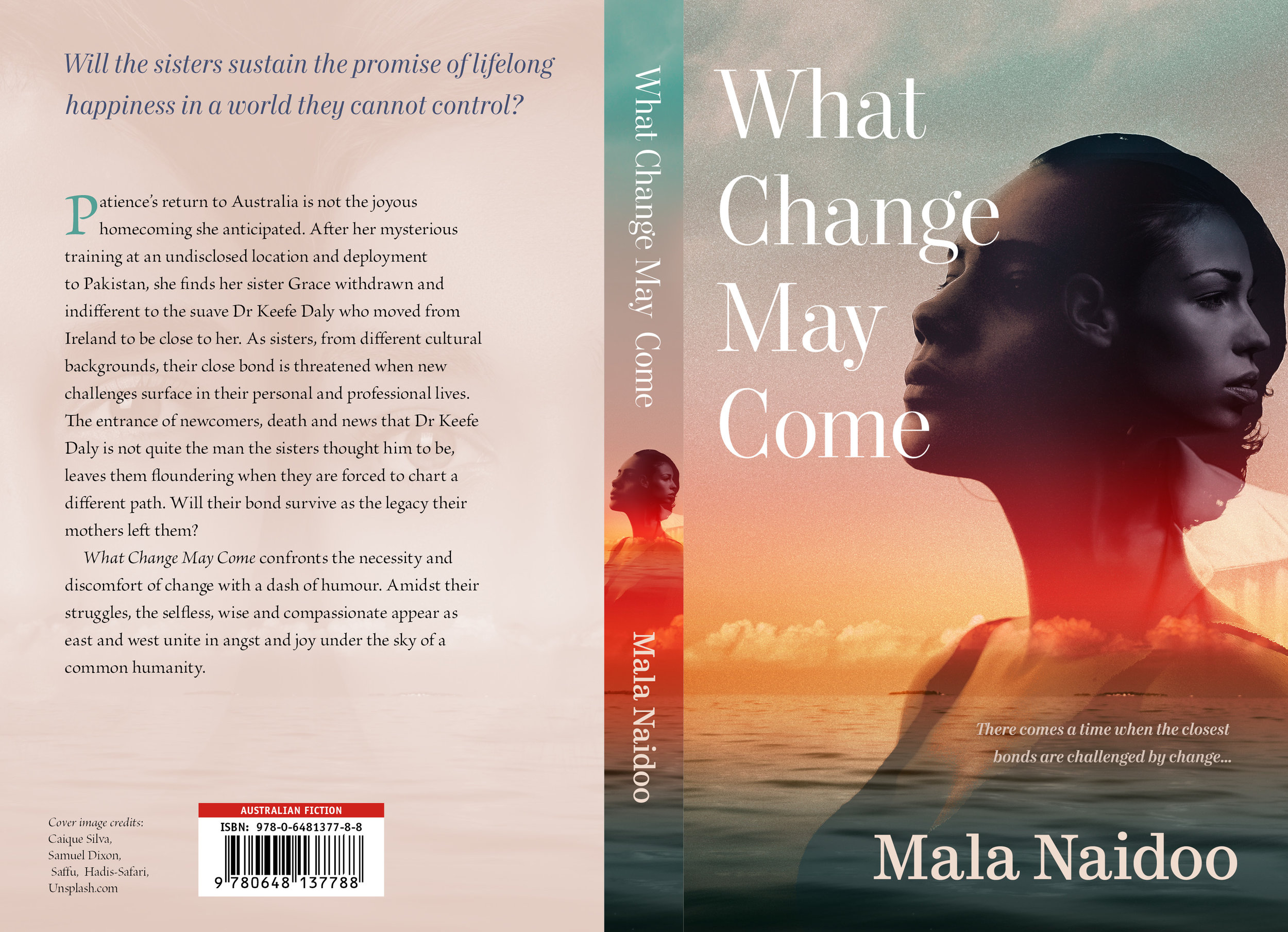
Change and Time — Cover Design
Mala Naidoo depicts complicated human relationships in her novels, her authorial eye remaining consistently wise and warm. We wanted to convey the depth and subtlety of her protagonists, opting for a dramatic sky with layered faces and a large, classical serif typeface (Mort Modern).
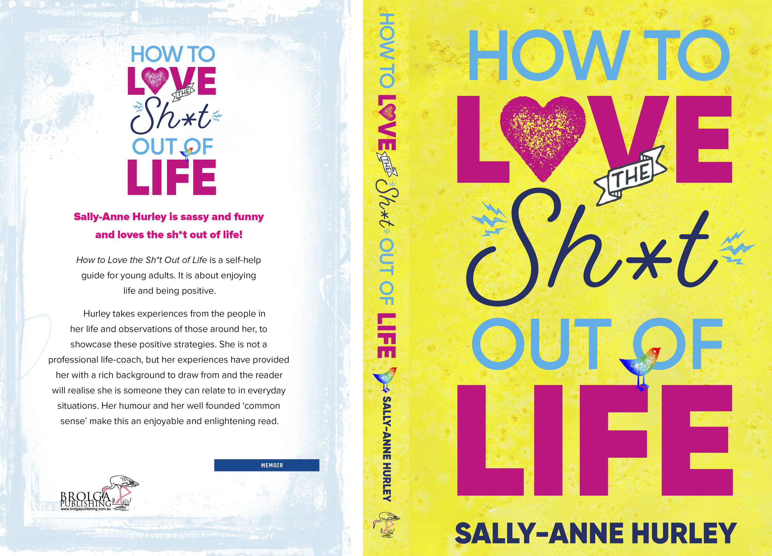
Life Advice_Book Cover Design
Typefaces: Eveleth and Proxima Nova. Published by Brolga Publishing.
A War of Hearts
Samantha Grosser writes psychologically compelling and sensitive stories of men and women, bringing the eras in which they lived to vivid life. Another Time and Place is set in World War Two and depicts two lovers separated by war, with no news of each other. Our cover design focused on the female protagonist, with a night-time colour palette and a transition from an interior setting to a broader landscape.
When First We Practice to Deceive — Cover Design
Deceit is a political thriller set in Australia. It depicts a parliament dominated by a deeply shady prime minister and surrounded by ambitious and ruthless supplicants. We wanted the cover to convey an air of foreboding and menace, and also of critical decisions to be made.
Funny Mistakes — Book Cover
The Funny Dictionary (published by the National Library of Australia) makes gentle sport of inadvertently amusing definitions written by children. Some of the "howlers" are accompanied by thematically aligned images from the extensive National Library photographic archives. The cover below was selected from many options generated by Working Type Design. The book is due for publication in the first half of 2018.
Book cover — Girl Over the Edge
Girl Over the Edge is an honest account of one woman's experience of mental illness. We wanted the cover to look raw and unfiltered, but not melodramatic. The typeface is Gilroy and the image was sourced from www.unsplash.com
Attunga — Science fiction book cover
Peter Wood has written an engaging and optimistic take on a future solar system. We wanted to depict an advanced interplanetary civilisation, and also bring in dolphins (cetacean intelligence is a major thread in the story) and the asteroid belt. Typefaces used were Trajan Sans, Conduit and Beloved Script. Peter's website is here.
Singing as a Science — Book Cover
This book details the history of the teaching of singing, and how it transformed from a craft into something approaching a science. We combined an old opera handbill with an image of Maria Callas and used Trajan Sans for the title type.
Making it Simple — Book Cover
Our client was looking for a cover that appealed to both genders and communicated in a direct, dignified fashion. After much experimentation with a variety of icons and logos, the final draft was characterised by symmetry and white space, with very clean type use. Typefaces used: Latina, National.
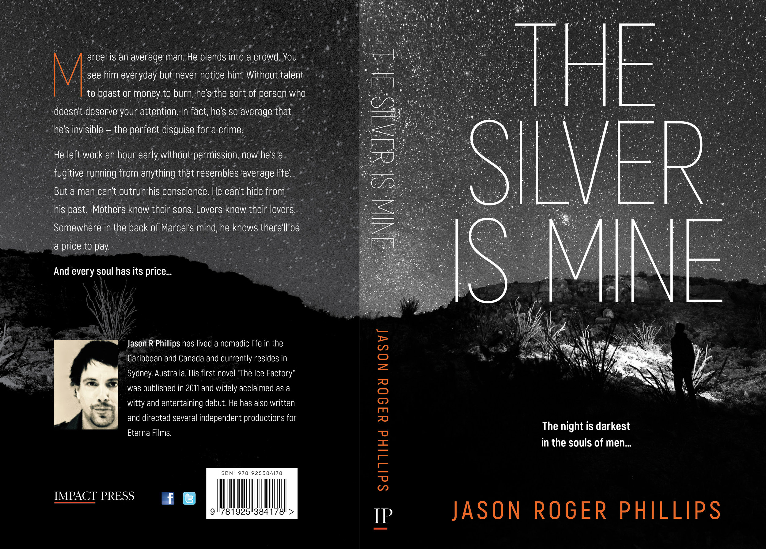
The Silver is Mine — WorkingType Cover
The Silver is Mine is an edgy psychological thriller published by Impact Press. Our client wanted a stark and high-contrast design. We used Akrobat Sans for the title type and a monochromatic starscape with enigmatic figure. The author's name provided the only splash of colour.
Property Finance Made Simple in the Kindle Bestseller List
Andrew Crossley's just-uploaded "Property Finance Made Simple" has immediately debuted on the Kindle bestseller list. Our cover design focused on a strong, straightforward combination of text and iconic image, that would reproduce well as a thumbnail and at larger sizes.
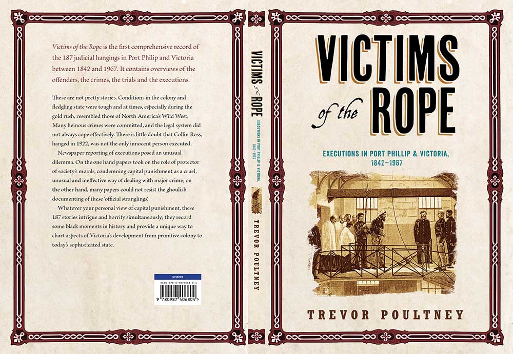
A Deadly Institution — Book Cover Design
Victims of the Rope, by Trevor Poultney
A cover design for a book discussing judicial executions in Victoria, Australia.
Read moreGreat Art by the Virtual Truckload
Marc Chagall’s Ceiling for the Paris Opéra, from the Google Image Project.
Via the fine folks at Open Culture, a definitive list of the best collections of digitised artworks.
- Google Art Project (250,000 images)
- L.A. County Museum (20,000)
- New York Public Library-Historic Maps (20,000)
- Norway National Museum (30,000)
- SFMoMA Rauschenberg Collection
- Stanford University’s Cantor Art Center (45,000)
- Stanford University’s French Revolution Collection (14,000)
- The British Library (100,000)
- The British Museum (4,200)
- The Getty (100,000)
- The Guggenheim (1,600)
- The Met (400,000)
- The Morgan Library Rembrandt Sketches (300)
- The Museum of Modern Art/MoMA (65,000)
- The Museum of New Zealand (30,000)
- The National Gallery (35,000)
- The New York Public Library: Photos, Maps, Letters (180,000)
- The Rijksmuseum (210,00)
- The Smithsonian (40,000)
- The Tate (70,000)
- The Whitney (21,000)
- The Van Gogh Museum (3500)
- Yale’s Great Depression Photo Collection (170,000)
- Vermeer (36)
Many of the artworks are scanned at very high resolution. In the case of institutions such as the Rijksmuseum in the Netherlands, re-use and alteration of the artworks is encouraged and celebrated. Considerable debate has erupted as to whether the wide availability of such material is somehow corrupting the ability of the general public to appreciate the actual rather than virtual artworks.
For those institutions that allow use and remixing of the digitised artwork, authors and designers have at their disposal a vast and powerful visual resource.
Lexie London — Book Cover
Our client already had the artwork they wanted for this children's title, but needed to liven up the type treatment. The nature and proportions of the image precluded the use of the middle two thirds of the page, so we utilised overlapping text and text on a path to fit in the rather long title. Typefaces used from the top of the cover: Another Shabby, Seaside Resort and Tommaso. Published by Brolga Publishing.


