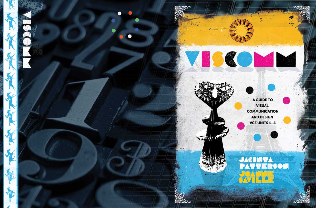
A cover concept for a Visual Communications textbook for Cambridge University Press. I used an old experimental French typeface for the title — each letter is as minimal as possible, but still quite readable. The strange object featured at centre left on the front cover is a student artwork. This concept didn't make the final cut, but it was my personal favourite.
PO Box 72
Eltham
+61 412 622 138
design + layout + print solutions + ebooks

Tips for authors, promotional ideas, design resources and more.
Information and tips, focusing on publishing, publicity, promotional ideas, author profiles, design resources and more.

