We were commissioned to produce an information graphic / poster for railway staff on the topic of fatigue management. With so much text on one poster, the background needed to be very muted and the relationships between different pieces of information as clear as possible.
Google Music Timeline
Watch your favourite types of music duke it out in the ring of public taste. Google has made a brave attempt to quantify the relative popularity of various strands of music since 1950 using objective criteria/data. Witness the massive displacement of previously dominant jazz by pop, rock and others. Watch the slow relative decline of rock as music contines to diversify and fragment. This article has some doubts about the methodology, but even if the results are not 100 percent reliable, imagine how many other axes/areas of human endeavour might fruitfully be subjected to this kind of approach.
Visualising Information
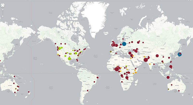
What the web is best at: marshalling complex data on interesting topics and making it accessible to everyone. A 'live' map depicting the cost of forgoing vaccination for diseases of childhood. Published by the US based Council on Foreign Relations.
Expo Display Unit
The Australian Academy of Sales wanted a display unit with a listing of all of their courses. White, highly readable type against a deep blue background made the unit highly visible without shouting too loudly.
Keeping it Clean
Sometimes the design is all about the information...


