

““Your cover is receiving accolades galore...you must take several bows and be delighted with the response to what I felt was an amazing depiction of the book. In this instance you CAN tell a book by its cover!!””
Client Testimonials #3

““The final viscomm textbook looks really really nice. The manager here even said it’s one of the best looking books we’ve done, and that is in no small part due to your cover and text design, so thanks again for your impressive work and help on that.””

Superb Blurbs for All

Most independent authors dread writing blurbs, and devote as little time to it as possible. Yet they are a critical tool for attracting potential readers. Seasoned author and promotional expert Joanna Penn enumerates several solid points to consider when engaged in the dreaded work of blurb construction. While many of the points (introduce key characters, describe the setting, a hint of mystery, etc.) might seem obvious, many authors opt instead for a leaden synopsis that gives away every important plot point.
Free and Nearly Free Fonts

Hundreds of websites cater to the Internet's limitless appetite for free typefaces. Only a few restrict themselves to high quality fonts. Font Squirrel is one such, and Lost Type allows users to pay what they want for their font of choice. Some of the Font Squirrel offerings have multiple weights, and a few are issued by commercial type designers, such as Plex, a huge font family commissioned by IBM.
Client Testimonials #2
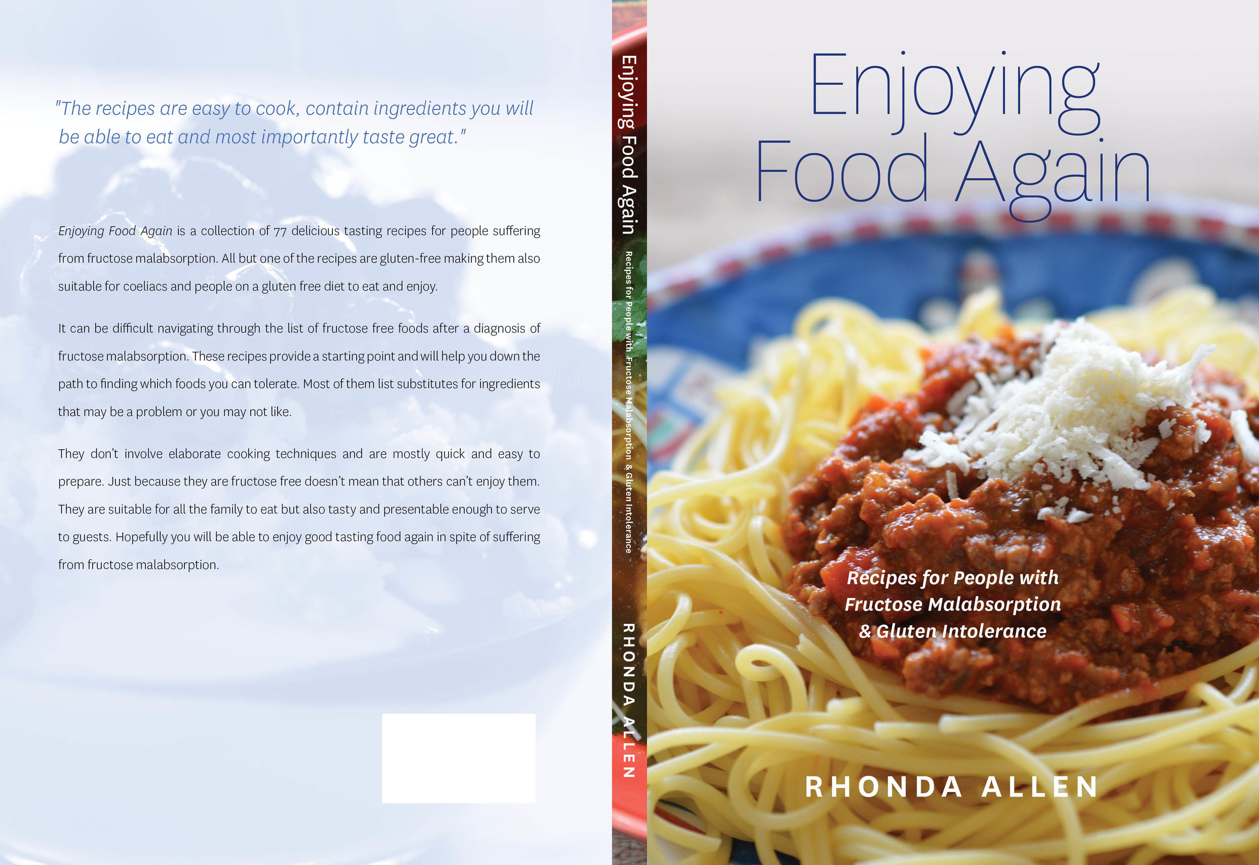
“Working Type did a fantastic design job for my cookbook, “Enjoying Food Again”. Luke had good ideas particularly for the section pages and typography but he was also happy to listen to what I wanted the book to look like. He was easy to work with and it all came together fairly quickly in spite of its size. I would be happy to use him again. ”
Client Testimonials #1

“Just wanted to thank you for all your brilliant work on “When Moons Collide” — apart from the wonderful typesetting, so many people have expressed amazement re the cover; one of them said she could just stare at it in eternal wonder! [My sentiments exactly!]”
Bookmarks — A Promotional Tool for Authors

Kathryn Gauci writes nuanced and emotionally affecting historical tales, often set in Greece or Turkey. When giving talks or promoting her books in other venues, she hands out bookmarks to potential purchasers. Inexpensive to print, the bookmarks are a useful reminder of her work, and might be viewed later by other readers.
Greek Courage
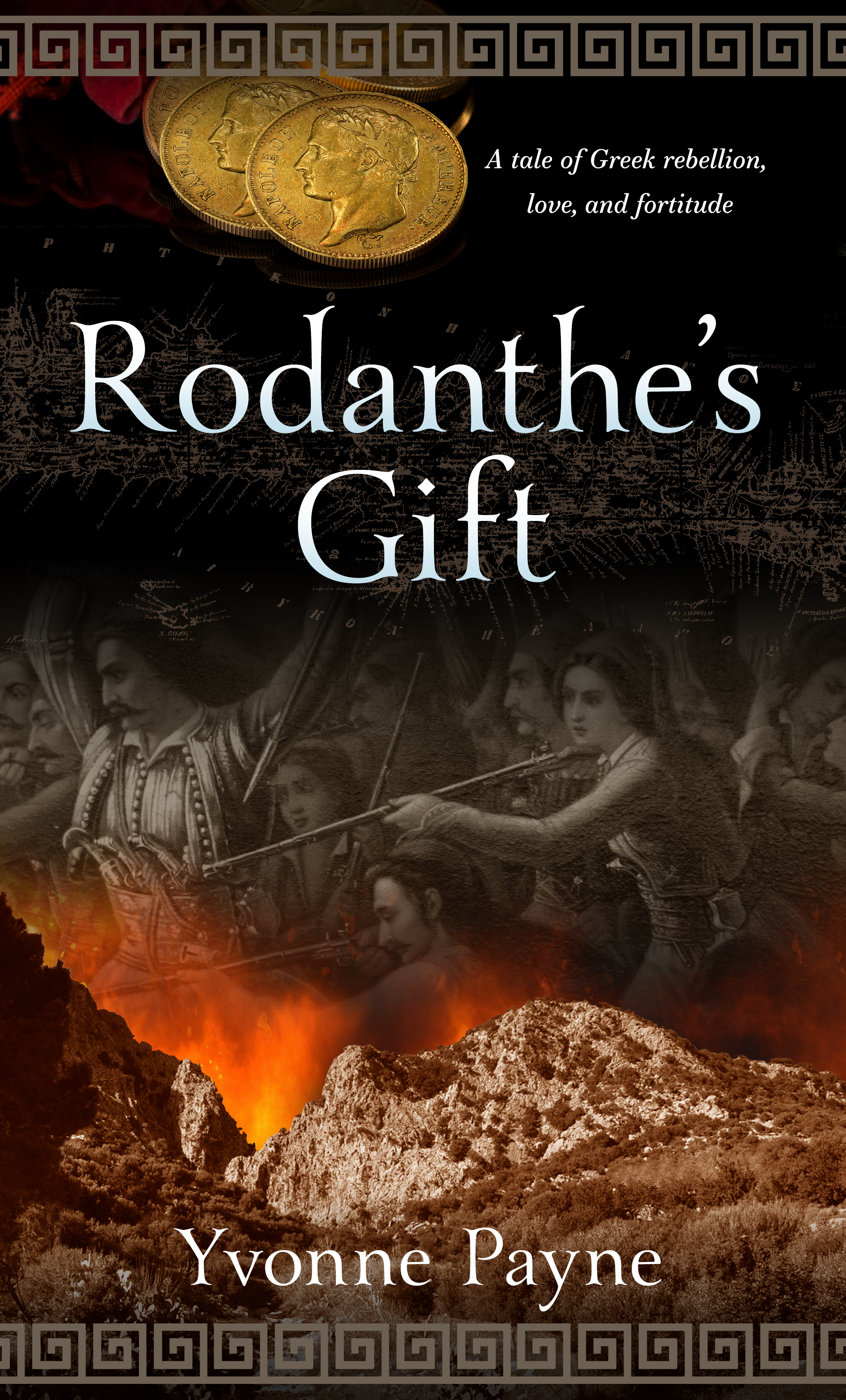
In the early 19th Century Greek patriots began the long and bloody process of re-establishing their independence after centuries under the Ottoman yoke. Yvonne Payne's story Rodanthe's Gift dramatises aspects of the rebellion that took place in Crete. We combined images of a mountainous Cretan landscape, gold Napoleons and a contemporary artwork. The title type is Yana. More information here.
A War of Hearts

Samantha Grosser writes psychologically compelling and sensitive stories of men and women, bringing the eras in which they lived to vivid life. Another Time and Place is set in World War Two and depicts two lovers separated by war, with no news of each other. Our cover design focused on the female protagonist, with a night-time colour palette and a transition from an interior setting to a broader landscape.
Tales of Mice and Men — Book Cover Design

Les Pobijie writes of a vanishing world — a small Australian town with an actual functioning newspaper. The tone of his novel is broad farce, with many mishaps and misunderstandings in store for the callow young journalist at the centre of the story. We combined a masked gunman, explosion, an authentic NSW pub and the intrepid hero. The typeface for the title and author name is Thunderhouse.
By the Book — Cover Design
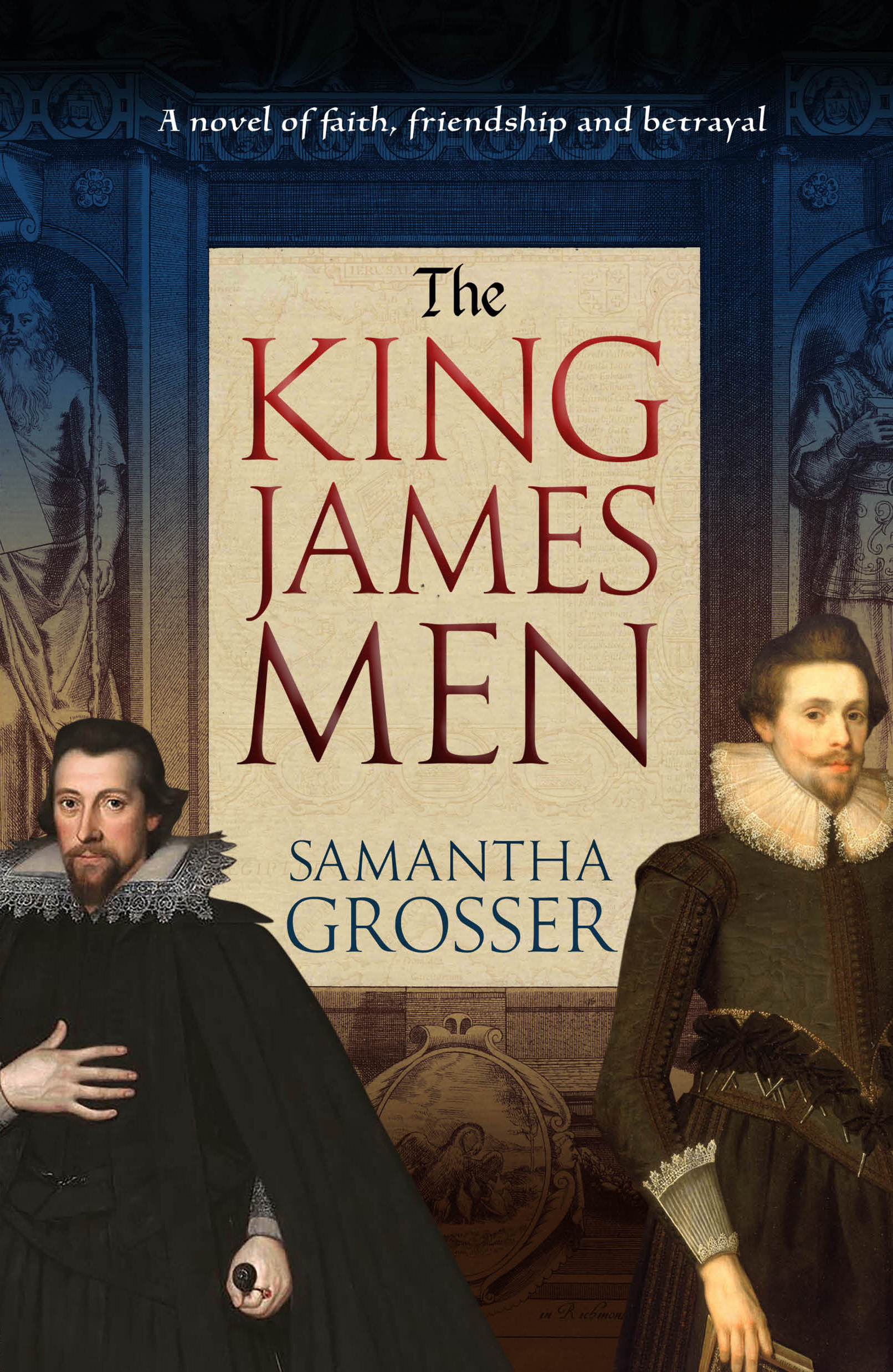
Often described as the only masterpiece ever produced by a committee, the King James edition of the Bible remained influential for several centuries. Samantha Grosser explores the world of the people who created the King James Bible, their aspirations, allegiances and betrayals. We used the frontespiece of the 1611 edition of the bible, along with contemporary portraits and a muted colour palette.
When First We Practice to Deceive — Cover Design

Deceit is a political thriller set in Australia. It depicts a parliament dominated by a deeply shady prime minister and surrounded by ambitious and ruthless supplicants. We wanted the cover to convey an air of foreboding and menace, and also of critical decisions to be made.
Using Images in Blog Posts
At Blogging.com, an interesting deep dive into using images in websites and blog posts, with a focus on the ethical use of creative commons images. The post goes into considerable detail on attribution, modification and sources for free or low cost images. As the page notes, including images in a blog post dramatically improves audience reach.
Making Old ISBNs New Again
If you bought a batch of ISBNs some years ago, and didn't allocate all of them, you may have noticed they are somewhat shorter than the current 13 digit ISBN formulation. Fortunately, new life can be breathed into your old truncated numbers. They can then go on to parent handsome barcodes to assist in the tracking of your magnum opus across the web and bookstores worldwide...
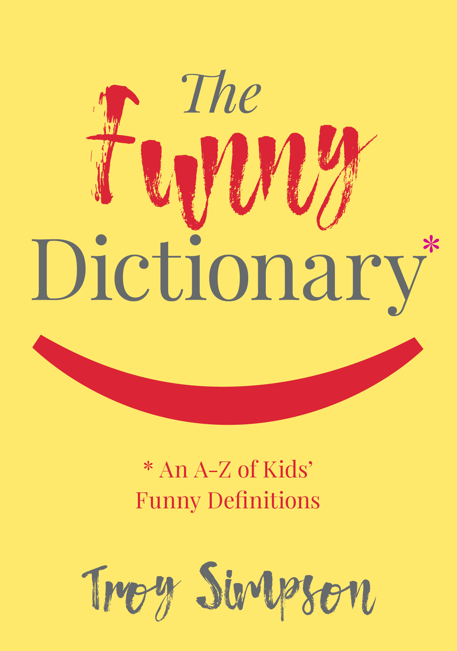
Funny Mistakes — Book Cover
The Funny Dictionary (published by the National Library of Australia) makes gentle sport of inadvertently amusing definitions written by children. Some of the "howlers" are accompanied by thematically aligned images from the extensive National Library photographic archives. The cover below was selected from many options generated by Working Type Design. The book is due for publication in the first half of 2018.
Images With a Yum Factor

An alternative to all the anodyne food images available at typical stock art libraries -- free photographs from www.foodiesfeed.com
Createspace Versus Lightning Source
For self-publishers, choosing between Amazon's Createspace print on demand service, and Ingram's Ingram Spark/Lightning Source service can be difficult. Both services have their pluses and drawbacks. For fence-sitters, here's an article that argues uploading to both services is a good idea. An author client recently indicated this approach was working well for him, and we'd be happy to hear opinions either was other print on demand using authors.
The Big Rort — Noir Fiction from Tasmania
Barry Weston writes entertaining detective novels set in Tasmania. Perhaps Australia's answer to Nordic noir? We wanted a dim, grimy and ambient feel for the cover -- the gumshoe on the cover is none other than the author. The title typeface is Veneer One.

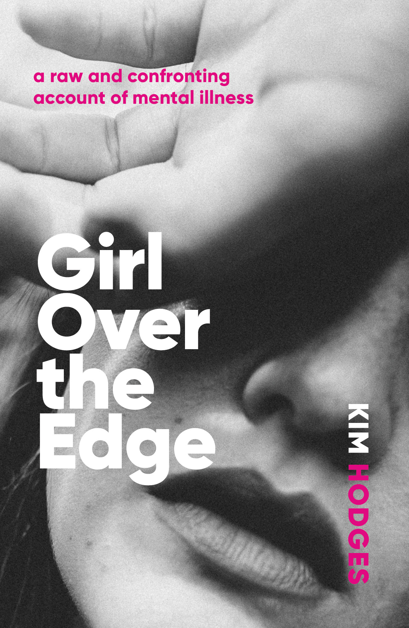
Book cover — Girl Over the Edge
Girl Over the Edge is an honest account of one woman's experience of mental illness. We wanted the cover to look raw and unfiltered, but not melodramatic. The typeface is Gilroy and the image was sourced from www.unsplash.com
Authors and their Digital Presence Explained
A thoughtful and in-depth examination of how authors are not getting the best results from their digital presence. The writer explains why the interests of authors and publishers do not always align, and how a new generation of author-centric services are being created.
“It is ironic that the author brand is foundational — the success of all title marketing depends on it and all publishers depend on title marketing — but how the author brands are developed gets very little professional attention.”