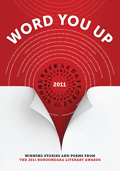
 Our client wanted a high-impact type-based design. We used contrast, intense colour and a line of text from each of the stories featured in the anthology. The page curl gives a hint of depth and serves to direct attention from the title down to the subtitle. Typefaces used were Museo Sans and Museo Slab by Jos Buivenga.
PO Box 72
Eltham
+61 412 622 138
design + layout + print solutions + ebooks
