Lorem Ipsum Hipster Zombie Brains

Designers are used to waiting for information. Blank spaces in layouts sometimes need to be filled with something, anything. Often they use Lorum Ipsum — pig Latin gibberish designed to simulate actual prose. Meet the Ipsums is a fresh take on Ipsum generation, with flavours including Zombie, Pommie, Gansta and Pirate. My favourite is Hipster:

Selvage Schlitz Brooklyn Williamsburg gastropub McSweeney's put a bird on it, forage ethnic iPhone. Cray american apparel shabby chic, cardigan before they sold out Carles disrupt thundercats bespoke DIY iPhone. 8-bit four loko Wes Anderson

So if a designer wants to put a smile on their client's face, or at least a look of complete bemusement, Meet the Ipsums might be their thing.

Flat is the New Black: How Google Designs Itself

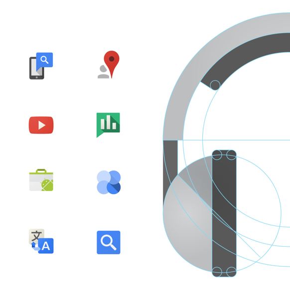
Users of Google (is that now officially everyone?) will have noticed in recent times a distinct improvement in the visual presentation of their various services. Use of white space is more sophisticated, icons eschew drop shadows and embrace unadorned flatness, and the typography is much more refined and readable. One of the people responsible for this design sea change at Google has posted at some length on the topic at Behance.

Pretty Annual Reports Pay

In times of economic austerity, corporations are wont to produce spartan annual reports, symbolising their determination to live within their means. Recent research shows this might be a counterproductive approach. Even strictly numbers-oriented investment analysts are heavily influenced by well designed company material. The prettier the reports, the more likely analysts are to give a company a 'buy' rating. The takeaway line is that “People are not aware of the effect of aesthetics on their financial decisions.”

Sumopaint a Middleweight Contender

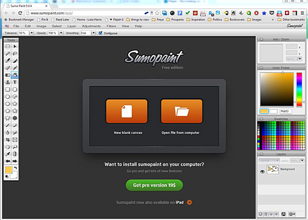
While unlikely to supplant Photoshop, Sumopaint is a surprisingly smooth and powerful image editor. Unlike Photoshop, Sumopaint operates in your browser. Powered by Flash, the program sports many of the same tools as Photoshop. The program also supports layers and filters. The filters are available only if you pay a one-off fee, and for slightly more, users can download an offline app version. The interface is very clean and professional. Now to search for a browser based image editor that runs on html5...

Google searches for Design

Founded by software engineers, Google's various apps and interfaces have often seemed curiously 'un-designed'. Clean and utilitarian they may have been, but also aesthetically problematic. That has changed in the last year or so under Larry Page — Google is finally designing very attractive and highly usable interfaces, eschewing Apple's skeumorphism and setting a surprisingly high standard. The Verge has an extended take on this development with plenty of examples.

Crimes Against Designers

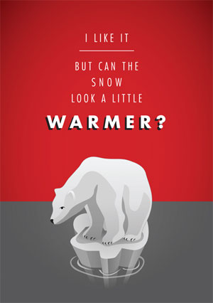
Designers like to grumble about occasionally unreasonable clients, but this collection of classic client comments was collated for a good cause (fund raising for an Irish children's hospital). The comments are all real, with "I have printed it out, but the animated gif is not working", "can you turn it around in Photoshop so we can see more of the front" or "I'm the target market and I don't like it" revealing a certain gulf opening up between client and creative.


A Taxonomy of Rapper Names

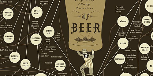
If you like your information visual, Pop Chart Lab merits closer examination. Their graphic designer takes light-hearted topics (rapper names, Hollywood haircuts, baseball, beer varieties and more) and turns them into gorgeous schematic diagrams.

"Pop Chart Lab was founded in August 2010 by a book editor and a graphic designer who joined forces with one modest goal in mind: to render all of human experience in chart form."  

Each poster has been meticulously researched and stands as an aesthetic tour de force as well as a conduit for some rather bizarre information.

Viewing Photoshop Files without Photoshop

Viewing native files from programs such as Photoshop or Illustrator can be difficult if you don't own the often very expensive packages. Google has recently added a useful functionality to Google Drive — the ability to accurately preview a number of exotic formats, including psd, ai, ttf and dxf. You won't be able to edit said files, but at least you will know what they contain. Users do not need to join Google apps (though doing so is a good idea) but can just go here to view immediately in-browser.

Atlas of Living Australia

The Atlas of Living Australia is a user-friendly visualisation of data related to Australian ecosystems, species and conservation programs. Simple to use and well thought-out, the website exemplifies the massive power of the web in displaying a range of information and making it accessible and understandable. Users can check biodiversity in their own area, browse for species of interest or add their own records. So if you've just spotted the elusive Night Parrot, this is the place to let the world know.

Wire Worm for Photoshop

While it sounds like a nasty intestinal parasite, Wire Worm is a plugin designed to rid your photographs of pesky unwanted artefacts (particularly wires). Like many modern Photoshop plugins and features, it does a lot of the heavy lifting automatically, calculating the replacement colour /tones and shapes from the surrounding background. And it does a pretty good job, cutting down on the need for fiddling around with endless cloning and other patching techniques.

Old School Type Specimens

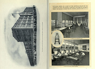
A long time ago, type was embodied rather than digital. Skilled craftsmen working for large companies laboriously designed and cut letters from metal and sold them across the world. The American Typefounders Company was one such outfit, and it regularly produced an exhaustive catalogue of their wares. Not only did the catalogue include hundreds of beautifully set sample pages of their type, it featured an extensive corporate introduction extolling the modernity of their facilities and sales outlets. It really was a 'gold mine for the progressive printer', digitised beautifully by The Internet Archive.

Poster Calling for Young Writers

Our client requested a bold and attention-grabbing poster to attract entrants to their short story writing competition. The design needed to echo design elements used in an earlier anthology of short story winners (also designed by Chameleon). We used the flowing, high contrast Mrs Sheppards (designed by Alejandro Paul) in conjunction with the clean lines of Museo Sans. With a big block of solid colour and the sharp page turn curves at the base of the poster, we gave the poster enough muscle to communicate effectively.

Cassian Brown: Content is King

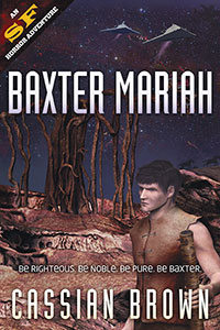
Author of two classy science fiction novels (covers designed by Chameleon), Cassian Brown has put together a website to showcase his work. Apart from excerpting an exciting sequence from Baxter Mariah, he links to the many ebook and print purveyors of his work, offers signed copies, a newsletter signup and biographical information. A next step might be to link to other writers and science-fiction oriented websites, to locate himself in the online sci-fi ecosystem. A link to his twitter account (EllameinePress) might also be useful.