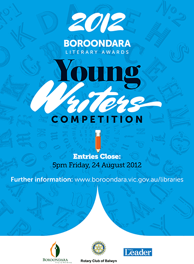
 Our client requested a bold and attention-grabbing poster to attract entrants to their short story writing competition. The design needed to echo design elements used in an earlier anthology of short story winners (also designed by Chameleon). We used the flowing, high contrast Mrs Sheppards (designed by Alejandro Paul) in conjunction with the clean lines of Museo Sans. With a big block of solid colour and the sharp page turn curves at the base of the poster, we gave the poster enough muscle to communicate effectively.
PO Box 72
Eltham
+61 412 622 138
design + layout + print solutions + ebooks
