 Adobe Systems are best known as the company behind Photoshop, Adobe Acrobat and InDesign. They also have been involved in the design and sale of typefaces for many years. In an unusually generous move, Adobe have released Source Sans —a very accomplished sans serif type family, for the price of absolutely nothing. Available in 6 weights, Source Sans is elegant, practical and suitable for portable devices, the web and print. A real workhorse typeface that designers will return to again and again, but useful for nondesigners who want to go beyond the usual defaults of Arial and Times.
Old School Type Specimens
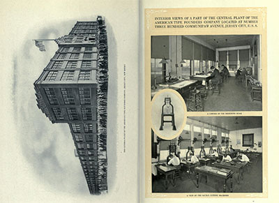 A long time ago, type was embodied rather than digital. Skilled craftsmen working for large companies laboriously designed and cut letters from metal and sold them across the world. The American Typefounders Company was one such outfit, and it regularly produced an exhaustive catalogue of their wares. Not only did the catalogue include hundreds of beautifully set sample pages of their type, it featured an extensive corporate introduction extolling the modernity of their facilities and sales outlets. It really was a 'gold mine for the progressive printer', digitised beautifully by The Internet Archive.
Scrabble for Typophiles
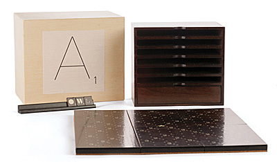 For lovers of design and typography — an elite Scrabble set to set you above the design-starved masses. Produced as a limited edition set, the board and tiles employ a variety of quality typefaces, are signed and numbered and constructed of stained walnut. Type lovers may find it difficult to concentrate on the game when so many typefaces await identification.
Photoshop Plugin is Just Their Type
A giant in the world of quality type, the FontShop can now tout its wares from inside Photoshop. Install their plugin, and you can preview any of the thousands of typefaces on offer. If you like what you see, click through to their online store, buy the typeface and start using it. Many are the ways a designer can be parted from their money.
100 Best Typefaces
It's a big call, but someone has to make it — Fontshop has listed the 100 typefaces it considers the 'best of all time'. Their ranking system includes both subjective and objective criteria, and takes into account sales figures. The top ten contain no surprises, indeed, the top twenty is pretty predictable. All the workhorse typefaces are there — Times, Helvetica, Univers, Garamond, Gill Sans, Frutiger and Franklin Gothic, so the list isn't a way of discovering new and interesting typefaces. It is more a ranking of those typefaces that have survived the vagaries of fashion and have been used over many decades (or centuries in some cases).
Sins of a Certain Type
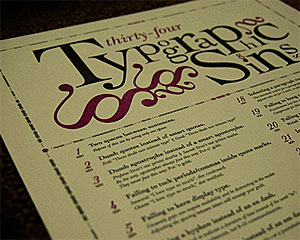 Just like grammar, typography attracts pedants. Some of their gripes are legitimate, while others seem rather trivial. One such perfectionist has put together all of his pet peeves on one poster. Ironically, the website showcasing this poster was rather hard to read, both in Chrome and Firefox.
Dingbats want to be Free
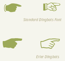 More than just an old-fashioned insult, dingbats are pictorial typefaces packed with symbols useful in a wide variety of design contexts. FontFont have released a sampler typeface (not the full complement of symbols, but a wide variety nonetheless) for free downloading. Erler Dingbats were first released some forty years ago and have now been updated for the digital era with new symbols. Each symbol has been designed to integrate with its fellows. In the usual way of European type, the result is slightly bloodless but eminently useable.
Anatomy of a Typeface
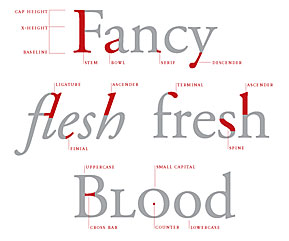 If you thought a stem belonged to a flower and a bowl was what you put the flower in, then visit Thinking with Type for a typographical education. The site is a well designed tour of type design, units of type measurement, classification and use, and hints on mixing typefaces, all written in plain English and elegantly illustrated. The site makes a good case for considering typography as the core of most graphic design, even on the web.
Type with soul
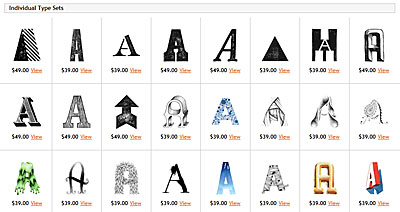 If precise typefaces with mathematically determined curves put together on a computer leave you a little cold, there is a tiny corner of the typosphere that is embracing a hand made alternative. The Organic Type features hand-drawn, painted, sketched, rubbed and eroded typefaces, achieving warm and charming effects impossible with standard type. Their typefaces cannot be installed via a font manager. Instead, each letter is supplied as a separate layered image file, and needs to be manually placed and kerned. Perfect for arresting and highly individual headers, and capable of heavy lifting in almost any design context.
Typography and Numbers
Follow this link at FontFont for a very detailed and accessible post dealing with the correct way to set numbers in tables, text, as super and subscript, and as fractions. The differences between poorly and elegantly set numbers is quite stark, and has implications for readability and sheer aesthetic enjoyment of the text.
Beautiful Type Samples from Emigre
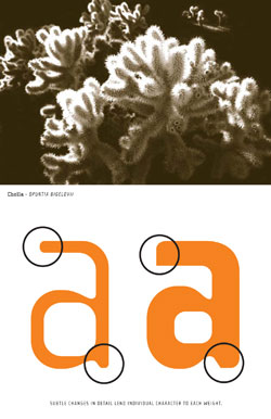 Digital type design pioneers Emigre have released some of their old printed type sample sheets in PDF form. The sheets are beautiful examples of graphic design in their own right and many of the spreads would make excellent posters. Several of the typefaces designed by the Emigre founders are still used, such as Mrs Eaves, Triplex, Filosofia, Template Gothic and Vista Sans. Some of the experimental typefaces have had their run, but they did help create the wide open field that is modern typography. Emigre was one of the first independent digital foundries and was responsible for the hugely influential Emigre magazine, which ran from 1984 to 2005.
Typography Times Ten
A solid list of both classic and contemporary books about typography, from the folks at Brain Pickings. Each book demonstrates the richness and complexity of the field, and how much typographers in their unobtrusive way contribute to artistic and literary culture.
Drive-by Fonts
 The last couple of years have seen a quiet revolution for web designers. Once limited to the small number of typefaces that 'everyone' had installed on their machines, designers have been completely liberated from that restriction by web-served typefaces. Now it no longer matters what the user has installed -- the website renders typefaces from a remote server. If you'd like to see what your website (or someone else's) would look like using the new web font services, try this neat little demonstration from type purveyor FontFont. Instead of bland patches of Arial or Verdana, imagine your site decked out with typefaces designed for the screen.
Archer Hits Typeface Bullseye
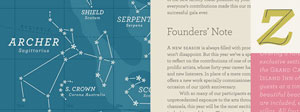 In combining prettiness and practicality, Archer is a rare typeface. With idiosyncratic letterforms and cute little ball terminals, this friendly slab serif has been spotted all over the web and and in hundreds of publications. As with other HF&J typefaces (especially Gotham), it has been (over)used, but in the right caring hands, it still has the capacity to give shine and personality to many kinds of print and web design.
Em and En Dashes
The typographically aware know that em dashes are preferable to hyphens in text, and en dashes are handy as range separators, but how to access them when emailing or posting to the web? Fortunately there is a handy shortcut. Instead of using -- or --- in lieu of the correct symbols, for em dashes paste — in the appropriate spot in your html editor or key in alt 0151 (on the numerical keyboard) in emails. En dashes are – for html or Alt 0150 for emails. Much more comprehensive discussions to be found here and here.
No Times for Us
Why we do not use Times New Roman for (virtually) anything:
- TNR was designed for newspaper use, not modern offset print work or websites
- Its preeminent position as a system font on all PCs arose by historical accident (installed by corporate fiat), not through its superior virtues
- It is everywhere, like Arial. As such, it lacks a distinctive voice. Why not choose from a host of fine serif faces (Caslon, Fairfield, Garamond, Arno, Palatino, Warnock and so on) ?
Give Me Your Hand (writing)
Type Radio
Build it, and they will kern
 You've visited all the type vendors and searched in vain. There's nothing that quite matches up with the search image in your head. 'I could do a better job myself!' you cry.
Fortunately for you. Fontshop has recently added an interesting functionality to their website: a typeface constructor. The FontStruct site equips you with an array of basic font shapes that can be moved arround lego-like on an underlying grid to form letters. Although the basic shapes are simple, when used in concert, the results are quite sophisticated. A gallery shows the variety of effects achieved by contributors. Once you have put together your masterpiece (and that might just be an uppercase set of letters, or an extended character set), your typeface can be saved as a truetype font and used out in the 'real' world. Over 160,000 people have signed up with FontStruct and 7,000 typefaces have been saved for public use. At the very least, the site is a worthy educational tool for those interested in typefaces, and reinforces the notion of an underlying grid over which the letterforms are arranged/organised. Oh, and it is completely free.
You've visited all the type vendors and searched in vain. There's nothing that quite matches up with the search image in your head. 'I could do a better job myself!' you cry.
Fortunately for you. Fontshop has recently added an interesting functionality to their website: a typeface constructor. The FontStruct site equips you with an array of basic font shapes that can be moved arround lego-like on an underlying grid to form letters. Although the basic shapes are simple, when used in concert, the results are quite sophisticated. A gallery shows the variety of effects achieved by contributors. Once you have put together your masterpiece (and that might just be an uppercase set of letters, or an extended character set), your typeface can be saved as a truetype font and used out in the 'real' world. Over 160,000 people have signed up with FontStruct and 7,000 typefaces have been saved for public use. At the very least, the site is a worthy educational tool for those interested in typefaces, and reinforces the notion of an underlying grid over which the letterforms are arranged/organised. Oh, and it is completely free.The Colour of Type
- type size
- type colour
- type clarity and contrast
- the ratio of the x-height to the overall letter height
- letterspacing
- kerning
- line length
- average word length
- frequency of hyphenation
- justified or set ragged left
- number of and space between columns
- leading (interline spacing)
- paper colour and thickness
- margins
- paper dimensions
