To get an idea of the amount of time that goes into the design of a large font family, check out this promotional site. FF Mark is the result of a long-term collaboration between some of the brightest lights in modern European typography. The designers are intimately aware of typographic history and prepared to slog through the minutiae of sketching, adjusting and kerning thousands of characters in ten weights.
Archer Hits Typeface Bullseye
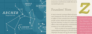
 In combining prettiness and practicality, Archer is a rare typeface. With idiosyncratic letterforms and cute little ball terminals, this friendly slab serif has been spotted all over the web and and in hundreds of publications. As with other HF&J typefaces (especially Gotham), it has been (over)used, but in the right caring hands, it still has the capacity to give shine and personality to many kinds of print and web design.

