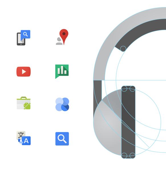
 Users of Google (is that now officially everyone?) will have noticed in recent times a distinct improvement in the visual presentation of their various services. Use of white space is more sophisticated, icons eschew drop shadows and embrace unadorned flatness, and the typography is much more refined and readable. One of the people responsible for this design sea change at Google has posted at some length on the topic at Behance.

