A thoughtful and detailed take on the very different world of planning and executing a large modern website. First, a thorough inventory of planned content, second a content planning matrix where the site architect learns to "match content with your website's users, their needs, and your purpose", then finally a content production matrix where "you can get into the tactical work of figuring out how that content is going to be produced". Proof that web design is a very different beast than print design, though designers such as Erik Spiekermann would argue that the fundamental constraints of readability and typographic restraint are universal.
Thinking About Your Website
Some interesting thoughts about planning for your new or updated website, and from an Australian perspective. Given the tendency of website implementation to stretch out to infinity, a little bit of forethought has the potential to save a lot of money and aggravation.
Cutting Edge Companies
From Fast Company, a compilation of companies intent on 'disrupting' their particular niche. Conspicuously absent from the list are Facebook and Twitter. The Fast Company website is an exemplar of the new trend of sites designed primarily for mobile. One day it will seem odd that an inferior viewing experience (tiny mobile phone screens) is driving the viewing experience for everyone else.
Cloud of Words
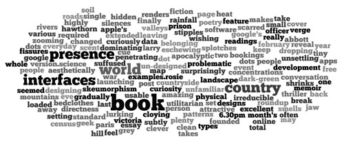
 Generate a cloud of your own words online at Wordle. Not sure what any given word cloud reveals (beyond one's tendency to overuse certain terms). Too many polysyllabic words might be a prompt to use plainer language. Or not.
Taming the Word > HTML workflow
Quite a bit of web content was originally created in Word for Windows. Word is infamous for creating messy html. To cut time spent on fixing tags, try this free service. Word2cleanhtml "strips out invalid or proprietry tags, leaving clean HTML behind for use in web pages and ebooks". Now to find a similar service for cleaning word docs for use in page layout programs...
TeuxDeux
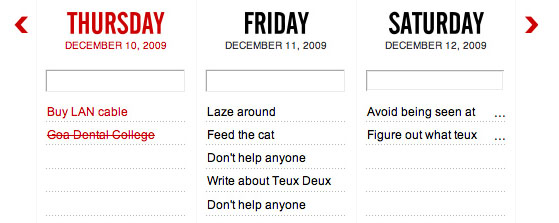
 The designer and blogger Tina Roth Eisenberg has come up with a neat little to-do service with a cute name: TeuxDeux. She has pared this free offering back to the absolute essentials of to-do-ness: seven days viewed at once, a list below, order or day of task changed by drag and drop, click twice to finalise a task, click little cross to delete. Future tasks are black, past are grey and present tasks are red. And that's it. It works. One might wish for additional features and email > task capabilities, but any additional features would tend to muddy what is a very clean interface.
Flatland on the Internet
Down with faux fur, ersatz stone, chiselled letters and imitation wood! Designers rise up against illusion and visual misdirection! A designer makes a good case against the current vogue for making interfaces look like physical objects. Pare it back, leaving only the absolutely essential .
"Remove the unnecessary embellishments and keep stripping until you’ve almost gone too far. We believe that elegant interfaces are ones that have the most impact with the fewest elements."
Be Your Own Newspaper Mogul
There's an American pundit who likes to bang on about the 'hyper-personal news stream' that will supposedly come to dominate the way we consume news. We will select a highly individualised stream of information that closely mirrors our preferences. A taste of this future can be seen with the various news aggregators. Paper.li can take Twitter, Facebook or Google+ feeds and turn them into quite an attractive simulation of a newspaper. A business can build a collection of feeds likely to be of interest to its clients, including their own tweets or Facebook posts. A pro version of the service also allows a company to add their brand/logo to the newsletter, currently $9 per month.
Book, Meet Internet...
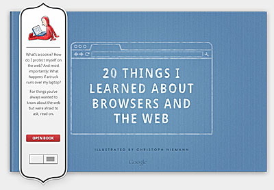
 A neat little primer on the contemporary Internet, comissioned by Google Chrome, illustrated by Christoph Nieman and (oddly enough) designed to look like a printed book (old metaphors die very hard). Learn about TCP/IP, web standards, the cloud, html5, plugins, extensions and more, all in straightforward, non-technical language.
What the Web is Made Of
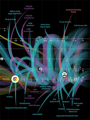
 Even casual users of the Internet will have noticed its constant evolution. Sites are vastly more sophisticated, attractive and responsive than they once were. Usability has evolved into a fine art and ecommerce has finally come of age. If you are interested in the underlying machinery that makes the modern Web hum, this website will be of interest. Displayed as a timeline, the site charts the arrival and growth of various protocols, security initiatives, programming languages and browsers. The early days of the Web are revealed in all their primitive glory and the sophistication of the current moment (with much more to come).
Principles for User-Friendly Web Services
A creditable attempt by the UK government to enshrine a list of simple principles for constructing user-friendly web-based services. The ten items listed are:
The website then goes on to enlarge on each point, giving concrete examples. The site authors promise to continually refine the list of principles.
Ludicrous Stock Photos
Anyone in the design or advertising trade has spent (way too much) time looking through stock photo libraries. While some of these images are works of creative brilliance, the majority are mind searingly dull and issue from the department of the extremely obvious and literal. Huffington Post celebrates the unintentionally surreal/idiotic nature of some stock photo memes, such as people holding tiny houses and people in bed listening to bluetooth devices. The sooner someone invents a software genie that can select the perfect picture via algorithm, the better.
Archive of Everything
The interface is pretty ugly, but the ambition is grand and noble: "universal access to all knowledge". The Internet Archive describes itself as a 'library of the Internet". It stores/caches permanently billions of pages and millions of websites, plus audio and visual files. To do that, it needs serious storage capacity (we're talking petabytes). The Internet is such an evanescent, fizzing medium, continually addicted to the new and happy to forget the old almost instantly, that an organisation dedicated to preserving that tumult seems very valuable.
 The Wayback Machine (a part of the site), for searching websites cached over the past decade or more, is exceptionally easy to use and functional. Likewise, the Open Library, featuring millions of digitised books, is incredibly interesting and well designed. Hopefully the programmers who put it together will work on making the entire site more accessible to lay users.
