Melbourne is home to a surprising number of high quality Art Deco buildings. Robin Grow has written about most of them, and has recently brought out the second edition of Melbourne Art Deco. We worked on a revision of the cover, and strove to allow the strong geometric forms of the featured building to speak without obstruction.
Recent Cover Design Work
An experiment in running the title type large enough to allow the image below to be seen almost without obstruction. The result feels open and warm and hopefully conversational.
Chameleon Print Design goes to Dakar
If one really squints, this motorbike (ridden by the intrepid Allan Roberts) sports the title type for his book The Hard Way Home (Jo Jo Publishing), courtesy of Chameleon Print Design. So the design at least has braved Andean precipes, forded terrifying rapids and generally defied death for several adrenalin soaked weeks.
Alan's entertaining book, already featured in an earlier Chameleon Print Design post.
Recent cover designs
Three variations on the same cover for a publishing client.
A restrained take on a very difficult, sensitive topic.
Covers from 2013
Some recent cover design work...
Cover Designs in Decline?
Writing in the New Yorker, Tim Kreider explains why he thinks that high end book cover designs are in aesthetic decline. He suggests that the field is afflicted by a degree of conformity probably exacerbated by the Internet. "There’s clearly some brutally efficient Darwinian process at work here, because certain images—half-faces, napes, piers stretching into the water—spread like successful evolutionary adaptations and quickly become ubiquitous". He gives examples and harks back to the inventiveness and frequent weirdness of covers designed for pulp science fiction. Other culprits include the decreasing popularity of hand lettered titles (making something of a comeback, in my opinion). Children's and young adult titles are lauded as an exception to the general malaise.
Trends in Graphic Design
Like all creative fields, graphic design continually lusts for the new while cannibalising and recycling the old. Trend List catalogues aspects of designers' eternal search for novelty and a fresh look. Depending on your perspective, its discoveries are an index of things to emulate, or approaches to avoid.
Vaudeville in Australia
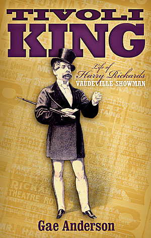
 Harry Rickards was a nineteenth century show business entrepreneur and performer who made a risky move from Britain to Australia. His business doings were colourful to the point of criminality and he died a rich man. We wanted to convey something of the swagger of the man and the constant chatter of the material produced to promote his shows. We used typefaces appropriate to the time.
Full Colour Cover

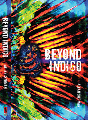
When "Beyond Indigo" was published twenty years ago, the author was unhappy with the book's cover, feeling it was conventional and stodgy. With a new publisher, he finally had the chance to remedy the errors of the past.
The book deals with an elderly opal miner and an extraordinary opal strike. We took full advantage of the dramatic colours of that gem. With a gem specimen overlaid against a close-up opal pattern, the composition might also be a wing, a sunset or a landscape — almost abstract, but concrete enough to tie the book to its subject matter.
Lonely for My Land sells well
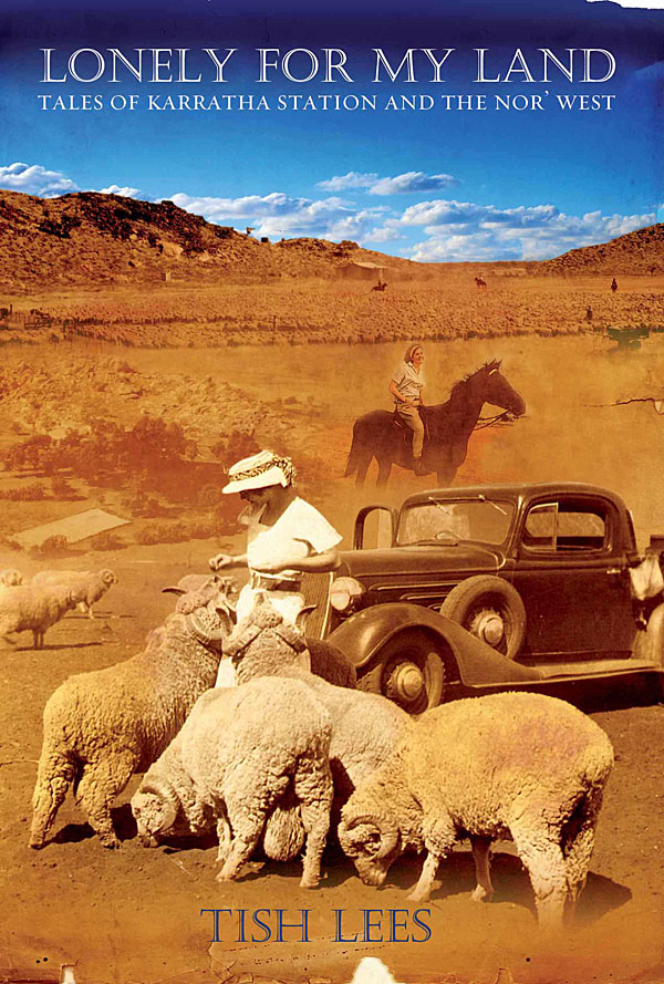
 Tish Lees grew up on a remote and beautiful cattle station called Karratha. An accident of geology put her parents' station at the heart of Australia's iron export industry. Tish chronicles in her book a vanishing way of life. She wanted us to capture the feel of the WA outback, the dust and blue skies, and to integrate the best of her family snapshots. The result has sold extremely well and is into its third printing.


