Melbourne is home to a surprising number of high quality Art Deco buildings. Robin Grow has written about most of them, and has recently brought out the second edition of Melbourne Art Deco. We worked on a revision of the cover, and strove to allow the strong geometric forms of the featured building to speak without obstruction.
Lousy Book Covers
Hilariously bad book covers paraded for the amusement of jaded designers. Shooting fish in a barrel, but nonetheless compelling entertainment. Misguided typeface selections, bizarre image use and juxtapositions, and primitive Photoshop skills abound, often on the same cover.
Recent cover designs
Three variations on the same cover for a publishing client.
A restrained take on a very difficult, sensitive topic.
All the Colours in the (rgb) World
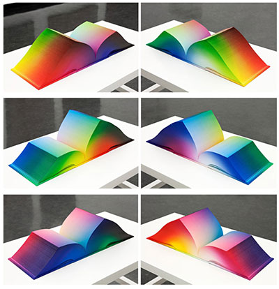
A book without any text content, a beautiful object, an amazing rendering of all the colours a monitor can display, a coffee table book that could double as a coffee table... as one blogger noted "It’s a gorgeous cube of many colors!"
Trends in Graphic Design
Like all creative fields, graphic design continually lusts for the new while cannibalising and recycling the old. Trend List catalogues aspects of designers' eternal search for novelty and a fresh look. Depending on your perspective, its discoveries are an index of things to emulate, or approaches to avoid.
Lions and Lilies
Catherine A Wilson and Catherine T Wilson (head to their website for an explanation of that unlikely pairing of names) write entertaining and well researched historical sagas set in medieval times. They have built up a dedicated readership for their "Lions and Lillies" series, and are excellent at building up reader expectations and involvement. We wanted their covers to convey a cinematic sense of excitement and immediacy.
Promote for Your Life
Alison Taafe is an accomplished chef and educator, but also possesses a key additional skill — promotional savvy. When she finishes work on one of her cookbooks, she then devotes just as much energy to making the public aware of it. She makes media appearances, gives demonstrations, interviews and keeps her website up to date and interesting. Aspiring authors would do well to make a study of her methods. Her latest book just sold out its first run.
The World's Best Pop-up Books
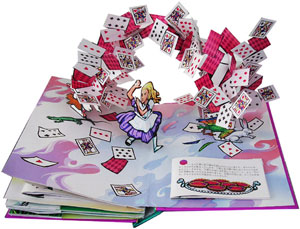 One area of print will linger longer than any other — children's books. More than any other books, texture, colour and real interactivity matter. And within children's books, pop-ups are the most resolutely three dimensional of all. Matthew Reinhart and Robert Sabuda are preeminent in this field. Together and individually, they have created some of the most amazing (and reasonably priced) books I have ever seen. They marry really high quality illustrations with bogglingly complex pop-ups. One can't even begin to figure out how each trick is achieved -- a man turning into a wolf, a Chinese dragon composed of intricately folded crépe paper, a massive T-Rex head with jaws that open, and so on. Although incredibly complex, their books are also quite durable. That said, it is probably a good idea to keep them out of the hands of smaller/destructive toddlers.
Book Trilogy
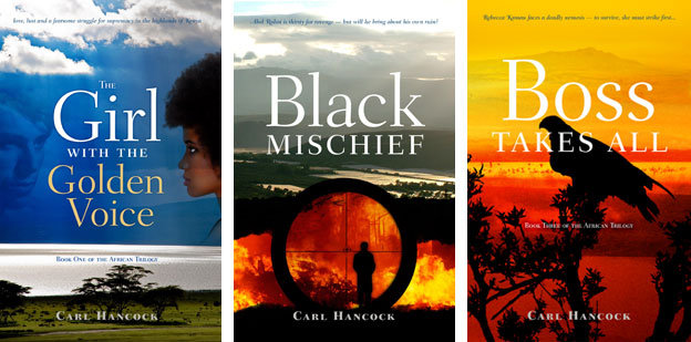 Our client had written three books that followed a largely linear narrative, and were strongly tied to a single location in Africa (the Rift Valley in Kenya). Our cover designs used that landscape as a reference, bringing in additional images specific to the particular volume in the trilogy. The title typeface is Fairfield and supplies a framework for all three covers.
Vaudeville in Australia
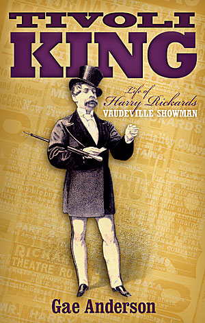 Harry Rickards was a nineteenth century show business entrepreneur and performer who made a risky move from Britain to Australia. His business doings were colourful to the point of criminality and he died a rich man. We wanted to convey something of the swagger of the man and the constant chatter of the material produced to promote his shows. We used typefaces appropriate to the time.
Taking Care of Business
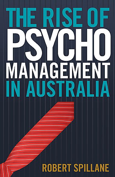
Our client wanted a bold, typography based cover. We used Trade Gothic, a pinstripe background and a tie standing in for a red arrow and achieve a high impact result.
Full Colour Cover
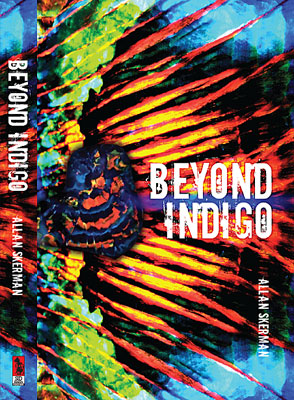
When "Beyond Indigo" was published twenty years ago, the author was unhappy with the book's cover, feeling it was conventional and stodgy. With a new publisher, he finally had the chance to remedy the errors of the past.
The book deals with an elderly opal miner and an extraordinary opal strike. We took full advantage of the dramatic colours of that gem. With a gem specimen overlaid against a close-up opal pattern, the composition might also be a wing, a sunset or a landscape — almost abstract, but concrete enough to tie the book to its subject matter.
Using Createspace
Along with ebooks, print-on-demand publishing is experiencing a period of rapid growth. The biggest publisher of POD in the english-speaking world is Createspace, a subsidiary of Amazon. Like all giants, Createspace is capable of both creation and destruction. It has helped make publishing easier and accessible. However, as both publisher and distributor, Amazon/Createspace has a worrying amount of control over dissemination of the printed word. As one blog commenter pointed out:
When an editor doesn’t like something you say, you find another editor or publisher. When one distributor doesn’t want to handle your book, you find another. And when one retail store refuses to place it on your shelves, other stores do and reap the profit. But Amazon plays all those roles and, even more important, it so dominates the market that some people think that if a book isn’t on Amazon, it isn’t in print.
Lonely for My Land sells well
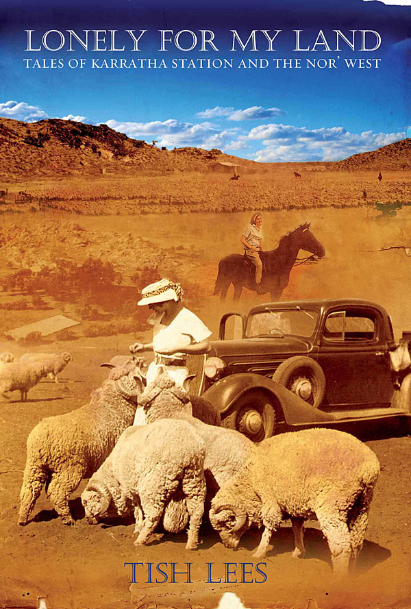 Tish Lees grew up on a remote and beautiful cattle station called Karratha. An accident of geology put her parents' station at the heart of Australia's iron export industry. Tish chronicles in her book a vanishing way of life. She wanted us to capture the feel of the WA outback, the dust and blue skies, and to integrate the best of her family snapshots. The result has sold extremely well and is into its third printing.
Indexers Rule
An index is a simple concept, but difficult to execute properly. Too often indexing is an afterthought, compiled without much planning. Authors and publishers sometimes begrudge the expenditure involved, but it is an investment in reader satisfaction. A well constructed index adds immeasurably to the value of a non-fiction book, making search and navigation simple and satisfying. An index automatically generated by a word processor or layout package is useless without the hand of an experienced indexer.
The Book Show on ABC Radio National recently ran an interesting program on the finer points of indexing.
If you are considering engaging an indexer, visit The Australian and New Zealand Society of Indexers and take advantage of their directory of available indexers. All people listed have completed the appropriate training.
Composite covers
 Financial constraints sometimes mean that we are unable to acquire a 'perfect' single cover image, but instead need to construct a composite of several less expensive or public domain images. The three titles above are examples of that approach.


