
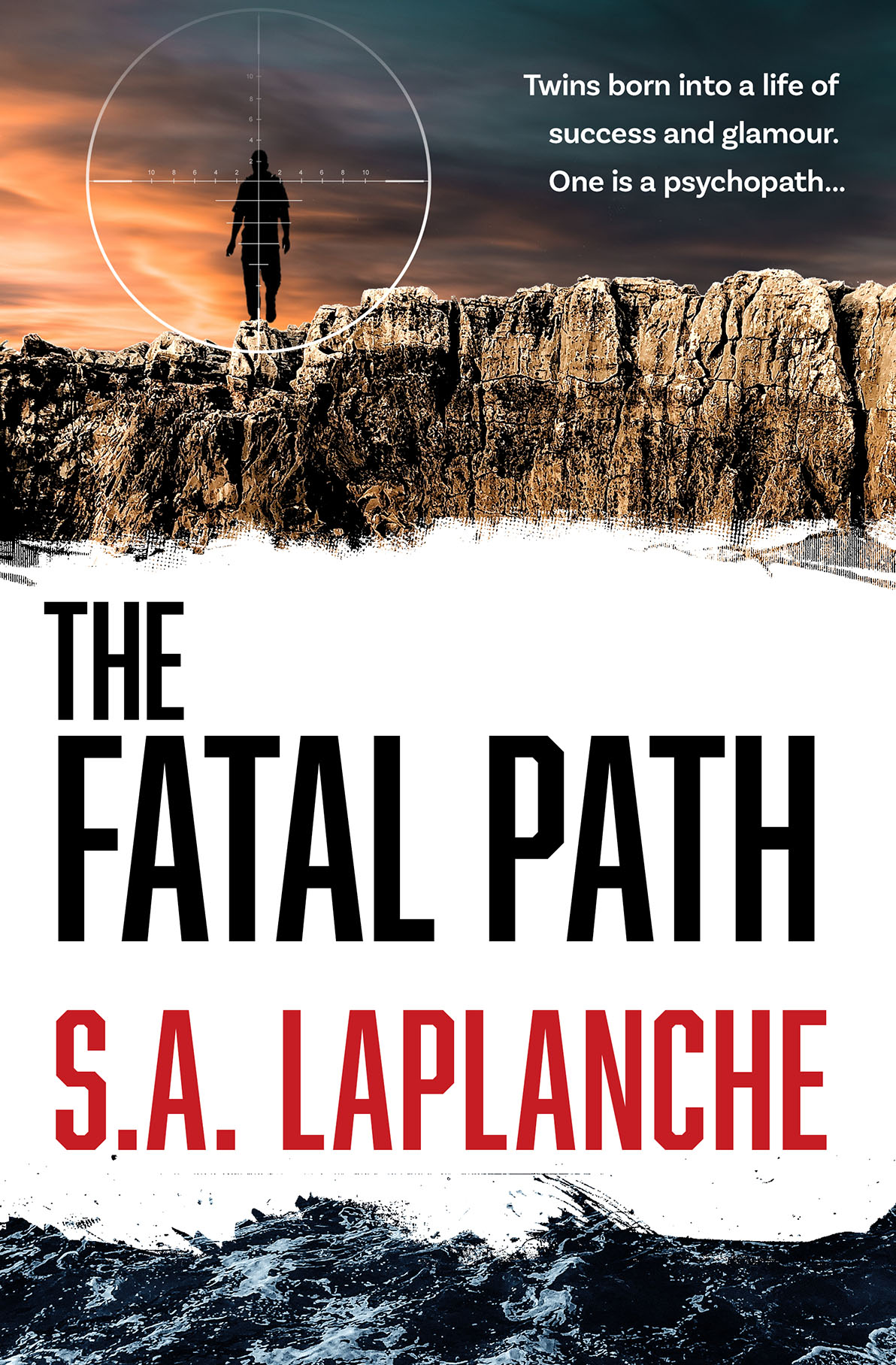
An update on an earlier post — two more iterations on this cover. Sometimes it is a long and winding road to a final cover…
Fatal Path Cover — More Iterations

Information and tips, focusing on publishing, publicity, promotional ideas, author profiles, design resources and more.
An update on an earlier post — two more iterations on this cover. Sometimes it is a long and winding road to a final cover…
For beautiful, jaw-dropping science graphics, the quirkily named TableTop Whale is an essential destination. Maintained by Phd student Eleanor Lutz, the work is astonishingly good. Hopefully she will produce something in print so I can read it to my children…

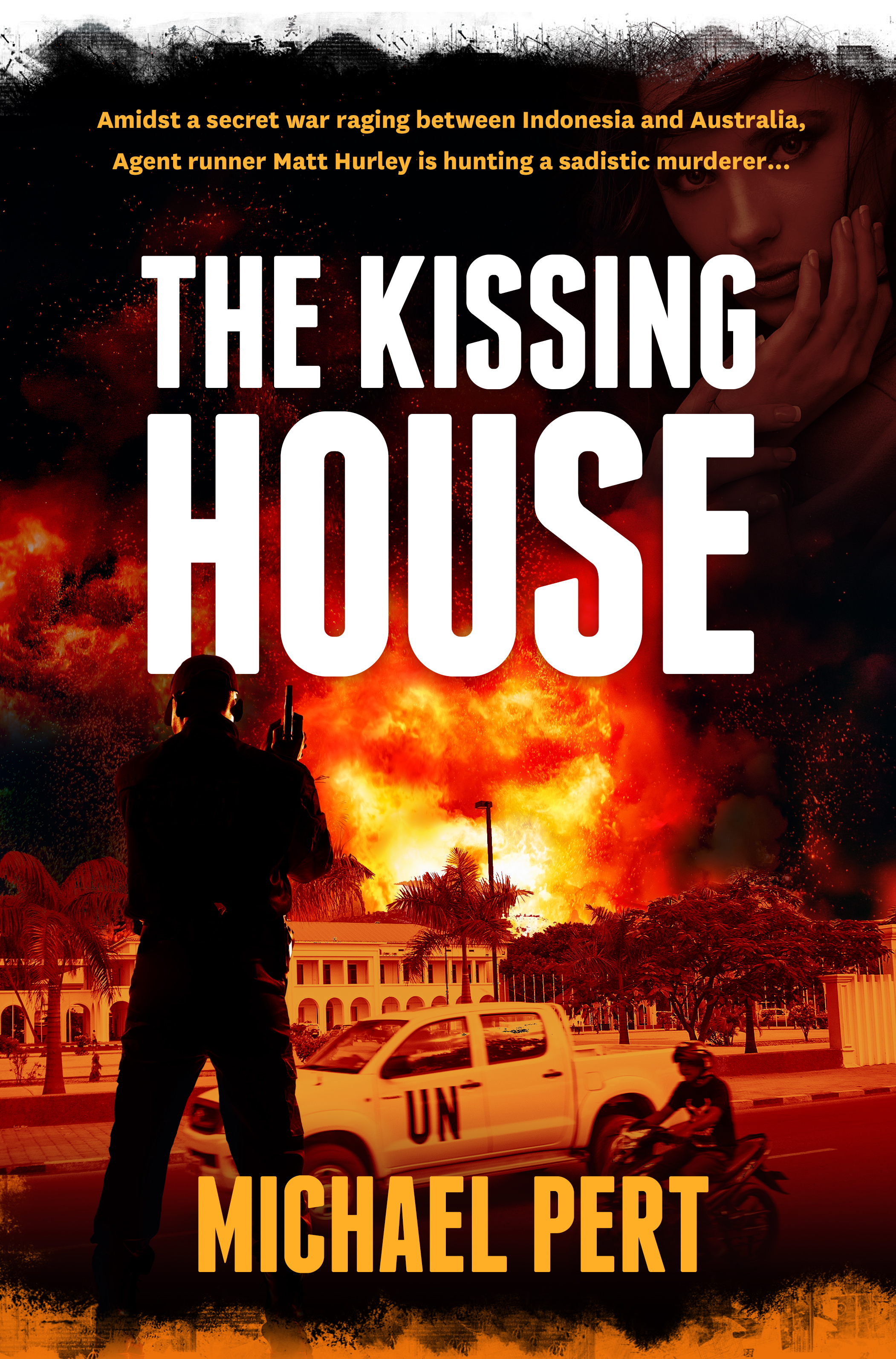
Michael Pert has written a taut, intelligent thriller based on Australia’s role in the troubled birth of East Timor. In the above draft cover, we blended images of Timor and a stark colour palette, and used the striking Franchise for the title typeface.
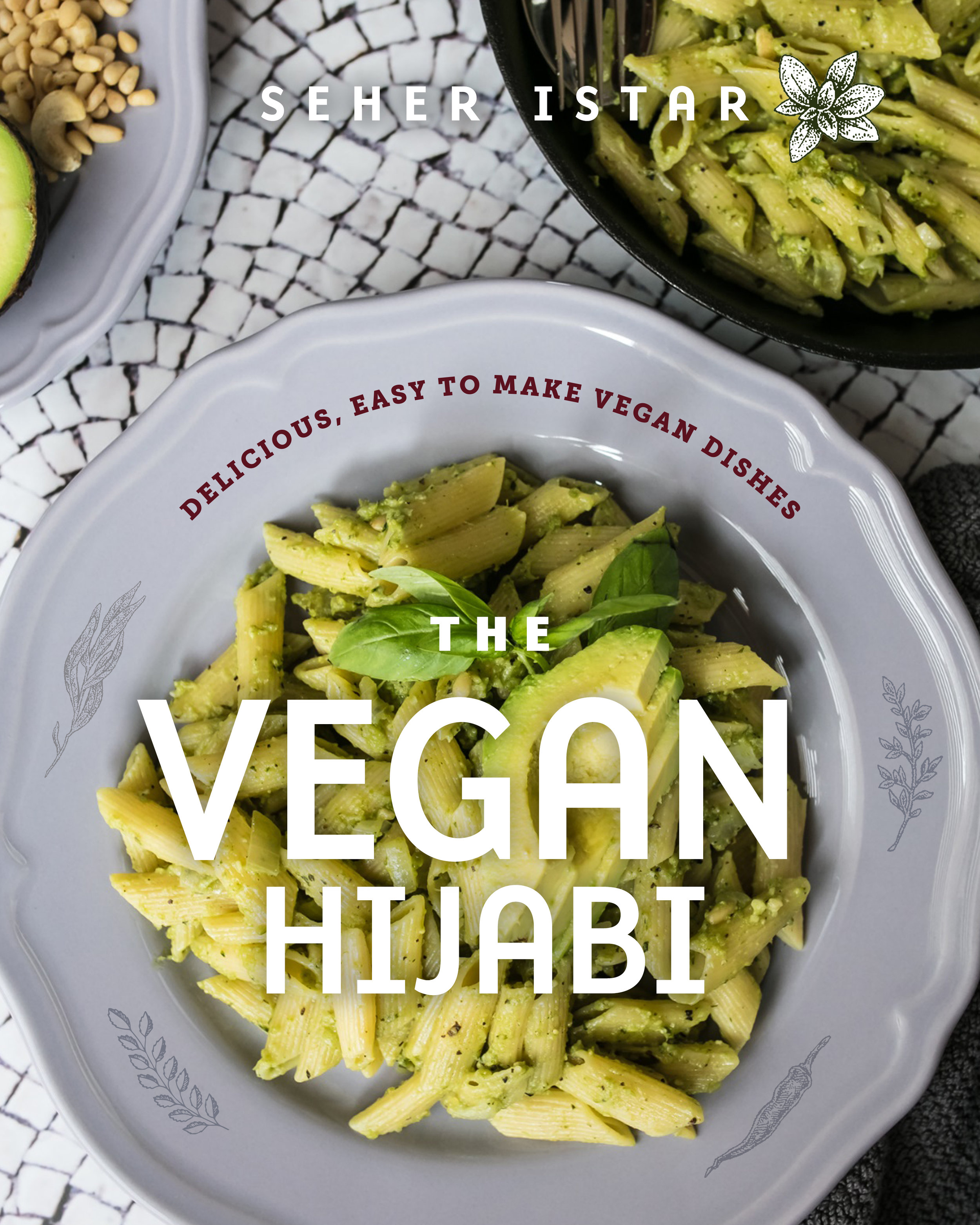
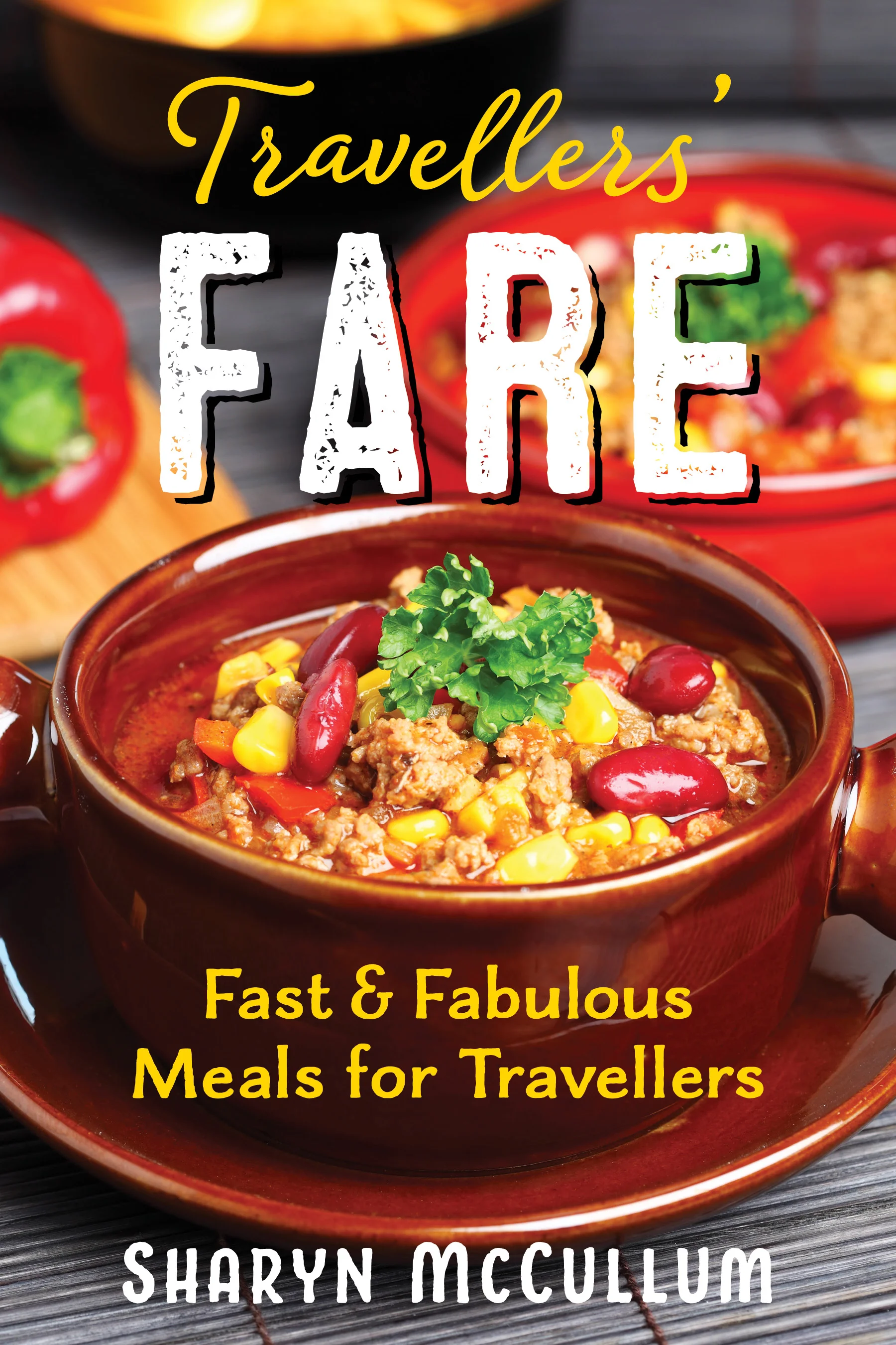
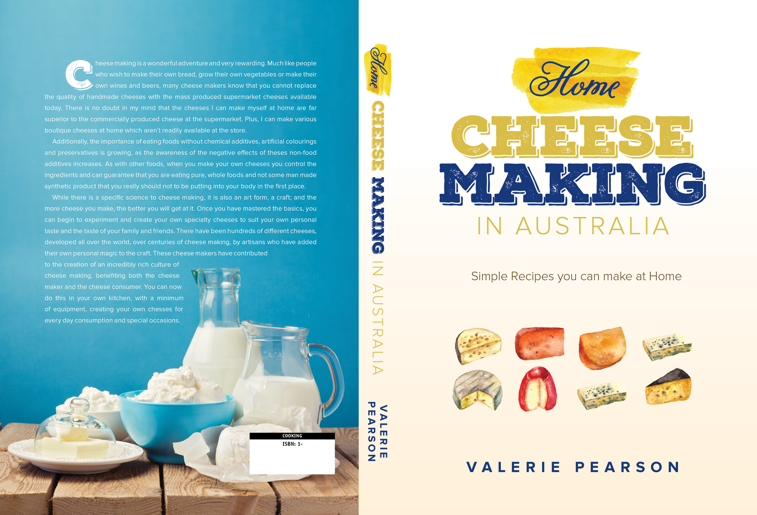
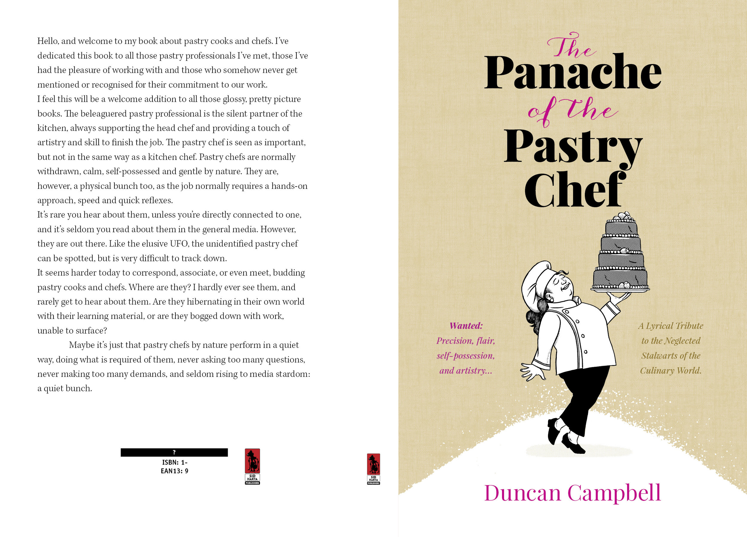
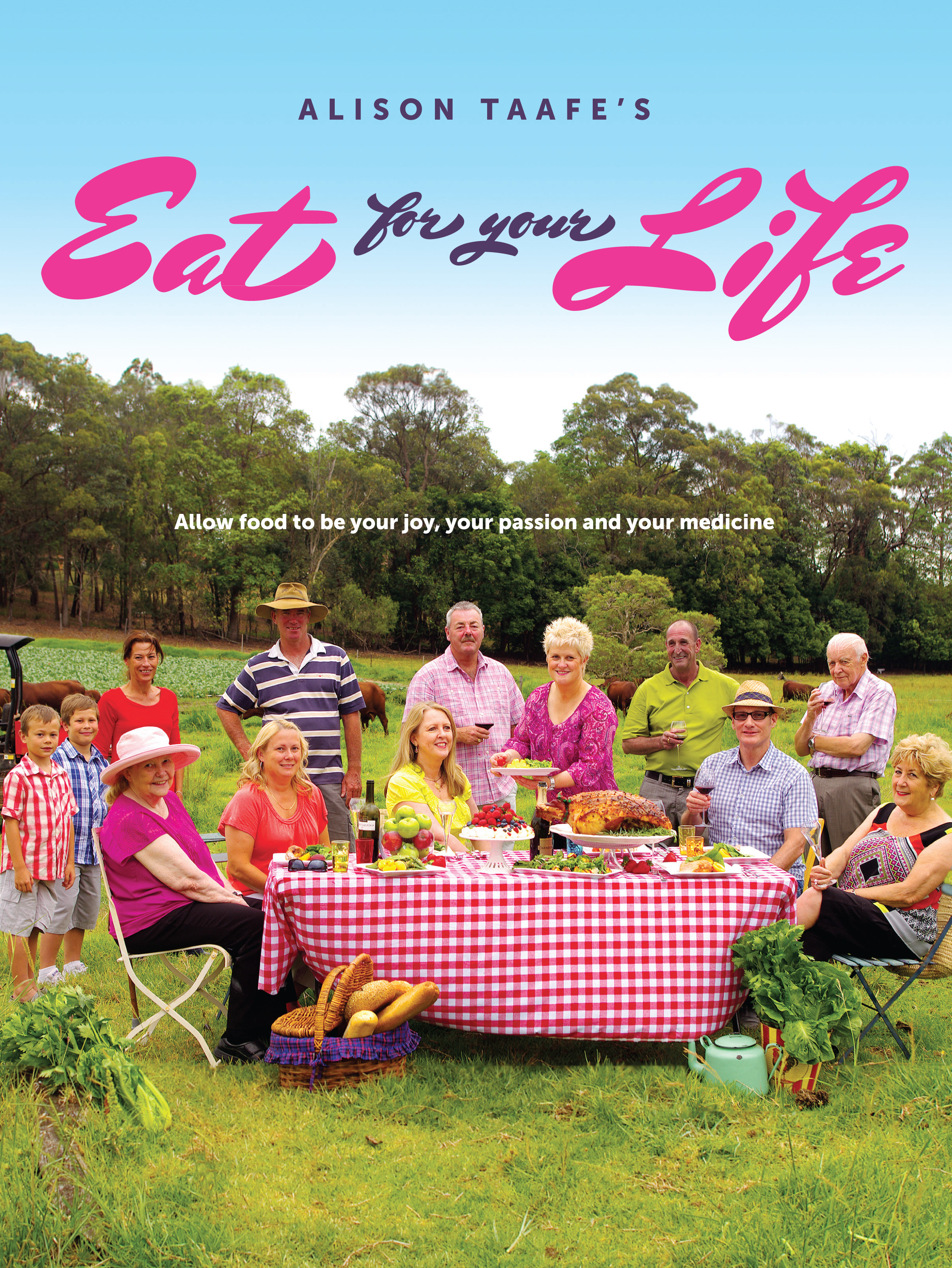
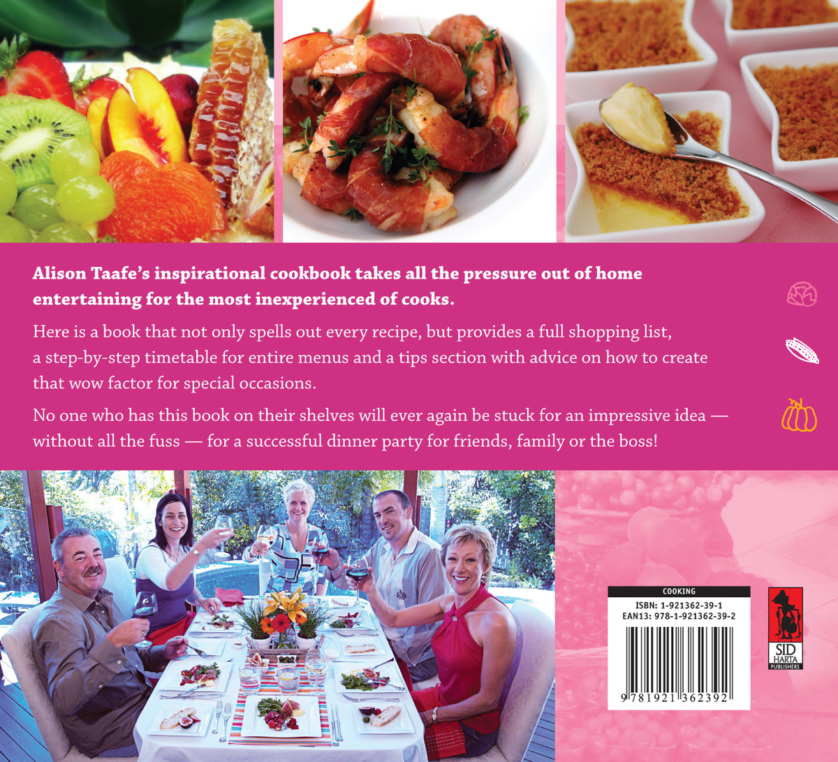
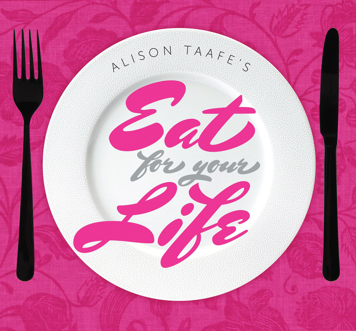
A small selection of colourful cookbook covers completed over the past few years. Anything involving food is always fun!


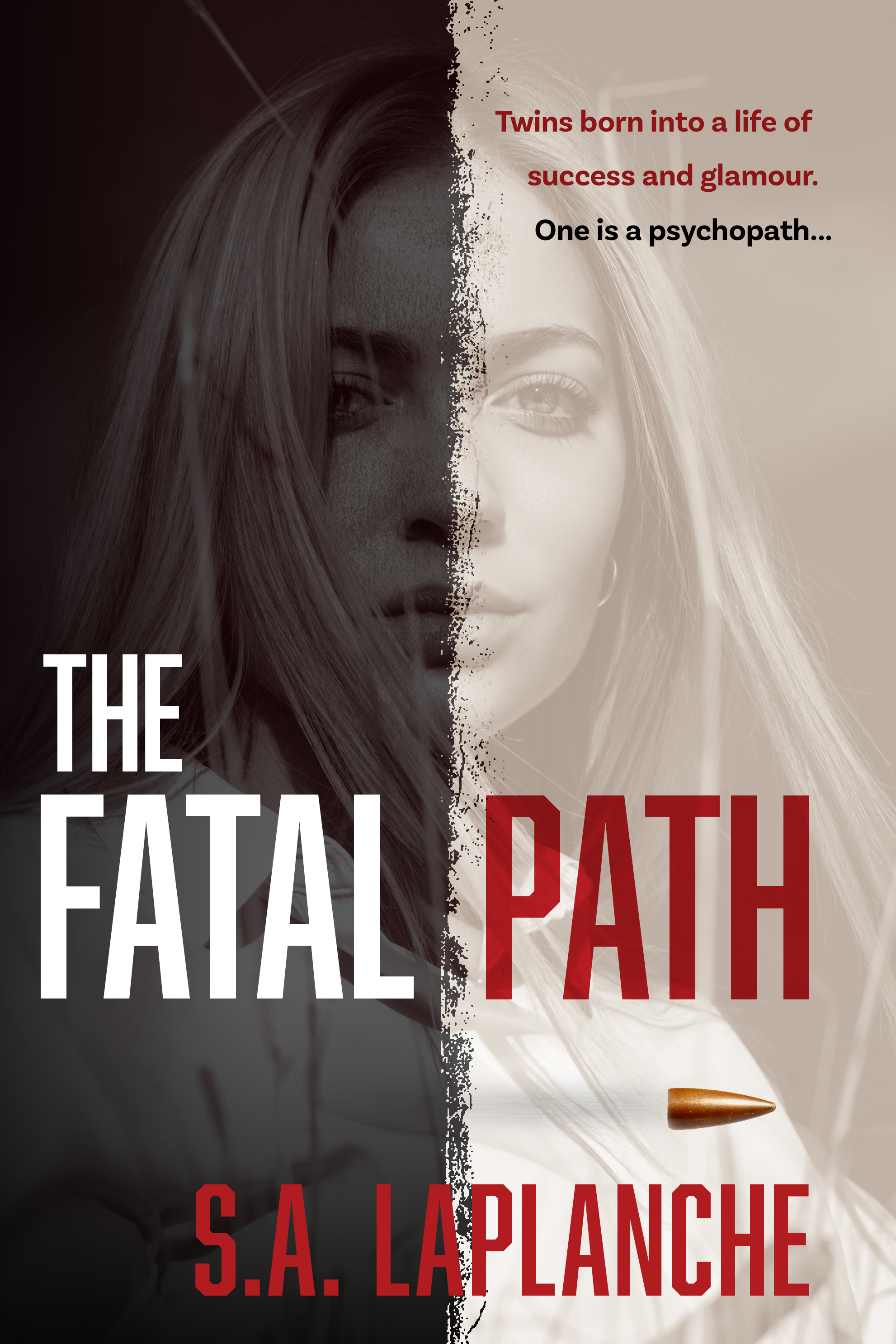
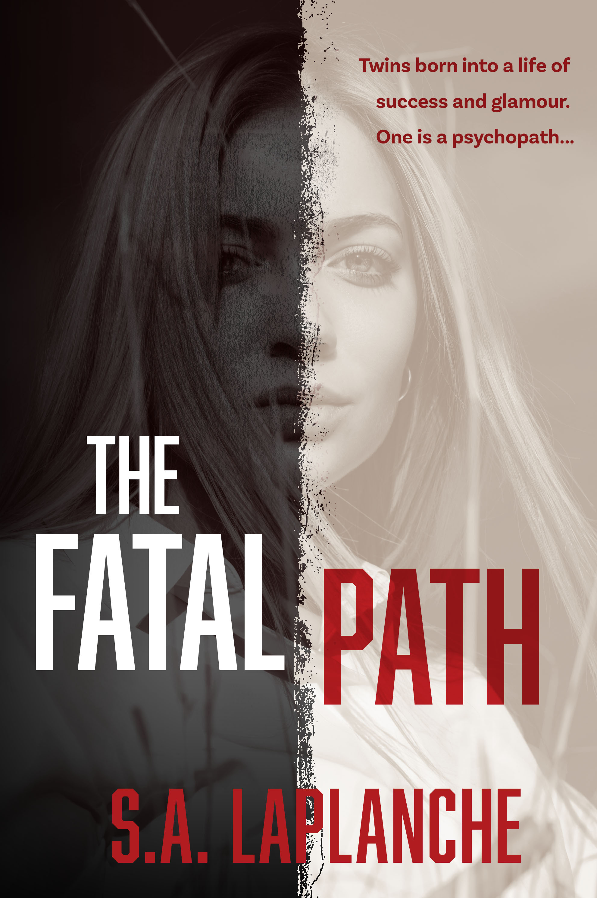
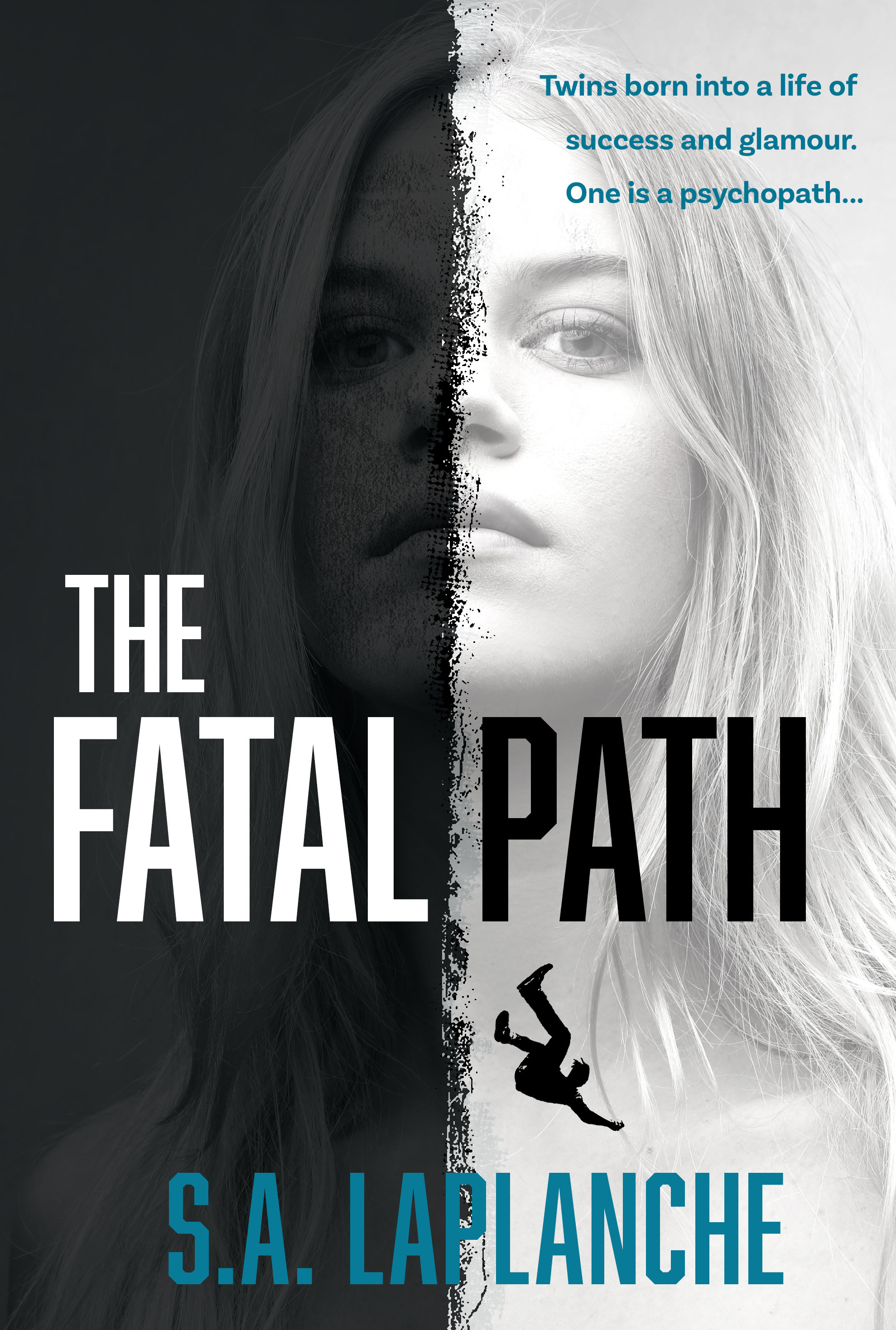
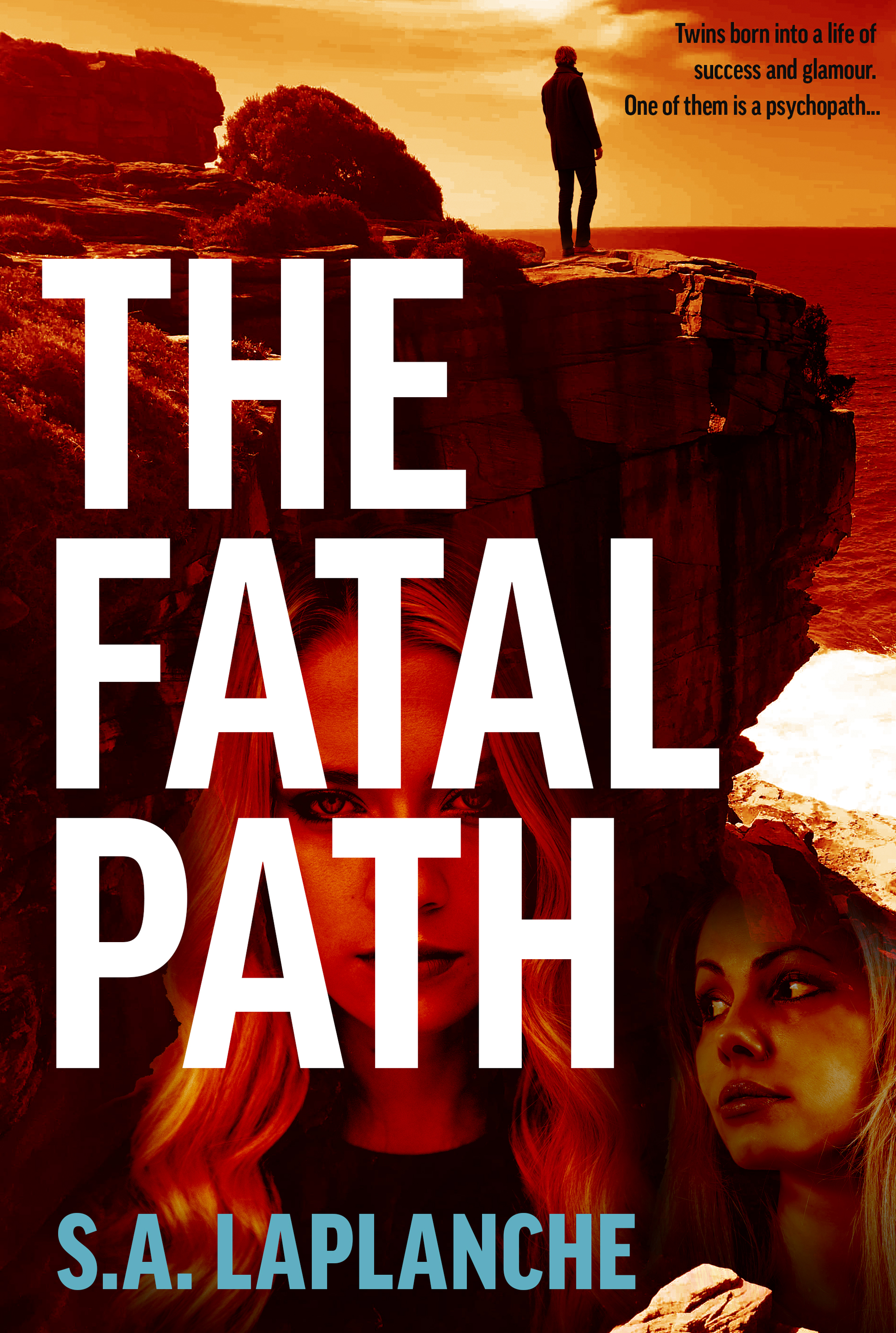
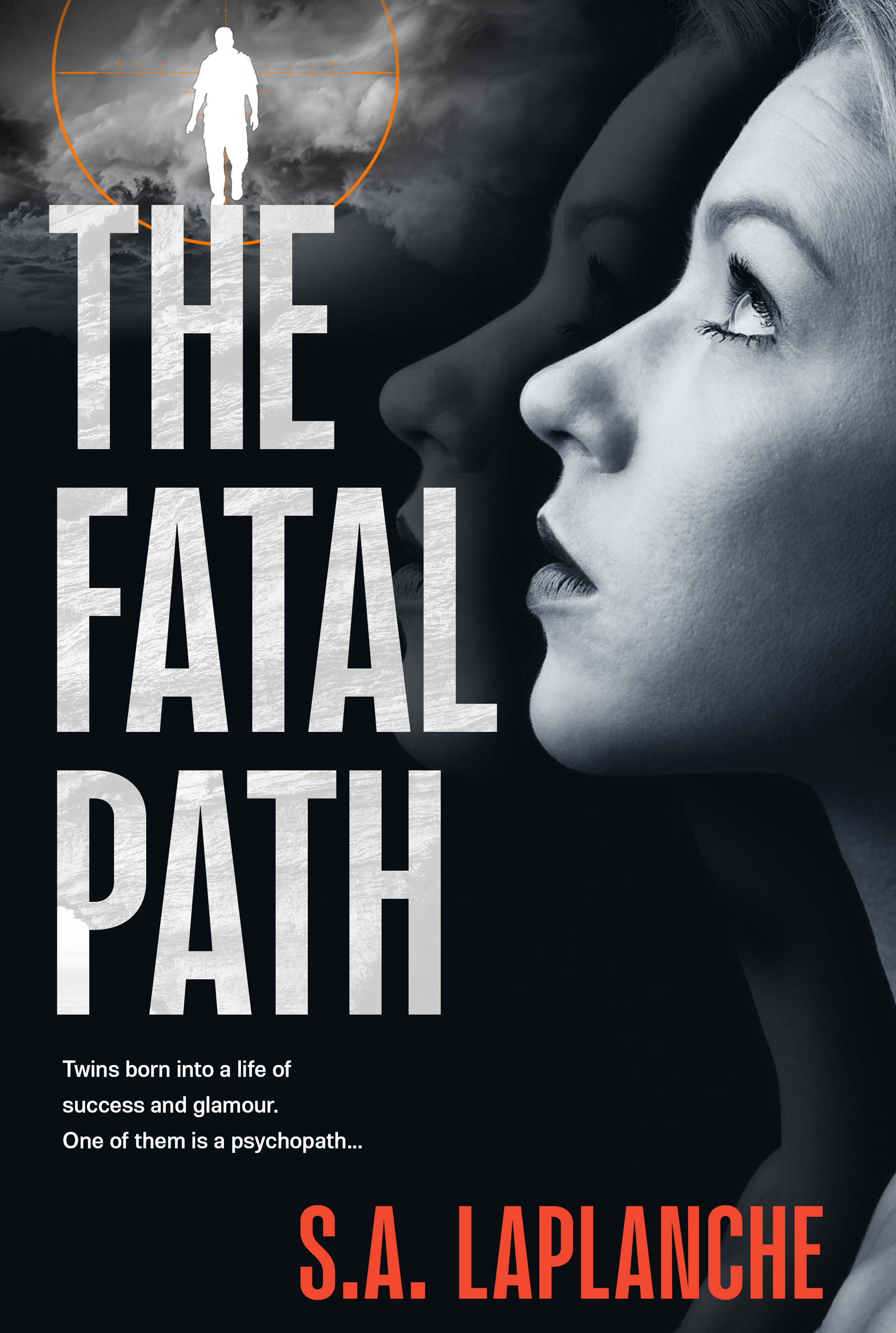
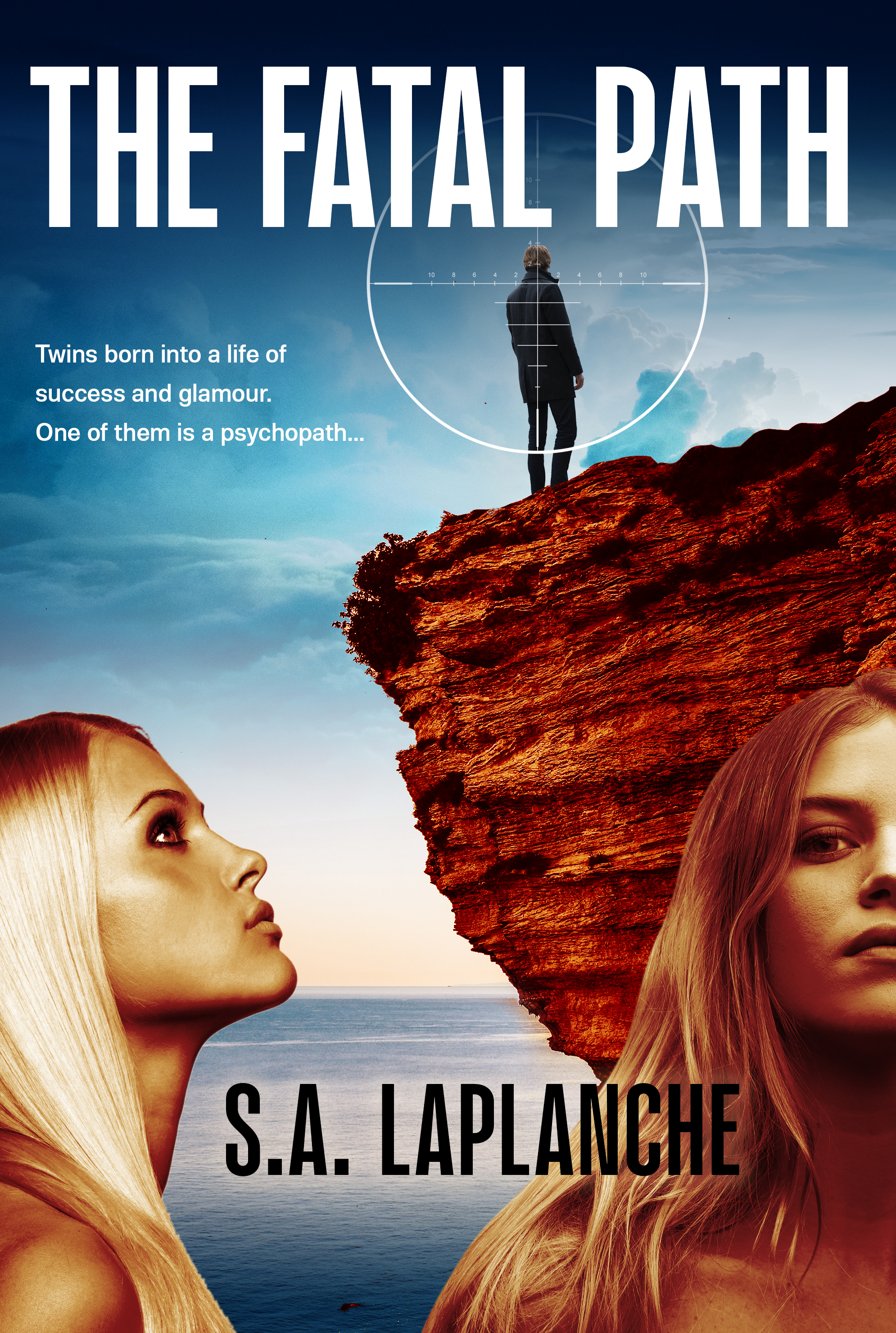
Thrillers are an enjoyable design challenge — very bold use of highly condensed type, high contrast, extreme emotions and a certain cinematic touch. The Fatal Path is no exception to this general pattern. Here are three alternate versions of the same cover.

Wanissa Somsuphangsri is an extremely talented calligrapher and illustrator based in Melbourne. If you need some highly individualised and polished work, she might be the person for you. We’re currently putting together a cover for an author client who engaged Wanissa and the results are amazing — will post the full cover in due course. Wanissa is also a member of the Letterettes.

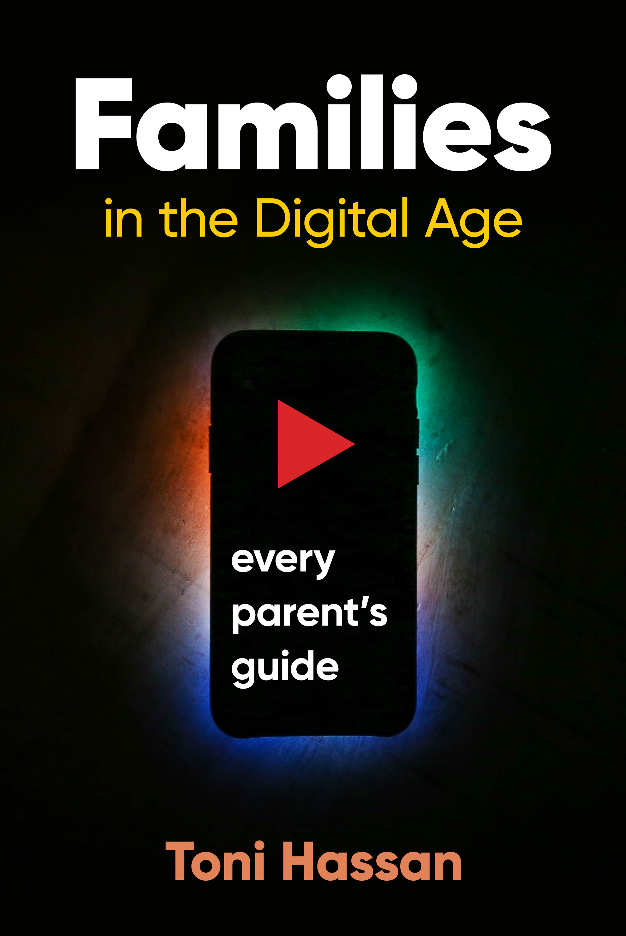
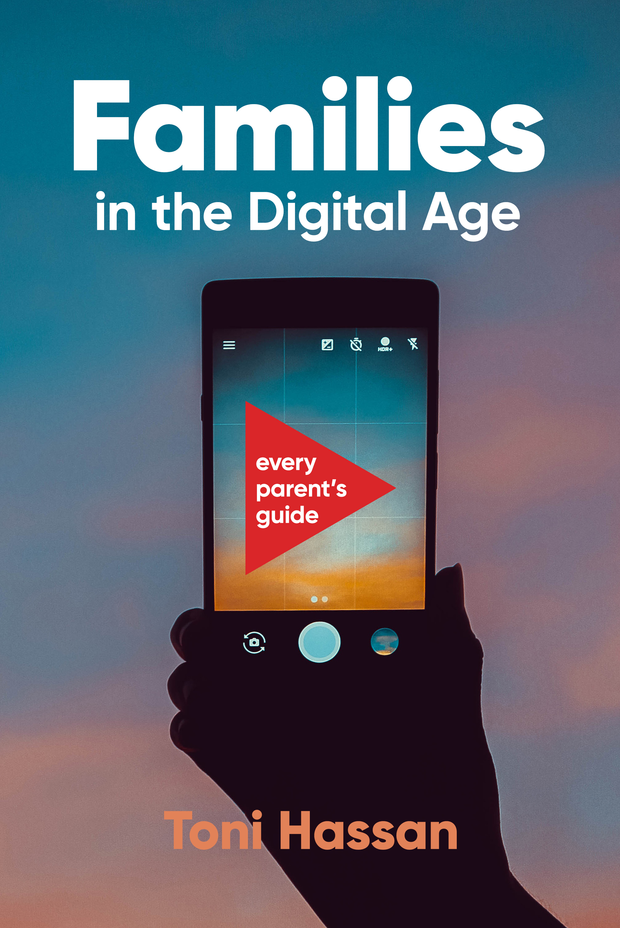
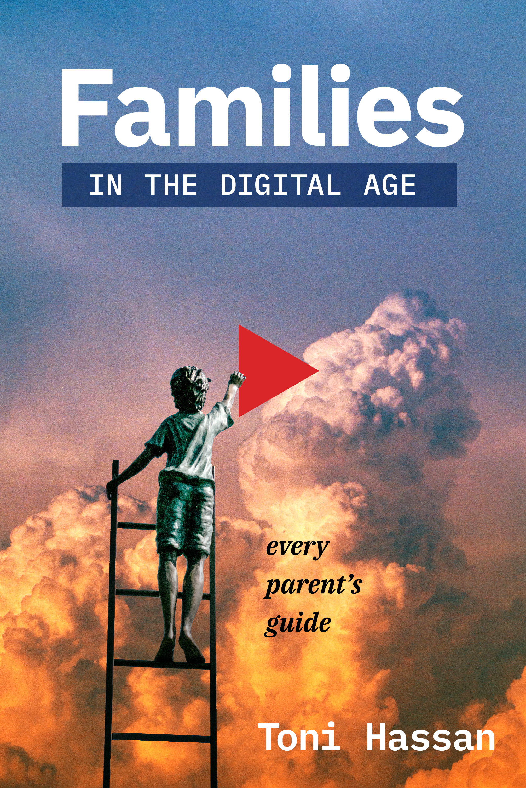
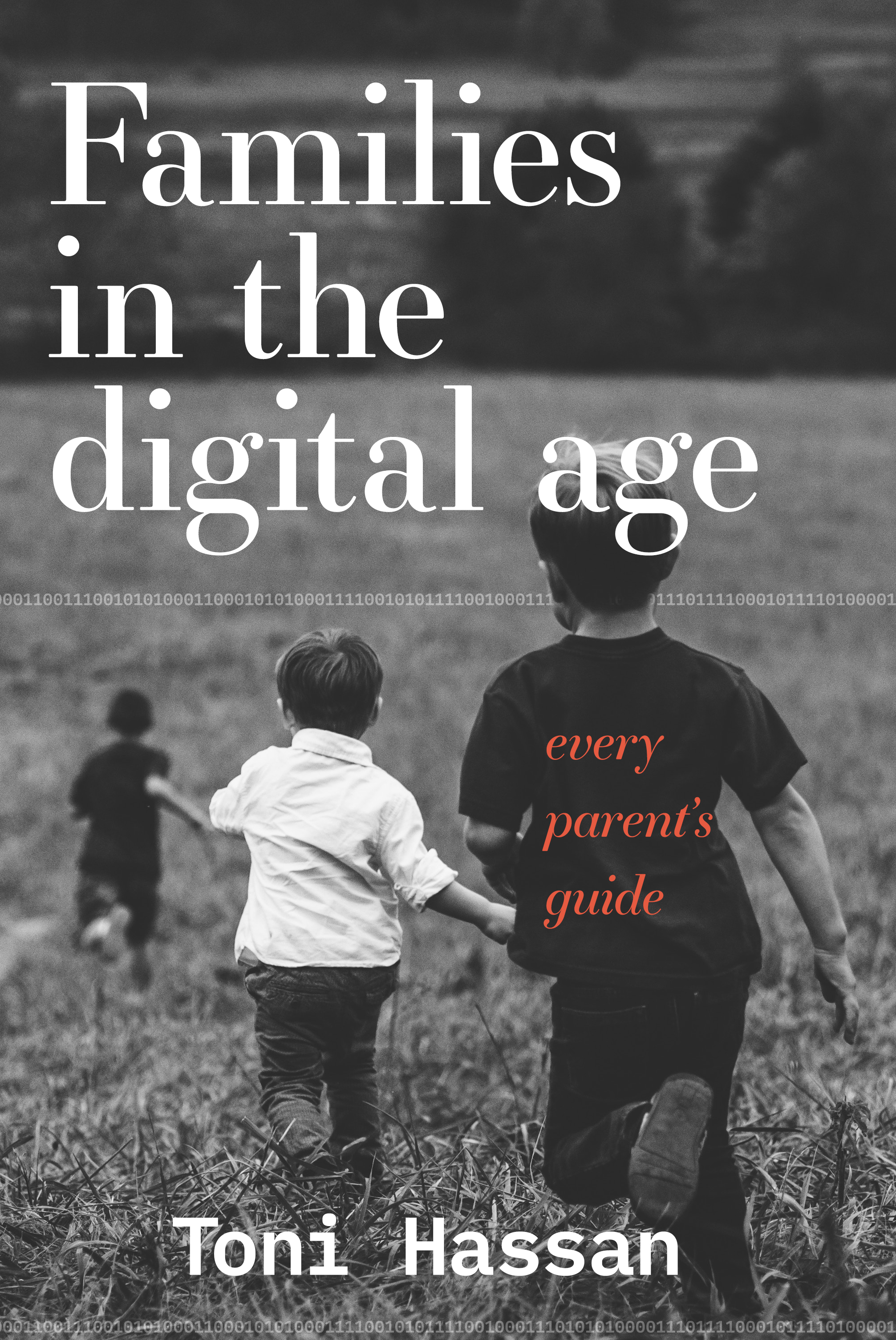
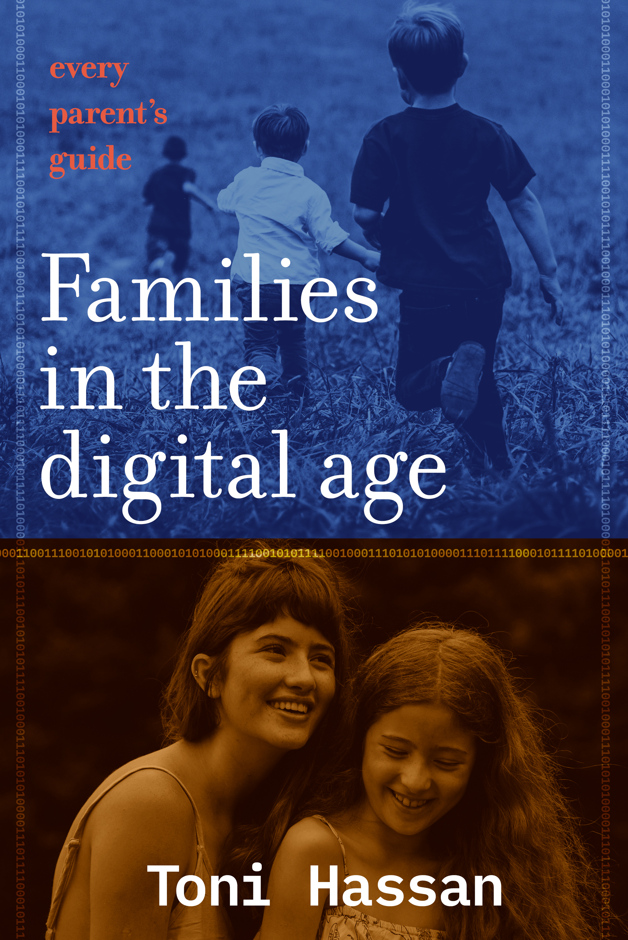
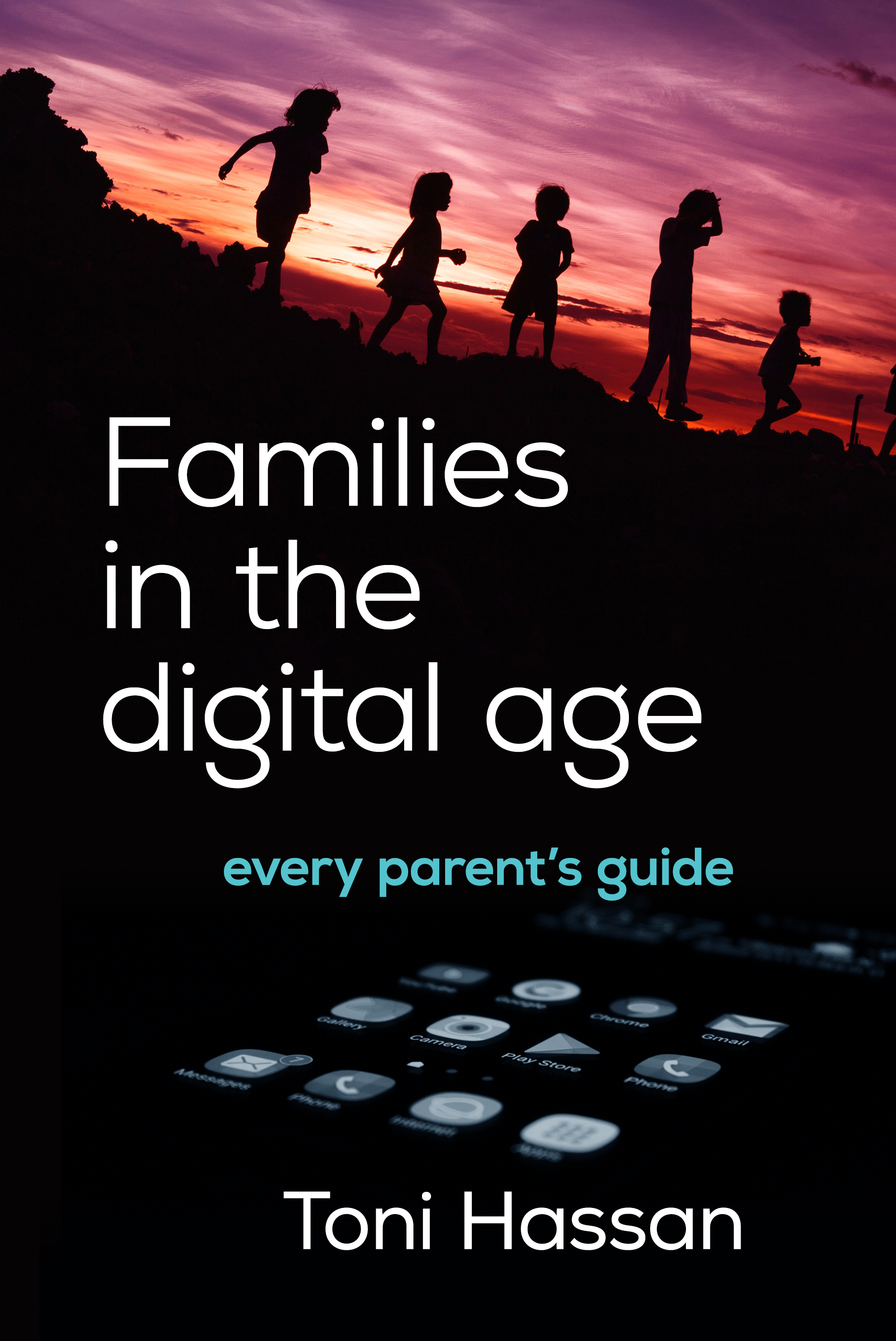

A few versions on the theme of ‘digital parenting’ — a thoughtful attempt to promote a rational balance between time on and off screen in a family context, and summarise the latest research on the topic. Published by Hybrid Publishers.

Troy Simpson’s Funny Dictionary (National Library of Australia publishing) catalogues numerous amusing mis-definitions perpetrated by students. One of his fans painted the illustration above — Troy holding the book cover (WorkingType Design).
“METAPHOR n. 1. a thing you shout through.
2. a kind of signalling used chiefly for long distances.”
See here for an account of the amusing speech given at the launch of Troy’s book.

James Pratt has written a cracking thriller novel set in the near future. A resurgent Russia invades an unprotected Europe, with only a small group of special services veterans standing in their way. If they are able to bring an extraordinary secret weapon to bear, they may be able to save Western civilisation. Our cover incorporates some of the elements of the story and uses dramatic colours and high contrast to attract reader attention. Typefaces used include National and Franchise. Published by Silverbird Publishing.
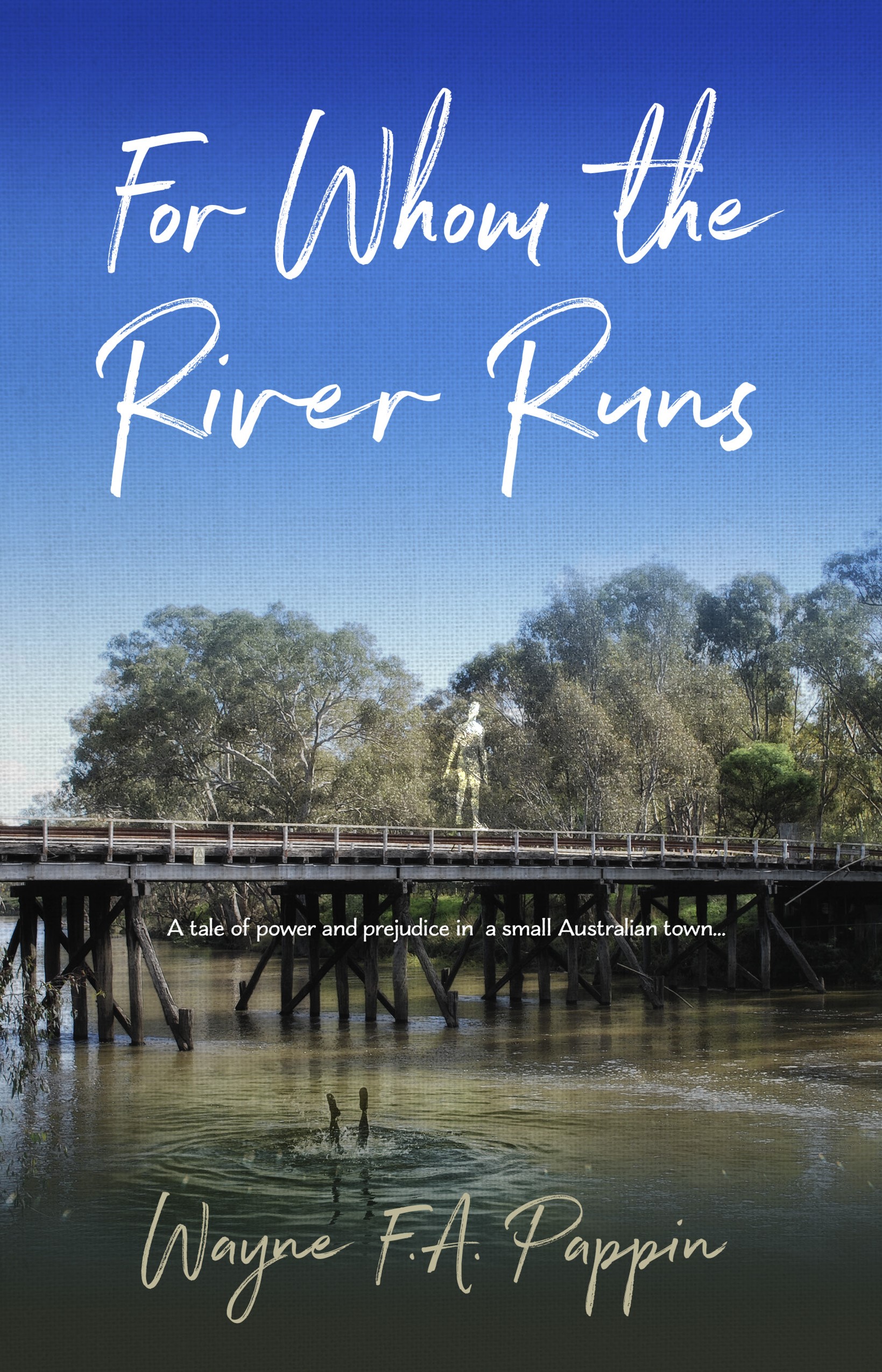
Wayne Pappin has written a heartfelt tale about a small Australian town, focusing on two young men and their travails. He wanted an image of the bridge that features at the heart of the story, which we combined with the two swimmers. The title typeface is Northwell and the subtitle Charcuterie Flared.

Janet Doyle’s fascinating book was launched at The Book Wolf, a charming bookshop in Maldon which also hosts discussion groups and music events. Guests enjoyed readings from the book, performed by John Curtis, Mike Smythe, and Janet herself. Musician John Curtis performed two pieces of music written especially to evoke the mystical town of Ldjakhion in which the novel is set. The audience asked many questions of Janet, and were particularly interested in aspects of the background research and the choice of names for the various characters. Signed copies of the book were sold on the night. We will post a sales link to the book shortly.

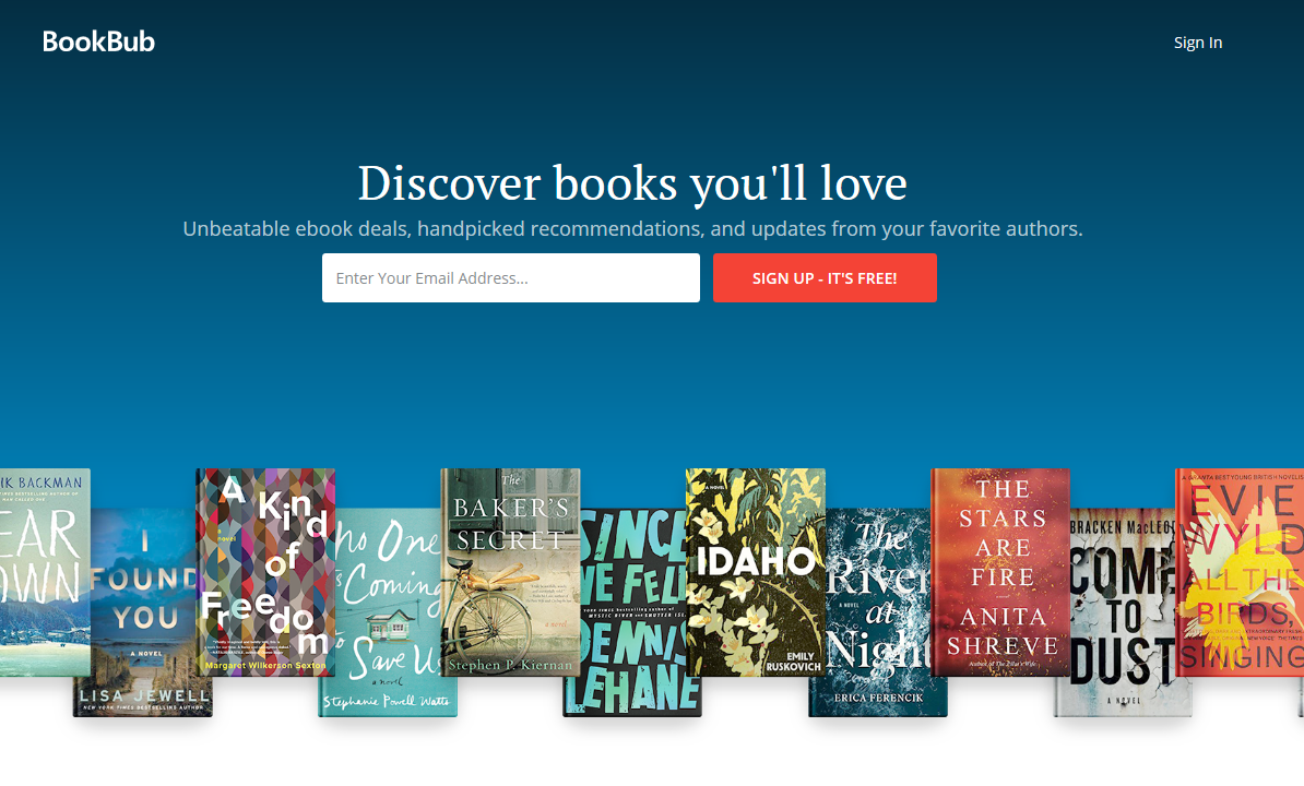
Many authors have never heard of Bookbub. The service is essentially a regular email offering selected discounted ebooks to a massive subscriber list. Most of the titles promoted therein are from major publishers, but a significant fraction are from independent authors and small publishers. Publishers and authors pay over $600 per title just to be considered for inclusion in their featured deals. They are extremely powerful in the world of ebook sales and massively profitable.
Peter Ralph has done a stellar job analysing the performance of bookbub and advising authors how to get one of the sought after featured deals. Other bloggers have useful posts about setting up effective ads for Bookbub, Others point out that while the sales spike created by bookbub is real and substantial, it can be rather short lived. This author suggests that the real benefit of being featured on bookbub is exposing the rest of your published work to a new audience.
In a world where bookstores, though gamely hanging on, represent a decreasing fraction of overall print sales (not to mention ebooks and audibooks), authors have to come to terms with the necessary techniques for online sales success, and letting the market know they even exist.
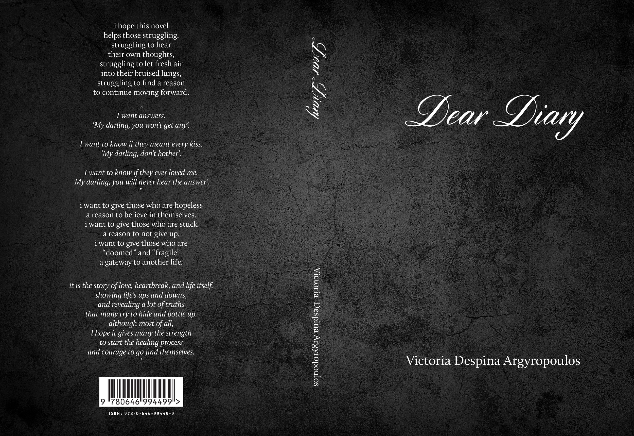
Victoria Argyropoulos composed a book of poetry (Dear Diary) exploring the nuances of a relationship. She wanted a fairly stark cover with a subtle texture. The book was interspersed with her own photographs and many solid panels. She was very pleased with the print job:
“Yesterday I received the proof of my novel and it looks incredible. I was honestly left speechless.”
We highly recommend the print management services of Tenderprint Australia. More news later re. the availability of this interesting volume.


Have registered with Reedsy, a service designed to ”connect and collaborate with a worldwide network of authors. “ Reedsy allows designers to apply to become service providers. As all the designers and other service providers have been carefully vetted, the theory is that users will receive professional quality assistance with their book, in contrast to mediocre crowdsourced design interfaces such as Fiver.
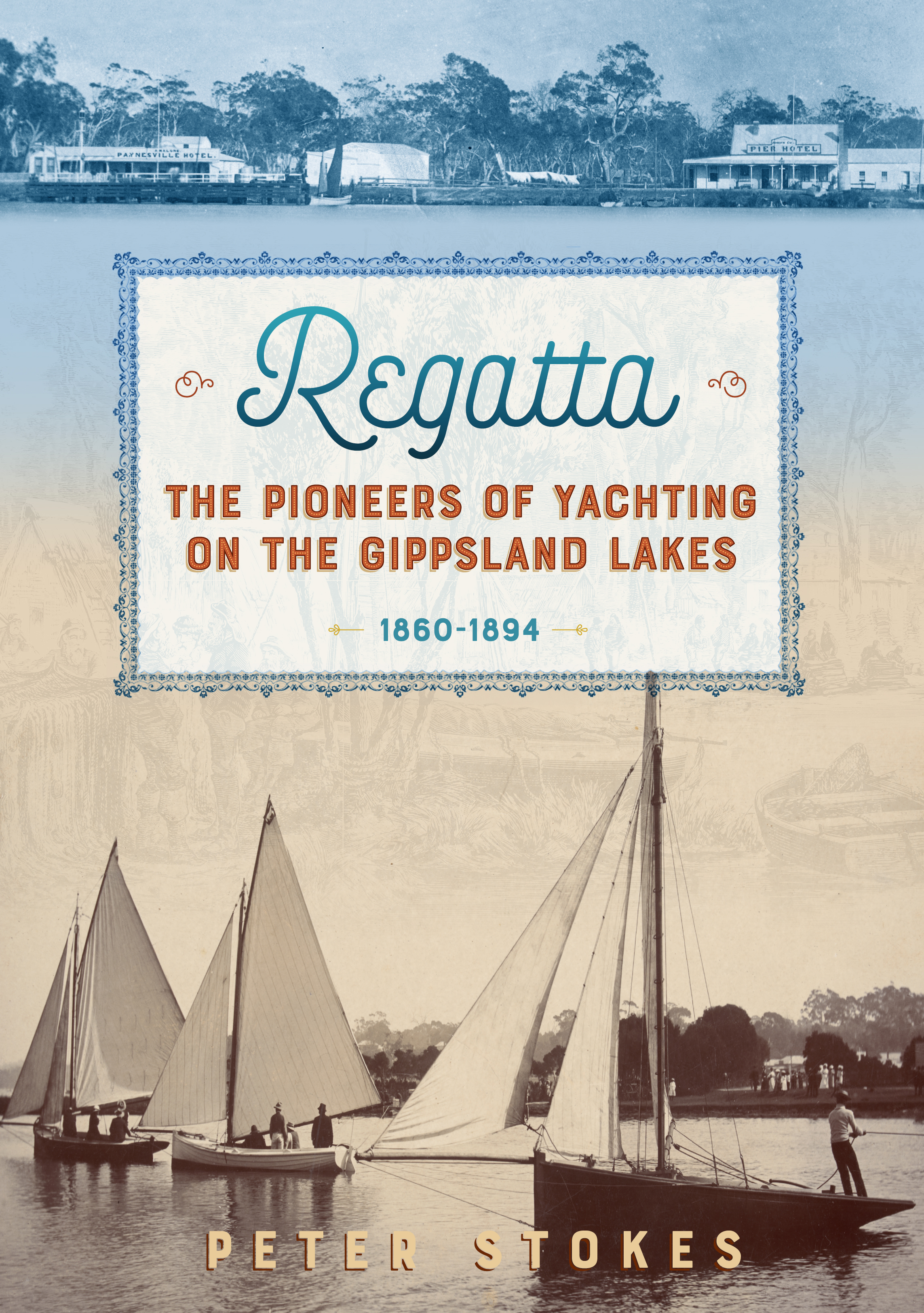
Peter Stokes has researched and written a very entertaining account of early colonial life on and around the Gippsland Lakes. He brings to life many interesting personalities and the yachting regattas held during the 19th century. The regattas were a major focus of social life in the region for many years, reflecting the importance of fishing and shipping before railways and cars came along. We received the following update from Peter recently:
“REGATTA has been quite well received in the small market of East Gippsland. I have sold/distributed quite a number of the 100 I had printed, and have only a few left; although there are quite a few on shelves around the place. Had great feedback regarding how well it looks as a book (thanks) and the stories. I will need to print some more.”
Regatta is available here.
In his youth James O’Brien was a republican firebrand, campaigning against the British presence in Northern Ireland and sympathetic with the aims, if not always the methods, of the IRA. Time and experience mellowed his views and he left Ireland for a prosperous life in Australia. We designed the cover for his memoir some years ago, and recently adjusted the layout for an audio book version he created in conjunction with Findaway Voices.

A book we designed last year has come to the attention of a popular cricket site. In addition to saying many positive things about the content, the writer also touches upon the design:
“Joe Darling, lived a full life, not just in a cricketing sense, and his story is a fascinating one. Thankfully it is told thoroughly and entertainingly by Whimpress and Ryan. Add to this some great production values and this is a great read. It should be in the book collection of all cricket fans. ”

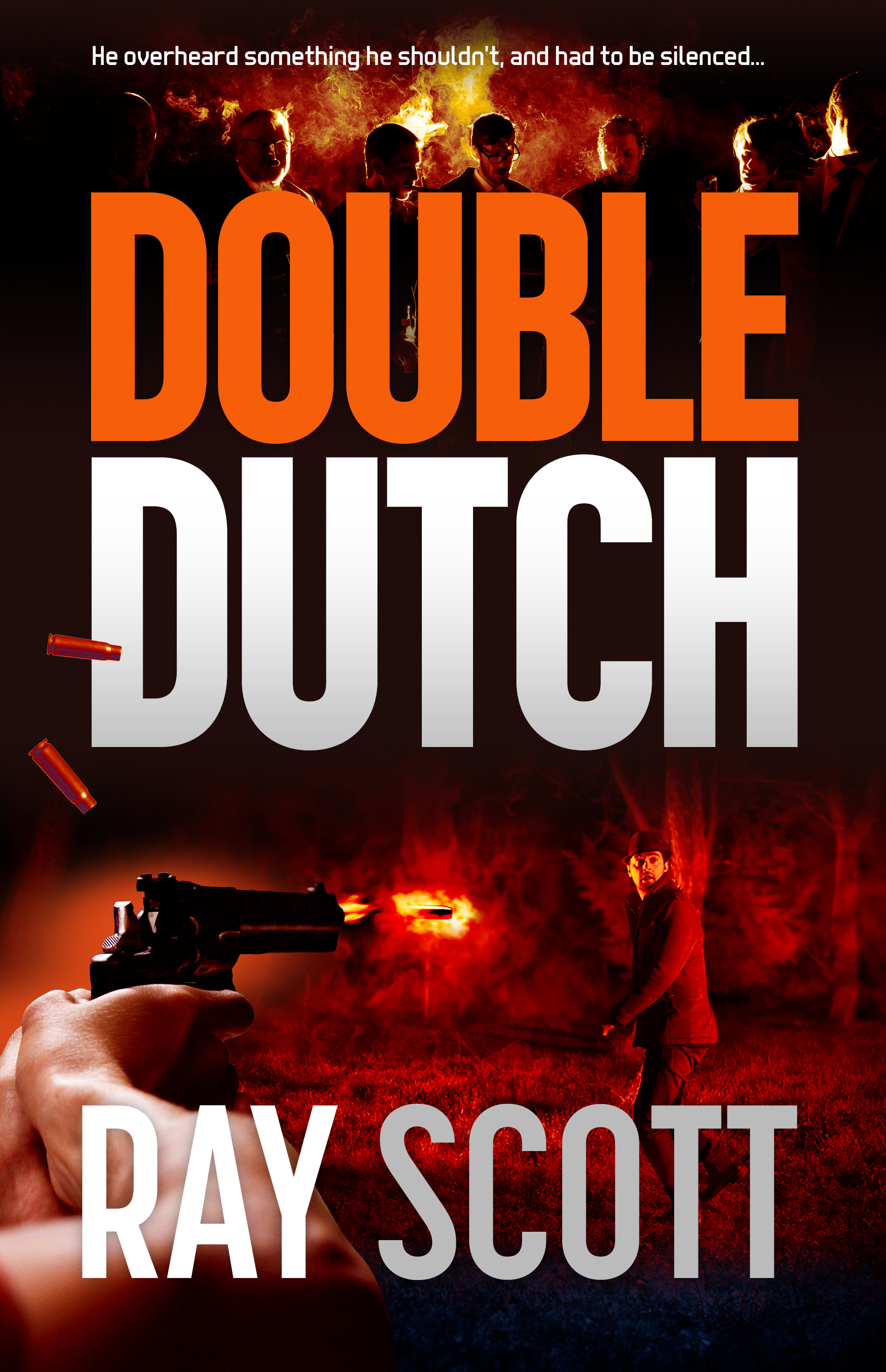
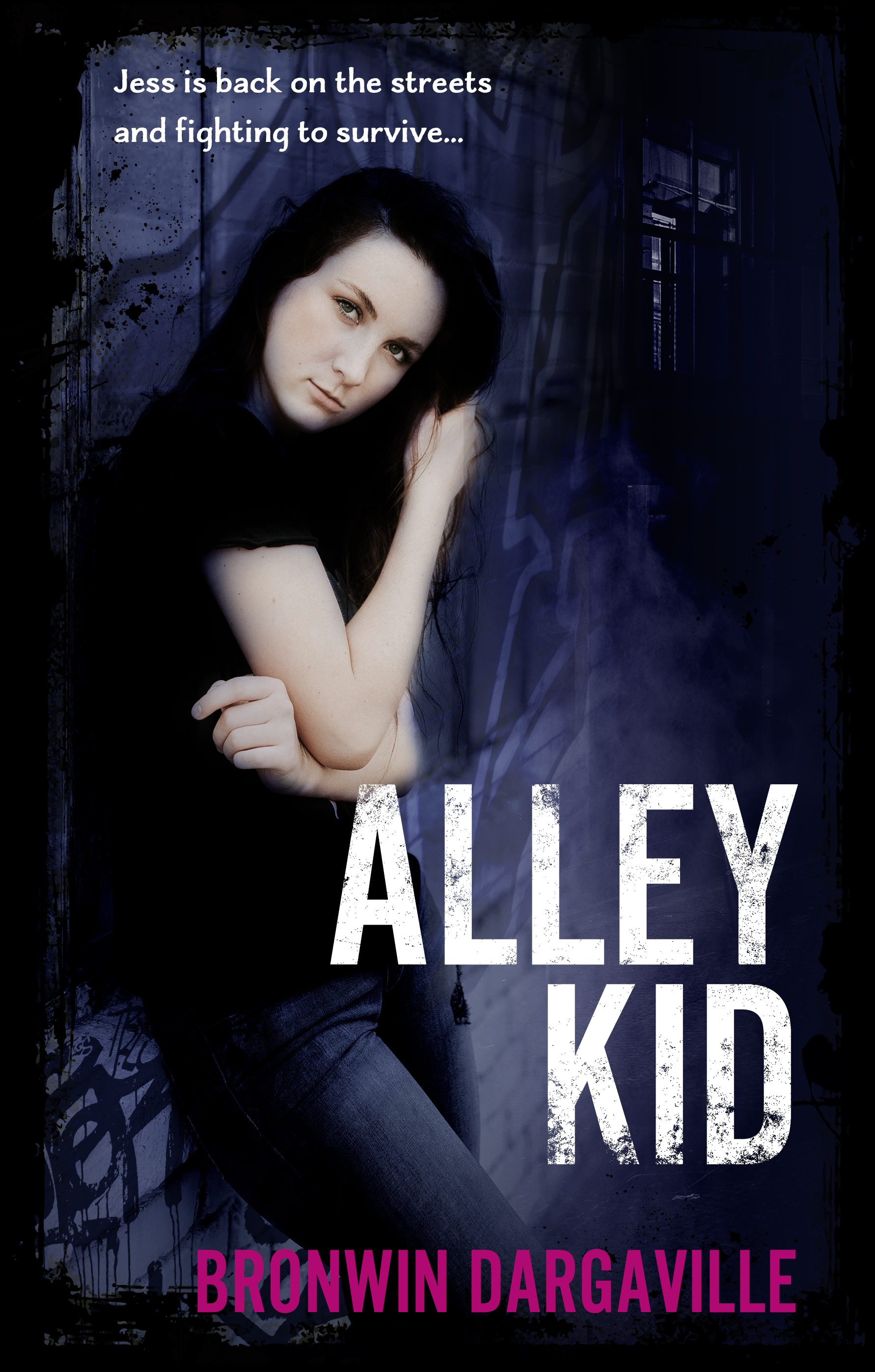
Three recent draft covers: a hard-driving thriller, a detailed family history and a gritty young adult story. Plenty of contrast and big bold typefaces. Typefaces include Korolev, Sentinel, Alternative Gothic.


Trevor Hay has spent his professional life studying Chinese culture and history, and brings this knowledge and sensitivity to bear in his novels, which very often relate to the Western experience of China. We combined a number of images around a famous artwork — that of the Fragrant Concubine, a semi-mythical eighteenth century figure. We used Kepler for the title typeface.
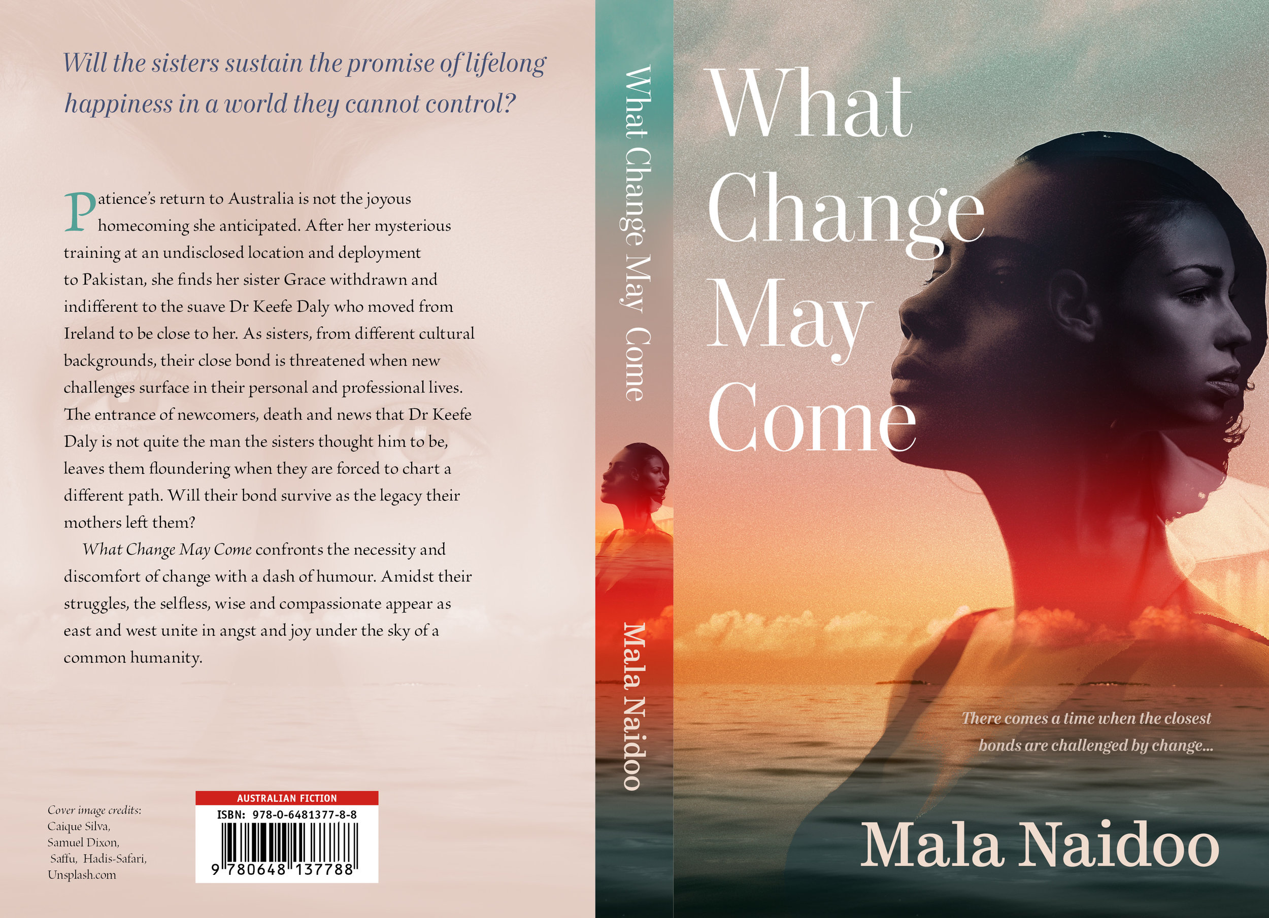
Mala Naidoo depicts complicated human relationships in her novels, her authorial eye remaining consistently wise and warm. We wanted to convey the depth and subtlety of her protagonists, opting for a dramatic sky with layered faces and a large, classical serif typeface (Mort Modern).