

Authors and cost-conscious designers often find themselves searching for low-cost or free imagery for covers and illustrations. This site explains in detail the copyright and usage issues associated with the employment of such imagery. It also maintains an extensive and extremely useful list of free image sites.
Book Launch in the Sunshine
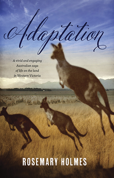
Rosemary Holmes, author of Adaptation, an engaging multi-generational epic about life on the land in western Victoria, reports on a successful launch for her book:
It was a great day on Wednesday, the sun shone and morning tea was outside in the courtyard and Michael Ronaldson (former Federal minister) spoke beautifully. After the launch there was a morning tea of scones, tea/coffee, served outside on the lawn. The next book launch is to be the 29th November here in Ballarat, at the Midlands Golf Club and the literary person from the Ballarat Courier is to make a speech. There are about 30 people coming to this event. Collins Bookstore here in Ballarat will be taking responsibility for selling the books and they are to promote it in their windows and around the store. Hopefully the local paper will write something about it.
I will be glad when the launches are over but it is all very exciting. My publisher has also suggested thatI submit the novel to the Foundation for Australian Literacy awards at James Cook University.
Noto — A Typeface for Every Language

Google has an endearing penchant for quixotic projects. Noto is that, but also a noble effort to construct a completely inclusive set of typefaces — covering all of the world's major scripts but also most of the minor ones. The name is derived from 'no tofu' — the little white squares that pop up when one attempts to type a character outside the character set of the font in question. The font itself is fairly vanilla, but highly readable and comes in four sans and four serif weights, and is free from Google.
Your Name Here — The Zen of a Blank Product

Department of There's an Internet Business for Everything: Yellow Images sells blank products ready for you to superimpose your own brand/product. There's something so soothing about a plain object not covered in all of the cruft designers are paid to create.
How to Design Children's Non Fiction
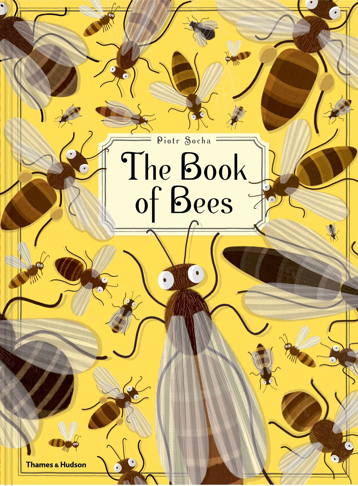
To get an idea of the quality of illustration in modern children's books, check out these two non-fiction titles: Tiny, by Nicola Davies and The Book of Bees by Piotr Socha. Both tackle big, complex topics and do so with humour, sophistication and amazing graphic impact. There has been an explosion of beautiful large format children's books in recent years, perhaps driven in part by parents keen to provide their children with an alternative to small glowing screens.
Typography and Elephants
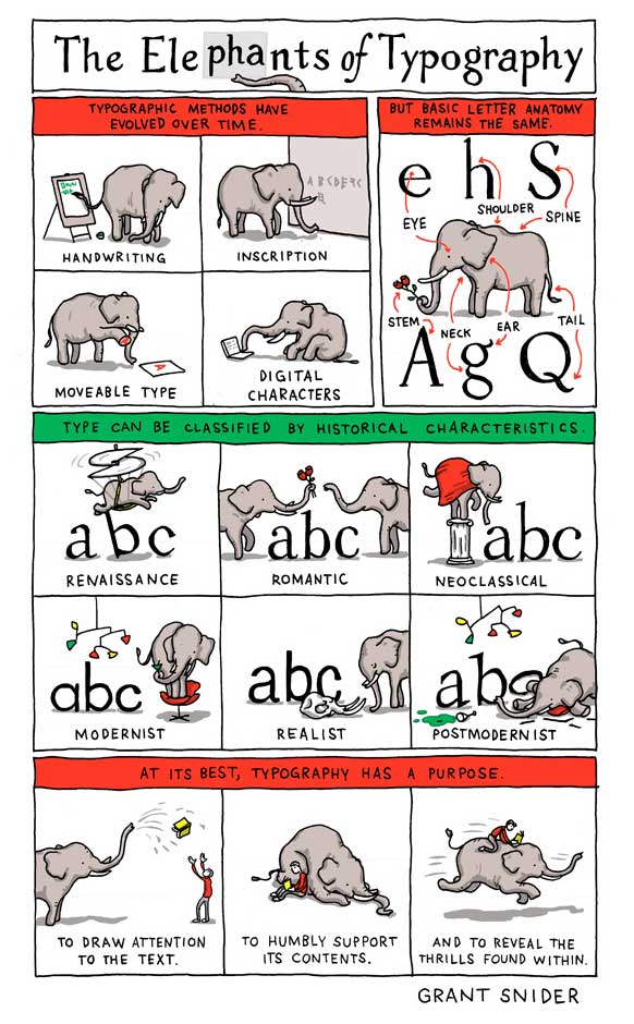
A charming look at the architecture of typefaces, and a useful mnemonic for remembering the terms used for their constituent parts. Posters available from the author's website.
The Silver is Mine — WorkingType Cover
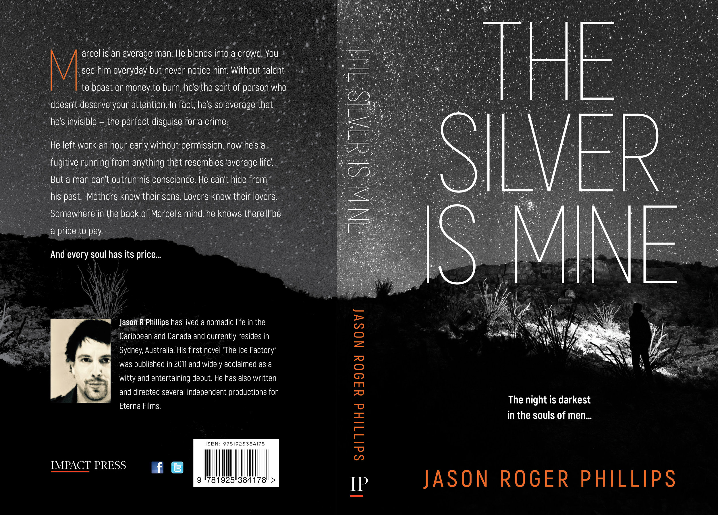
The Silver is Mine is an edgy psychological thriller published by Impact Press. Our client wanted a stark and high-contrast design. We used Akrobat Sans for the title type and a monochromatic starscape with enigmatic figure. The author's name provided the only splash of colour.
200 Gigabyte Wireless Data Plan
For those of us who with a very poor quality ADSL connection and NBN still years in the future, mobile data has seemed like a tempting alternative. Price has been the sole limiting factor -- running to $10 per gigabyte. A recent package released by Optus represents a dramatic improvement in affordability. Home users in approved areas can now sign up for a $80 per month plan that gives users 200Gb of data. If this trend continues, landlines might be a thing of the past, even for power users. And NBN will find itself up against competitors with much lower infrastructure costs.
The Rise and Rise of Indie Authors
The Author Earnings website has worked hard at 'scraping' data from Amazon's various sites to provide unprecedented detail on sales data. As Amazon now represents close to a majority of print titles sold, knowing what is being sold and by whom is very interesting indeed. The data shows that independent authors represent a large and rapidly growing fraction of book sales on Amazon. There is also ample evidence that having a book listed on the Amazon bestseller lists provides a substantial boost to non-listed titles from the same author. Overall, Author Earnings claim that they identified over 9,000 authors earning more than USD $10,000 per year, and half of that number were earning over USD $20,000 per year. Read the whole report, which goes into much greater detail.

Property Finance Made Simple in the Kindle Bestseller List

Andrew Crossley's just-uploaded "Property Finance Made Simple" has immediately debuted on the Kindle bestseller list. Our cover design focused on a strong, straightforward combination of text and iconic image, that would reproduce well as a thumbnail and at larger sizes.
A Man of the Land — Book Cover

Bob Gillespie has taken five decades of farming experience as the basis of this saga of life on the land. He wanted the cover to show some of the character of the land in the southern Riverina, combined with images of the protagonists. Typefaces used: Amberly and Didot.
Faraway Places — Book Cover

In "Faraway Places", Albert Trajtsman writes about strange places and abominable acts. One of the tales dealt with an outpost the wilds of Tsarist Russia, and led us to use the photograph of Siberian windmills in the background, paired with monstrous images from medieval documents.
Famous People Who Have Met Me — Cover Design

Greg Noakes has made a career of photographing musicians and showbiz figures, and "Famous People Who Have Met Me" is the result of a trawl through his extensive photo library, coupled with wry explanatory captions. From Linda Ronstadt to Grace Jones, and Iggy Pop to Cold Chisel, readers will enjoy encountering the famous and infamous of decades past. The cover features Grace Jones and a suitably lurid combination of typefaces. To be released soon, via the Arcadia Imprint of Australian Scholarly Press.
Miles and Miles of Type
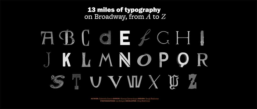
It would be difficult to top this website for lovers of street typography — a survey of 13 miles of one of the world's best known avenues. A great showcase of the glorious variety of public taste when it comes to type.
Integrating Work and Life — Book Cover
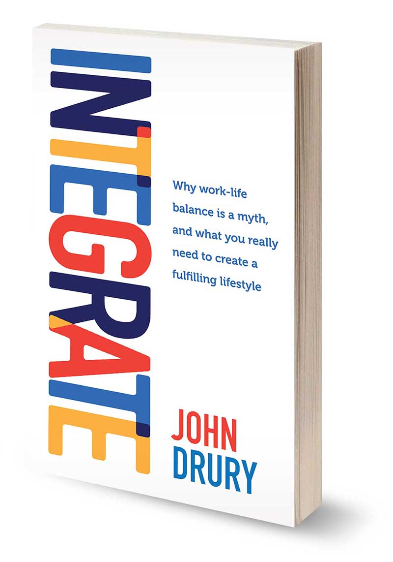
John Drury wanted a bold, simple design that reflected his theme of integrating life and work, and we represented that via overlapping letters, the colours for which were drawn from his web presence. The whole project was turned around in only a few days, including the print run.
Why Type Selection Matters (or How Not to Give People a Reason to Stop Reading)
Matthew Butterick at Practical Typography makes a great argument for considered type selection and use. A great line from the essay:
“The substance matters, but if that’s all that mattered, then everything could be set in 12-point Times New Roman. And that would be the equivalent of mumbling toward your shoes.”
Using Type Effectively on the Web

Type guidance for web neophytes.
Read moreAuthor Appearance on ABC Radio National

Ricc Carr talks about her career and teaching methods. Cover by WorkingType Studio.
Read moreHow to Help People Using Outmoded Browsers...

This nifty little Google-run service identifies the version of browser you are using and provides easy links for installing alternative browsers. Besides promoting Chrome, the site is designed to nudge people to towards installing modern browsers and to gradually chip away at the huge legacy population of people still using ancient versions of Internet Explorer.
Recent Book Cover Design from WorkingType

Recent cover designs from WorkingType Studio.
Read more