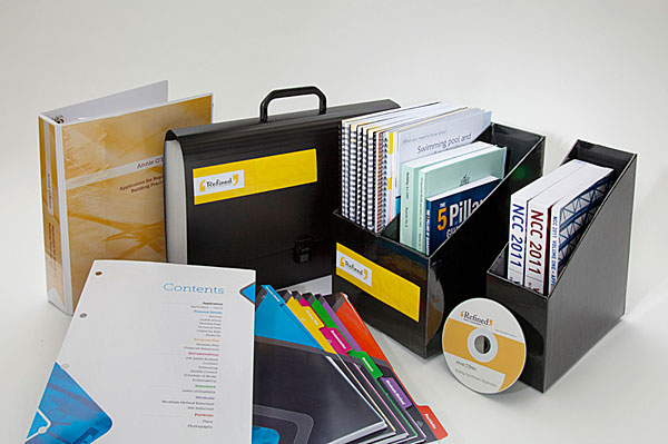
 Our client provides an integrated service to people in the building trade. She wanted her documents to look attractive, but not overdesigned. Her clientele are mostly male and are looking for practical, no-nonsense assistance. Our solution involved generous amounts of white space, strong colours, clear imagery and bold, spare typography.
PO Box 72
Eltham
+61 412 622 138
design + layout + print solutions + ebooks
