 A simple idea, well executed: the Noun Project is a catalogue of symbols covering everything from the mundane to the sublime. They are available free of charge, and the web interface is as simple, clean and monochrome as the symbols themselves.
Lost Worlds of Graphic Design
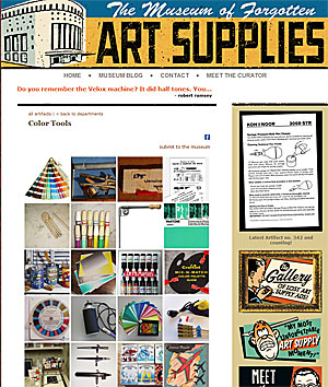
 Personal computers and the Internet have opened up new worlds for millions of people, but they have also remade or destroyed dozens of professions and made hundreds of specialist skills obsolete. The Museum of Forgotten Art Supplies chronicles the items used by professionals in the graphic design and advertising industries. They seem very distant and quaint, but once they were essential tools for serious professionals, and the making of them was an entire industry in itself.
The Information
 Our client provides an integrated service to people in the building trade. She wanted her documents to look attractive, but not overdesigned. Her clientele are mostly male and are looking for practical, no-nonsense assistance. Our solution involved generous amounts of white space, strong colours, clear imagery and bold, spare typography.
Diamonds are Forever
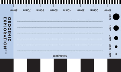
 Our client prospected for diamonds, and even diamond-hunters need a business card. Aside from the usual contact details, he was keen to give the reverse side of his card additional utility as a way of measuring objects and providing scale in photographs. He also intended to use it for jotting notes to include with samples. After ten years of use, he returned for an update and reported that the card/ruler had been very handy.
D is for Dragon
 Dragonfall Press is bravely dipping a toe into the turbulent waters of modern publishing, showcasing fantasy and science fiction by Australian authors. We were commissioned to craft a logo suitable for use on book spines and readable at quite small sizes. With the famous Slovenian dragon bridge as source material, we melded a wing, a head and an elegant 'D' (Filosofia Grand by Zuzana Licko) to create a logo that will hopefully help give Dragonfall a distinctive brand.
Pictograms go to the Movies
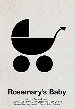
 Remember those endearingly plain pictograms that first gained popularity in the 1970s? Designed to transcend text and communicate simple concepts/commands, pictographs are still a staple of the sign world. Victor Hertz has employed the pictographic vocabulary to amusing effect, creating pictographic posters for a raft of movie classics. Beside the whimsy, it is a very interesting design exercise to be forced to boil a complex idea down to simple iconic image.
