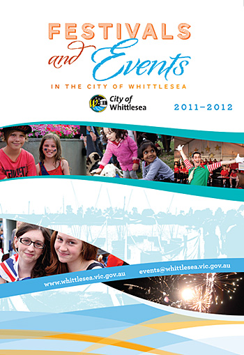
 For this draft of a local Festivals program we needed to adhere to a certain corporate colour palette and also make reference to a corporate 'swirl' (see the base of the image). We took elements of the swirl and employed them throughout the A3 double-sided brochure, and set some type to follow the curving lines and thus add visual interest. The typeface used is the elegant HF&J Archer, mentioned before on this blog.
A Muse yourself
Adobe has long striven to cater to code-phobic designers, via GoLive and later Macromedia acquisition Dreamweaver. Their latest offering (Muse) is the most intutive yet and aimed squarely at print designers with minimal web authoring skills. Muse looks and feels a touch like InDesign and offers similar object-oriented functionality. The program is currently in beta and is available as a free download until early next year.
Muse has its detractors in the web design community. Coders concur that the code it automatically produces is ugly and full of redundancy. They dislike the way Muse renders non-standard typefaces, the lack of dynamic page resizing, and argue that print designers should learn their web skills the way they did — via hard work and experimentation.
Big Bold Billboards
 Billboards are an important way for local government to keep ratepayers up-to-date with coming events. When people are driving past at 60kph, text needs to be big, bold and attention-grabbing, and boiled down to just the essential information.
Patterns and Colour
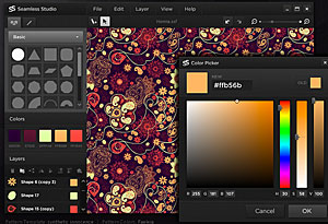 Fascination with combinations of repeating images/symbols and colour seems to span cultures and appear in every historical period. The Mayans, the Egyptians, the Persians and Victorian-era Britons were obsessed with pattern, whether applied to walls, monuments, clothes or jewellery. Those similarly afflicted in the 21st century can use programs like this. While they may not be designing a grand tomb, they could at least generate a nifty wallpaper for their mobile phone or PC...
Get on the Grid
If you can't quite figure out why one website just looks good and is a pleasure to read, and another similar one is hard on the eye, then the underlying structure (or lack thereof) may be to blame. Plenty of interesting material on the topic of web design grids here.
Crowdsourcing: an Exchange
The Internet has brought many benefits for designers (enhanced communications with clients, easy transfer of files, access to vast image libraries and type retailers, etc) but it has also brought some challenges. One of these is the phenomenon of Crowdsourcing. Certain websites offer clients the chance to post a brief, and receive many potential designs before paying a pittance for the selected artwork. Needless to say, the vast majority of crowdsourced designs are deriviative, poorly thought out and represent the lowest common denominator of graphic design. The exchange here goes right to the heart of this vexed issue and does a great job of explaining why using a real designer is always a better option.
Vale Louis Braille Audio
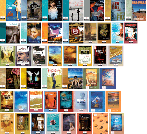
With little fanfare, another victim of convulsions in the book trade: audio book publisher Louis Braille Audio. A long term client, Louis Braille Audio published unabridged audio versions of some of the finest Australian fiction, non fiction and children's literature. Director Pauline Meaney had an uncanny knack of selecting books that later went on to feature on shortlists and win awards. Operating as a part of Vision Australia, Louis Braille did important work and will be sadly missed.
Note: All of the covers featured in the image below are Chameleon Print Design originals.
A Great Ocean Road
 Drivers have a hard time on the Great Ocean Road — torn between vistas of forest and sea and keeping their vehicles on the road. The Road runs from just south of Geelong, past Apollo Bay and Cape Otway, alongside the Twelve Apostles and on into the windswept cliffs and beaches of Western Victoria. Our client painted a panorama of the Road and its attractions, and wanted to sell it at information centres in the region. We scanned and stitched together the metre long artwork, adding circular images of attractions and trying not to obscure any important information.
Diamonds are Forever
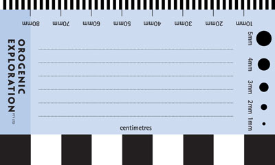 Our client prospected for diamonds, and even diamond-hunters need a business card. Aside from the usual contact details, he was keen to give the reverse side of his card additional utility as a way of measuring objects and providing scale in photographs. He also intended to use it for jotting notes to include with samples. After ten years of use, he returned for an update and reported that the card/ruler had been very handy.
Pictograms go to the Movies
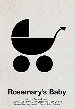 Remember those endearingly plain pictograms that first gained popularity in the 1970s? Designed to transcend text and communicate simple concepts/commands, pictographs are still a staple of the sign world. Victor Hertz has employed the pictographic vocabulary to amusing effect, creating pictographic posters for a raft of movie classics. Beside the whimsy, it is a very interesting design exercise to be forced to boil a complex idea down to simple iconic image.
Three colours from two colours — working with Pantone
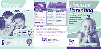 Working with two colours can be a challenge, but it is an interesting one. By combining the two chosen spot colours in a duotone, the designer can effectively generate a third colour. The third colour is tied to the other two and creates a harmonious overall effect. This job was designed to promote a lecture series staged by a local Library Corporation.
