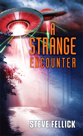
 Our client wanted to depict an encounter with alien spacecraft on a lonely forest road. We composited laser beams, UFO illustrations, severe weather and a night scene to come up with a suitably atmospheric solution.
A Tale of Modern Japan
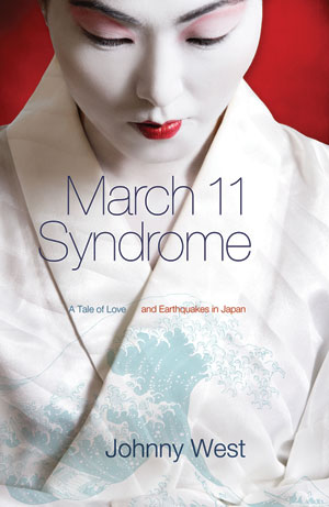 Our client's novel was set in tsunami-hit modern day Japan and he wanted to evoke both the modern and traditional aspects of Japanese culture. We used an ultra-light sans for the title typeface and a faint image from Hokusai's Views of Mt Fuji. The subtitle text plays with the earthquake theme, separated along a rift that is also a fold in clothing.
A Meta Books Search Engine
 If you order books online, it can be a pain comparing proces between the different booksellers. An Australian service, Booko takes pricing and ISBN data from all of the major outlets and collates them for you. Just type in your book title or author name, and you are underway. Booko takes a commission from bookstores if you purchase from an incoming link from their site.
Uncertain Beginnings
 An unusually well designed author website. Jim Bain showcases his book on early exploration of the coastline of Australia, and advances his theory of why the British ended up successfully claiming the continent ahead of their contemporaries.
Vale Louis Braille Audio
With little fanfare, another victim of convulsions in the book trade: audio book publisher Louis Braille Audio. A long term client, Louis Braille Audio published unabridged audio versions of some of the finest Australian fiction, non fiction and children's literature. Director Pauline Meaney had an uncanny knack of selecting books that later went on to feature on shortlists and win awards. Operating as a part of Vision Australia, Louis Braille did important work and will be sadly missed.
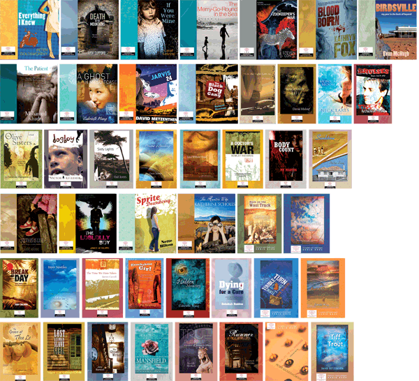
Note: All of the covers featured in the image below are Chameleon Print Design originals.
Georgie Girl (cover versions)
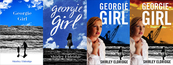 Sometimes a book cover evolves through several versions, keeping some elements and losing others. Clients can change their minds or come up with new ideas. Whilst sometimes time consuming, design iteration has the virtue of being unpredictable and therefore interesting.
Sacred Space
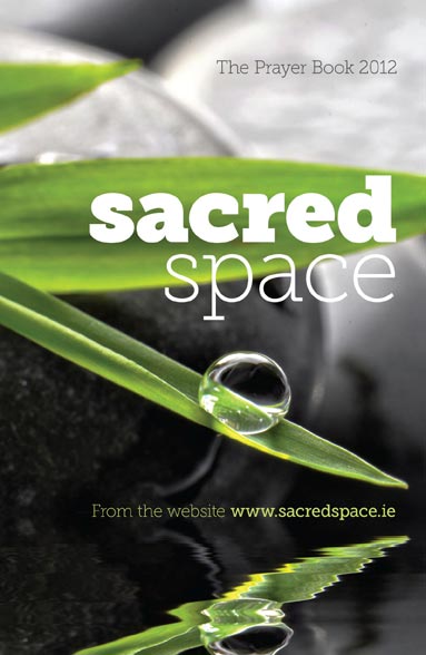 Our task was to convey the contemplative mindset of prayer without resorting to overt displays of religious symbolism. Sacred Space is a book of prayer published each year by the Irish Jesuits. After a long search through uninspiring imagery, we finally found a beautiful, tonally balanced photograph ready for the addition of type. We used Museo Slab at a variety of weights for both impact and delicacy.
Face Book
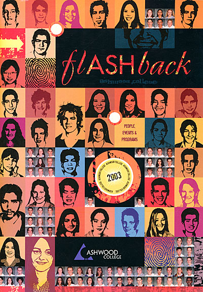 For departing Year Twelve students, their yearbook has sentimental significance — the last memento of thirteen long K-12 years of education. We tried for an unusual effect — the face of every single student in the entire school (the back cover had another few hundred faces), some converted into black and white and others still in colour. The layout took quite a while, but our clients were happy with the result.
The World's Best Pop-up Books
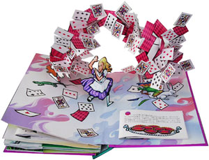 One area of print will linger longer than any other — children's books. More than any other books, texture, colour and real interactivity matter. And within children's books, pop-ups are the most resolutely three dimensional of all. Matthew Reinhart and Robert Sabuda are preeminent in this field. Together and individually, they have created some of the most amazing (and reasonably priced) books I have ever seen. They marry really high quality illustrations with bogglingly complex pop-ups. One can't even begin to figure out how each trick is achieved -- a man turning into a wolf, a Chinese dragon composed of intricately folded crépe paper, a massive T-Rex head with jaws that open, and so on. Although incredibly complex, their books are also quite durable. That said, it is probably a good idea to keep them out of the hands of smaller/destructive toddlers.
Book Trilogy
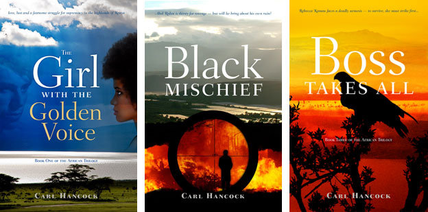 Our client had written three books that followed a largely linear narrative, and were strongly tied to a single location in Africa (the Rift Valley in Kenya). Our cover designs used that landscape as a reference, bringing in additional images specific to the particular volume in the trilogy. The title typeface is Fairfield and supplies a framework for all three covers.
A Brighter Future for the Book?
A prominent tech site has a thoughtful update on the ebook trade, and signs that it might be reaching some kind of maturity, or at least adolescence. On a closely related topic, another blogger points out that self published ebooks can be quite profitable, provided you already have a name/profile.
Book Promotional Tips in One Place
We have collated all of the promotional ideas received from authors and put them here. Please let us know if you have anything to add to the list.
Selling Your Books to Libraries
Besides being one of the most positive and useful institutions in Australia, public libraries are also major book purchasers (in this time of bookstore bloodbaths), so authors should pay attention to them. Jerry Bell, author of Lighting Up Australia had this to say:
I found that librarians rarely responded to the written word. It seems that those doing the ordering are young, and live on the email, so once I began to email the librarian responsible for the ordering at libraries all over Australia, I got very positive responses. It also helps to stress if a bit of Australian history is involved, as that is seen as desirable.
Vaudeville in Australia
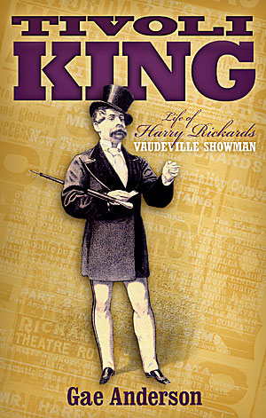 Harry Rickards was a nineteenth century show business entrepreneur and performer who made a risky move from Britain to Australia. His business doings were colourful to the point of criminality and he died a rich man. We wanted to convey something of the swagger of the man and the constant chatter of the material produced to promote his shows. We used typefaces appropriate to the time.
Tips from Self-Publishing Authors: Part 3
Steve Jovanoski, author of The Brotherhood:
Taking Care of Business
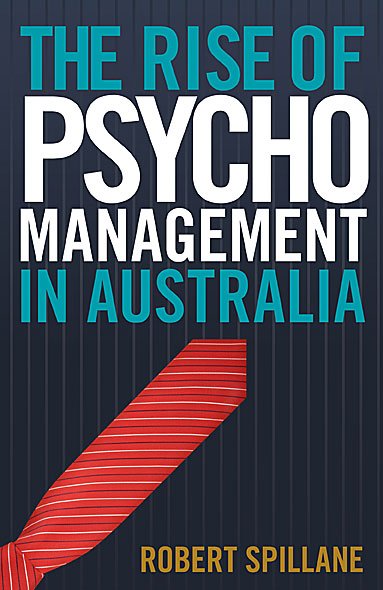
Our client wanted a bold, typography based cover. We used Trade Gothic, a pinstripe background and a tie standing in for a red arrow and achieve a high impact result.
Self-Publishing Author hints: Part 1
Self publishing or small press publishing does not have to be a royal road to obscurity and crates of unsold books. Active, savvy authors can drive healthy book sales. Here are a couple of tips from a multi-thousand selling Australian author:
Jacqueline Dinan, author of "A Woman's War", a work of fiction dealing with World War One, has focussed on giving talks about her book to interested groups. She says that:
- The book came about because I married a history buff and realised that other than watching ‘The Sullivans’, my knowledge of Australia’s war history, was very limited. So, we set out to write a book for women like me.
- Writing the book was the history lesson that I never received at either girls’ school that I attended.
- I present to groups – Rotary, Probus, View, U3A, Legacy, War Widows, Educational, Shrine, RACV Club (they are all keen for speakers)
- The power point presentation is about the research I did into Women on the Home Front & Men on The Western Front
In addition, Jacqueline was very active in soliciting reviews for her book prior to print publication. Reviewers included the Herald Sun, the Weekly Times and Dame Elisabeth Murdoch.
Stay tuned for further practical tips for authors.
Full Colour Cover
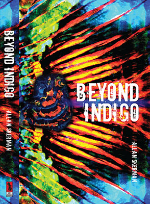
When "Beyond Indigo" was published twenty years ago, the author was unhappy with the book's cover, feeling it was conventional and stodgy. With a new publisher, he finally had the chance to remedy the errors of the past.
The book deals with an elderly opal miner and an extraordinary opal strike. We took full advantage of the dramatic colours of that gem. With a gem specimen overlaid against a close-up opal pattern, the composition might also be a wing, a sunset or a landscape — almost abstract, but concrete enough to tie the book to its subject matter.
Using Createspace
Along with ebooks, print-on-demand publishing is experiencing a period of rapid growth. The biggest publisher of POD in the english-speaking world is Createspace, a subsidiary of Amazon. Like all giants, Createspace is capable of both creation and destruction. It has helped make publishing easier and accessible. However, as both publisher and distributor, Amazon/Createspace has a worrying amount of control over dissemination of the printed word. As one blog commenter pointed out:
When an editor doesn’t like something you say, you find another editor or publisher. When one distributor doesn’t want to handle your book, you find another. And when one retail store refuses to place it on your shelves, other stores do and reap the profit. But Amazon plays all those roles and, even more important, it so dominates the market that some people think that if a book isn’t on Amazon, it isn’t in print.
Em and En Dashes
The typographically aware know that em dashes are preferable to hyphens in text, and en dashes are handy as range separators, but how to access them when emailing or posting to the web? Fortunately there is a handy shortcut. Instead of using -- or --- in lieu of the correct symbols, for em dashes paste — in the appropriate spot in your html editor or key in alt 0151 (on the numerical keyboard) in emails. En dashes are – for html or Alt 0150 for emails. Much more comprehensive discussions to be found here and here.
