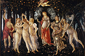
 Google turns its hyperactive eye to the world of fine arts: tours of some of the world's greatest art galleries using its Street View technology. Stroll along through rooms lined with icons of Western art, then zoom right in on the selected artwork. It's fantastic to see the artworks in such detail, even if the works featured represent only a tiny fraction of each participating institution's collection. And no matter the fidelity of the images, the artwork as artefact is still lost when it makes the transition from reality to pixel.
Vale Louis Braille Audio
With little fanfare, another victim of convulsions in the book trade: audio book publisher Louis Braille Audio. A long term client, Louis Braille Audio published unabridged audio versions of some of the finest Australian fiction, non fiction and children's literature. Director Pauline Meaney had an uncanny knack of selecting books that later went on to feature on shortlists and win awards. Operating as a part of Vision Australia, Louis Braille did important work and will be sadly missed.
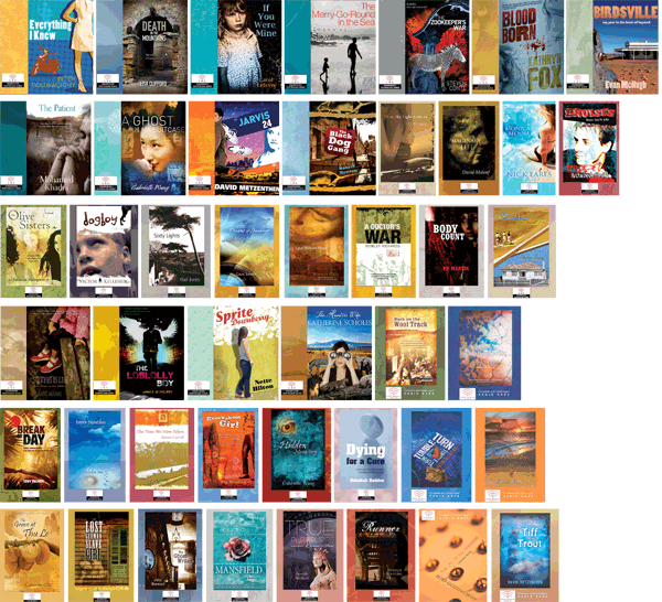
Note: All of the covers featured in the image below are Chameleon Print Design originals.
Deserting Facebook
If the recent successful launch of Google+ (with its simple privacy controls and intuitive interface) has you reviewing your allegiance to Facebook, then an escape route is available. A guide here leads you down the path to liberating all of your Facebook data. If only having a social profile did not mean having to leap into the arms of a major corporation...
Future Books and Dead Authors
Bibliophiles fear the impending death (or serious decline) of the printed book. We fear the often transitory and that the trivial nature of much web content and alleged reduction in attention spans will make long-form fiction and non-fiction less attractive. Even if we tentatively embrace the shift from paper to ebook, we sense perhaps that the very form itself is somehow obsolescent.
The Institute for the Future of the Book addresses these issues in a direct and engaging way, without the dispiriting jargon that accompanies much discussion on this topic. They pretty much skip over the current pallid ebook format and envisage a future embedded into the browser, with the book analogue of the future richly linked to the surrounding intellectual/cultural milieu.
Drive-by Fonts
 The last couple of years have seen a quiet revolution for web designers. Once limited to the small number of typefaces that 'everyone' had installed on their machines, designers have been completely liberated from that restriction by web-served typefaces. Now it no longer matters what the user has installed -- the website renders typefaces from a remote server. If you'd like to see what your website (or someone else's) would look like using the new web font services, try this neat little demonstration from type purveyor FontFont. Instead of bland patches of Arial or Verdana, imagine your site decked out with typefaces designed for the screen.
Apps versus the Web
Do you prefer a walled garden, or the wide open plains beyond? Apps on iPhone, iPad and Android devices have proven to be a massive success (by some metrics at least), so you'd think the argument was settled. Not according to Christopher Butler, who lists some pretty compelling reasons why the open, linkable web beats the fenced off, controlled app ecosystem.
Office finally comes to the Cloud
After conceding much ground to their competitors, especially Google with its cloud-based docs suite, Microsoft is finally coming to the party. It seems that the Office suite software will be available online later this year, which is about a thousand years in cloud development time. As is the new norm, a stripped down version will be available for free, and a fully featured priced model also offered. Whether that will be enough to staunch the bleeding of users to Open Office, Google Docs and other services such as Zoho remains to be seen.
The M(e)dium is the M(e)ssage
Ebooks are continuing their blitzgrieg assault on print publishing. Book publishing is starting to go through similar convulsions to the recording industry. Unlike the recording industry, piracy is not a massive issue (yet). But Ebooks are not just replacements for the printed book. They are something very different, and will become more different still. If the ebook does largely replace the printed version, designers, publishers and authors will have to make many adjustments. Ebook readers may expect a much more sophisticated and dynamic interface than a print book could ever supply. Their expectations of what constitutes a 'book' will rapidly alter. Content will shift to match these expectations. And unlike the printed book, which took essentially the same form for several hundred years, the ebook will be subject to continued and rapid development.
The View from Over Here
 A funny little riff on how the world looks different from where you live — a Bulgarian designer maps Europe according to the parochial perceptions of each country (including the US, depicted at right). An Australian version would be amusing.
Some Tasks with Gmail, Madam?
If you spend a lot of your working life managing emails, then a task manager that lives inside Gmail is going to sound attractive. Taskforce have come up with a very functional and minimalist task manager that is right at home within the uber email service. Users can run multiple lists for different users, link emails to tasks, add comments, deadlines and reorder tasks easily. Installation is extremely simple. Taskforce is free at the moment, but will eventually morph into one of the many excellent cloud-based services that (shock, horror) charge a little for their wares.
Byliner
If the decline of serious print journalism seems like a bad thing, perhaps there is light on the other side of the digital divide. An increasing number of websites are tackling long-form non-fiction writing and journalism, and optimising their work for all kinds of viewing platforms. Examples include Byliner, Unbound and Red Lemonade. No doubt the medium will change the form of analytical and investigative writing, but new journalistic business models may yet thrive as newspapers fade away.
Georgie Girl (cover versions)
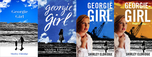 Sometimes a book cover evolves through several versions, keeping some elements and losing others. Clients can change their minds or come up with new ideas. Whilst sometimes time consuming, design iteration has the virtue of being unpredictable and therefore interesting.
Hacked Password Blues
If you are worried about the forces of darkness (aka hackers, phishers, purveyors of malware, contrivers of viruses) accessing your bank account, hijacking your Facebook profile or logging into a host of services under your name, this website offers an interesting service. It has compiled a database of hacked email addresses and if you type in your email address it will cross-reference it against the records (without storing your email address). A negative result provides no assurance that your passwords have not been compromised, but if you do show up, then you know it is time to start making changes.
A Great Ocean Road
 Drivers have a hard time on the Great Ocean Road — torn between vistas of forest and sea and keeping their vehicles on the road. The Road runs from just south of Geelong, past Apollo Bay and Cape Otway, alongside the Twelve Apostles and on into the windswept cliffs and beaches of Western Victoria. Our client painted a panorama of the Road and its attractions, and wanted to sell it at information centres in the region. We scanned and stitched together the metre long artwork, adding circular images of attractions and trying not to obscure any important information.
1001 Courses
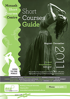 Our client had selected a striking image for the cover of their short courses brochure. We needed to integrate the image with quite a bit of information whilst keeping their branding very clear. In addition, we only had two colours to work with. As described in other posts, by using duotones, we were able to push the two colour format a bit further and arrive at a high impact solution. The typeface used for this job was HF&J's beautiful Archer.
Typography for Lawyers
Though it could be an obscure indie band, TFL is actually a website that follows through on the promise (or threat) of its title. America's lawyers produce gargantuan piles of poorly formatted documents and in the process communicate rather poorly. Matthew Butterick makes a persuasive argument for the importance of the considered use of type and page layout (especially using Word or Excel). His website and book are rich in practical examples and of course apply to anyone producing documents, not just the legal set.
Buy the type, choose the price
A recent micro trend has seen some businesses allow their customers to choose the price they pay for their services. Radiohead invited their fans to pay what they could afford for a recent album. Now there's a type foundry offering the same concept — good quality typefaces for whatever you want to pay, from $0 on upwards. The psychology of it is interesting — if the typefaces were free, a user would download them free of guilt. When there's a possibility of payment, however small, the free option then seems mean spirited.
Museum of Me Me Me
You choose: this site embodies/showcases all that is good about social media, all that is creepy and intrusive. Intel logs in to your Facebook account, siphons up your name and all of your images and some of your friends' images as well, then displays them in a virtual museum, accompanied by soft, uplifting music. The whole exercise is technically impressive and emotionally manipulative. You are supposed to feel moved as the faces of friends and family float past and memories are triggered and massaged. In privacy terms, this site performs a useful service: reminding you how much of your personal life you have fed into a commercial service, and how much that service knows about you and your preferences.
Sacred Space
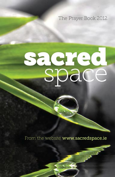 Our task was to convey the contemplative mindset of prayer without resorting to overt displays of religious symbolism. Sacred Space is a book of prayer published each year by the Irish Jesuits. After a long search through uninspiring imagery, we finally found a beautiful, tonally balanced photograph ready for the addition of type. We used Museo Slab at a variety of weights for both impact and delicacy.
Face Book
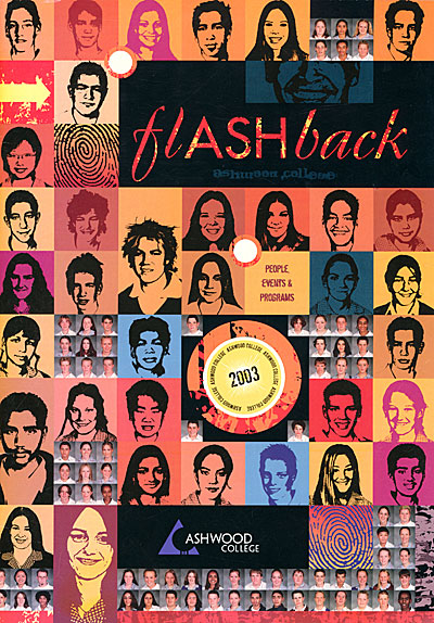 For departing Year Twelve students, their yearbook has sentimental significance — the last memento of thirteen long K-12 years of education. We tried for an unusual effect — the face of every single student in the entire school (the back cover had another few hundred faces), some converted into black and white and others still in colour. The layout took quite a while, but our clients were happy with the result.
