 Our client offers online and posted University course modules to students all over Australia. Their courses manual needed to be very clear and easy to understand. We used plenty of white space and bright, attractive colours to make the information accessible.
SyncToy
SyncToy is a remarkably useful free utility from Microsoft. It assists in the process of backing up files from one volume/drive to another. Simple, easy to use settings allow users to select a source and destination folder and choose whether the files are mirrored (altered on volume B when A is changed, and vice versa) or echoed (changed in one direction only). After your initial (and possibly quite lengthy) backup using SyncToy, the program subsequently only transfers files that have been altered since the last backup, which speeds matters up considerably. Very useful if you want to create multiple backups on your files (you really should!)
Diamonds are Forever
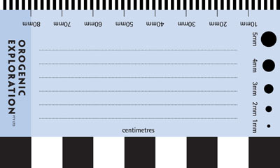 Our client prospected for diamonds, and even diamond-hunters need a business card. Aside from the usual contact details, he was keen to give the reverse side of his card additional utility as a way of measuring objects and providing scale in photographs. He also intended to use it for jotting notes to include with samples. After ten years of use, he returned for an update and reported that the card/ruler had been very handy.
Google Docs, aka GDrive
In a small but significant move, Google Docs now allows users to upload folder structures as well as files. Recently they opened Docs to uploads of any kind of file. This helps Docs move a bit closer to the fabled GDrive. Still not as functional as DropBox with its efficient and seamless file synching, but an increasingly viable place to store and work with personal or business files. Google seems to be putting a lot of resources into its cloud products, so watch out for ever more fully featured iterations of Docs, Gmail and their music storage service.
Escaping the USSR

Frieda Belakhova was born in the Soviet Union and as a Jewish woman endured prejudice and opression. Her story covered her Soviet experiences and also her journey to Australia as a young woman. She wanted the cover of her book to show both sides of her story, past and future, the USSR and Australia. We depicted her hometown Odessa and the famous Odessa Steps against the dramatic backdrop of the Soviet flag. The Sydney Opera House provided the Australian side, as if waiting at the base of the stairs. The overall composition had echoes of Soviet-era graphic design.
Finding a Future for Libraries
Although his blog seems rather full of overwrought 'inspirational' and 'motivational' thoughts, Seth Godin has some interesting things to say about the future of the Library. Rather than despairing at the gradual demise of ink on paper, he forsees an active role for librarians as interpreters of data, educating the less info-savvy in the ways of the 'Mesh'. He sums his argument up as follows: "take the world of data, combine it with the people in this community and create value."
For Very Organised Cooks
 Susan Bennett had no luck locating a practical cook's organizer, so she invented one herself. She engaged us to lay out the various information sheets, recipe indexes, planners, tabs and the binder in which they were contained. We aimed for a clean, open design with complementary colours. Typeface selection was critical — Myriad Pro is a humanist sans serif with a touch of warmth and plenty of available weights. The Cook's Toolkit is now available at a reasonable price.
Take DropBox to the Next Level
If you are a cloud power user and you have hit the 100Gb DropBox storage ceiling, then you might be looking elsewhere (such as Rackspace) for online storage/synching options. But wait — DropBox will allow you to break right through that ceiling! Unfortunately, their 350Gb Teams option seems to be oriented more towards small/medium sized businesses than individual users. At $795 per year (5 user license), $2.20 per Gb seems quite steep. Rackspace clocks in at around $1.80 per Gb per year, and their rates are calculated on the amount actually stored, not on the maximum storage amount. That said, DropBox still has the best and simplest synching and interface (and has just passed 100,000,000 users).
Entry Level Blogging
Toy Story Too
 The Eltham Toy Library is a not-for-profit organisation that aims to give parents a cost-effective way of accessing interesting toys and puzzles for their children. A small council grant enabled them to seek our assistance in developing a colourful, friendly logo and also a banner. Our solution blended iconic toys and alphabet blocks.
D is for Dragon
 Dragonfall Press is bravely dipping a toe into the turbulent waters of modern publishing, showcasing fantasy and science fiction by Australian authors. We were commissioned to craft a logo suitable for use on book spines and readable at quite small sizes. With the famous Slovenian dragon bridge as source material, we melded a wing, a head and an elegant 'D' (Filosofia Grand by Zuzana Licko) to create a logo that will hopefully help give Dragonfall a distinctive brand.
The World's Best Pop-up Books
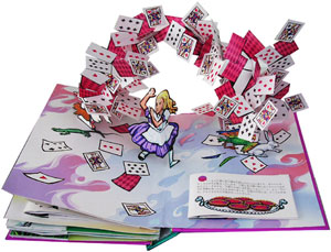 One area of print will linger longer than any other — children's books. More than any other books, texture, colour and real interactivity matter. And within children's books, pop-ups are the most resolutely three dimensional of all. Matthew Reinhart and Robert Sabuda are preeminent in this field. Together and individually, they have created some of the most amazing (and reasonably priced) books I have ever seen. They marry really high quality illustrations with bogglingly complex pop-ups. One can't even begin to figure out how each trick is achieved -- a man turning into a wolf, a Chinese dragon composed of intricately folded crépe paper, a massive T-Rex head with jaws that open, and so on. Although incredibly complex, their books are also quite durable. That said, it is probably a good idea to keep them out of the hands of smaller/destructive toddlers.
Pictograms go to the Movies
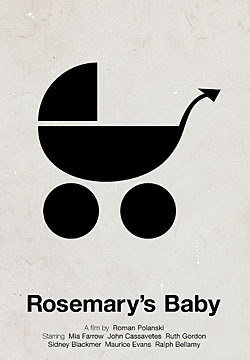 Remember those endearingly plain pictograms that first gained popularity in the 1970s? Designed to transcend text and communicate simple concepts/commands, pictographs are still a staple of the sign world. Victor Hertz has employed the pictographic vocabulary to amusing effect, creating pictographic posters for a raft of movie classics. Beside the whimsy, it is a very interesting design exercise to be forced to boil a complex idea down to simple iconic image.
Archer Hits Typeface Bullseye
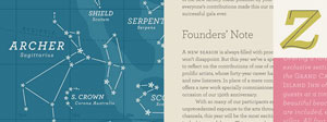 In combining prettiness and practicality, Archer is a rare typeface. With idiosyncratic letterforms and cute little ball terminals, this friendly slab serif has been spotted all over the web and and in hundreds of publications. As with other HF&J typefaces (especially Gotham), it has been (over)used, but in the right caring hands, it still has the capacity to give shine and personality to many kinds of print and web design.
Stars in Your Eyes
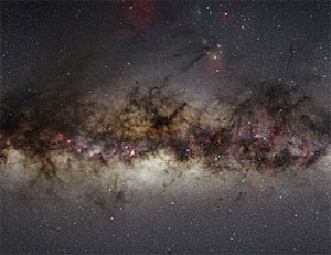 As a child, I was disappointed to discover that only a couple of thousand stars were visible to the naked eye. With the encroachment of light pollution, that figure is probably rather optimistic. Uber-enthusiastic amateur astronomer Nick Risinger decided to create a massive full sky image combining thousands of images -- the night sky we wish we could see. For optimum viewing, he travelled tens of thousands of kilometres to seek out the darkest parts of the US. The results are awe-inspiring. Our own galaxy extends from edge to edge in a blaze of starry glory, with lanes of gas and companion star clusters clearly visible. He has made large versions (3000 pixels wide) available to the public, plus selling prints on archival stock.
Google eBooks
Yet another Google service/business has been launched to very little fanfare. Google ebooks offer a huge number of current titles and also older works now out of copyright. Given that Google has scanned a vast swathe of print books already (outraging many publishers) one would think they have a big advantage over other ebook providers. Their ebooks are only available for sale or download in the USA at present, though they promise this will soon expand to other markets. The formats available are PDF and epub. Most older books are available only in PDF format. In a best-case scenario, Google will provide effective competition for Amazon in this market. Google is often good at keeping entry costs low, and may allow publishers to keep more of the sale price of their ebooks.
Book Trilogy
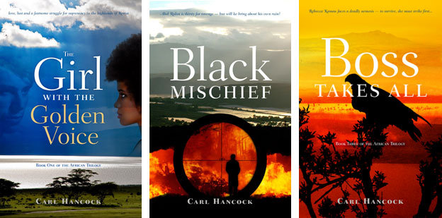 Our client had written three books that followed a largely linear narrative, and were strongly tied to a single location in Africa (the Rift Valley in Kenya). Our cover designs used that landscape as a reference, bringing in additional images specific to the particular volume in the trilogy. The title typeface is Fairfield and supplies a framework for all three covers.
A Brighter Future for the Book?
A prominent tech site has a thoughtful update on the ebook trade, and signs that it might be reaching some kind of maturity, or at least adolescence. On a closely related topic, another blogger points out that self published ebooks can be quite profitable, provided you already have a name/profile.
Online File Conversions
Sometimes a client might give you a file saved in an exotic format. You don't have the program required to open it, nor are you inclined to install it for this one instance. Now you don't have to — Zamzar allows you to upload your file and save it as something openable. In my case, I tested the service by uploading a Microsoft Publisher file and saving it as a Word Doc. Seconds later, the converted file was in my inbox. The basic service is currently free, with a paid service allowing online file storage and faster processing. The name of the service derives from the protagonist of Franz Kafka's The Metamorphosis.
Interpretive signage
 Currently the subject of political debate, renewable energy research is a major focus for the CSIRO. The large sign at right was one of a series designed to acquaint stakeholders with various ongoing initiatives and achievements. Interpretive signage is usually a combination of large, eye-catching images and pared back prose. We placed the text at eye level (approx 1500mm) and kept the composition clean and open.
