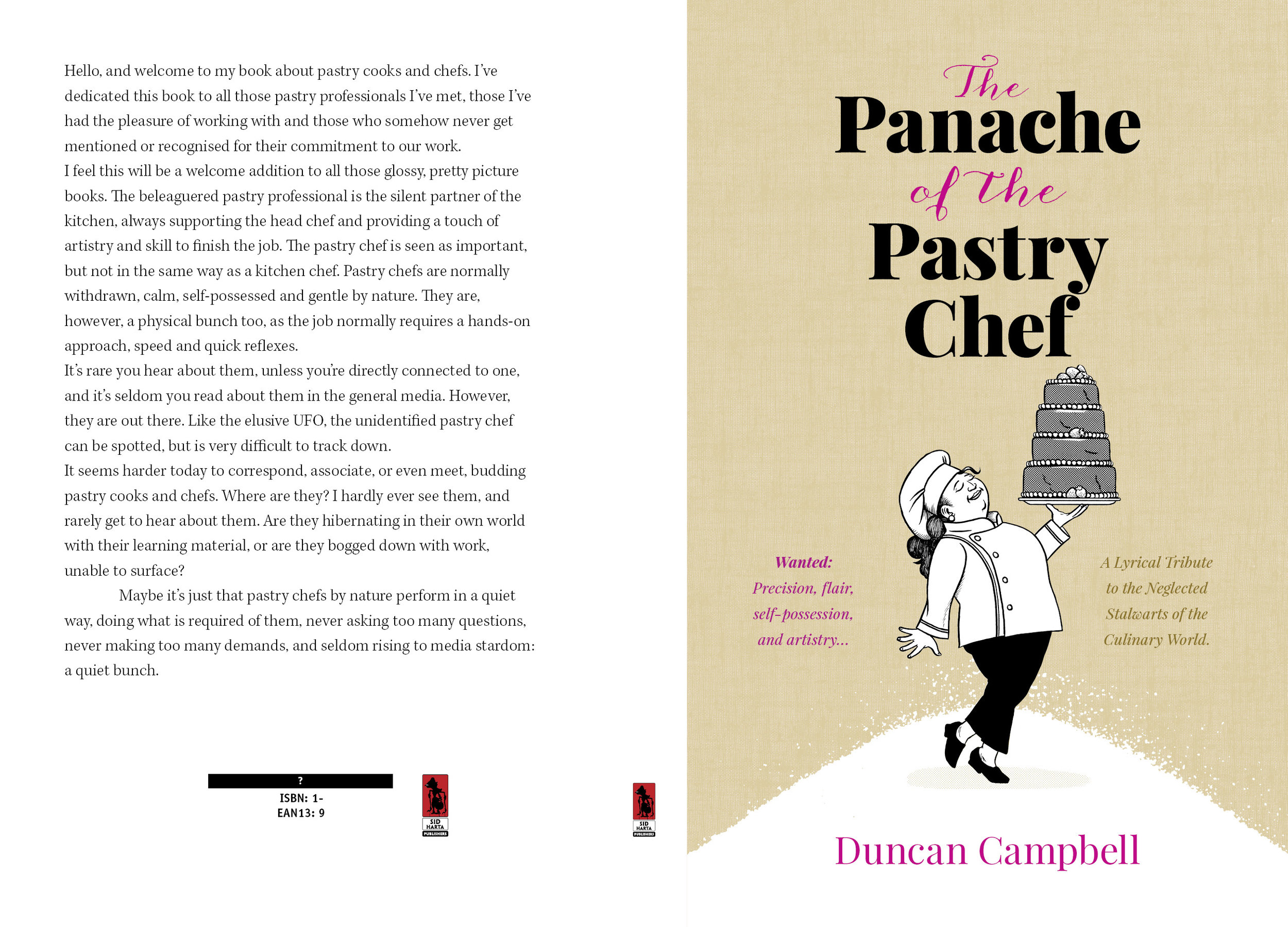
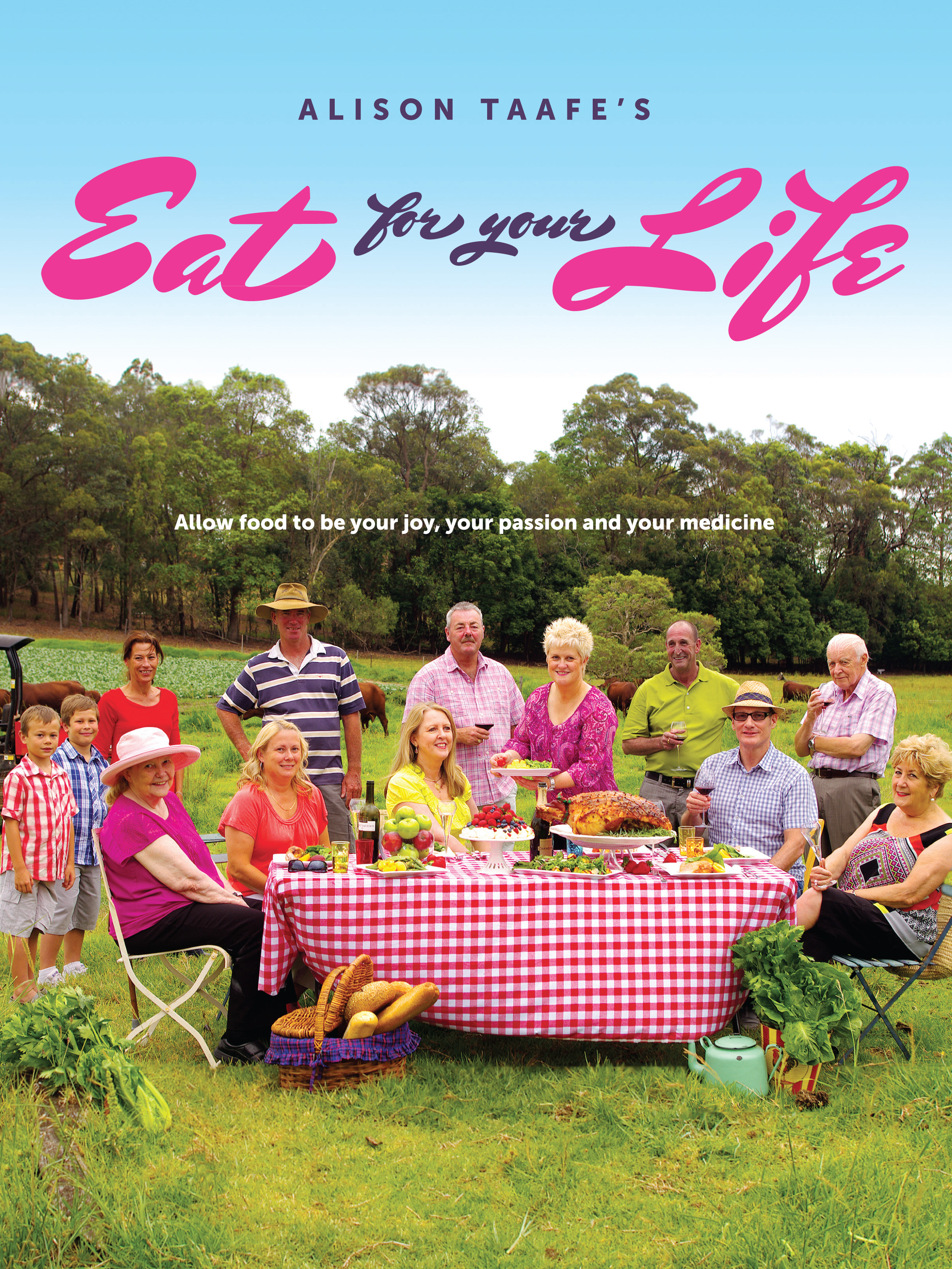
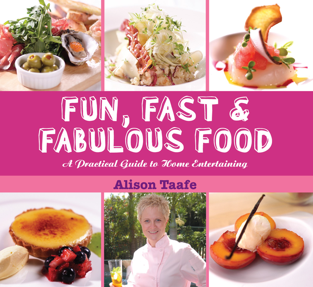
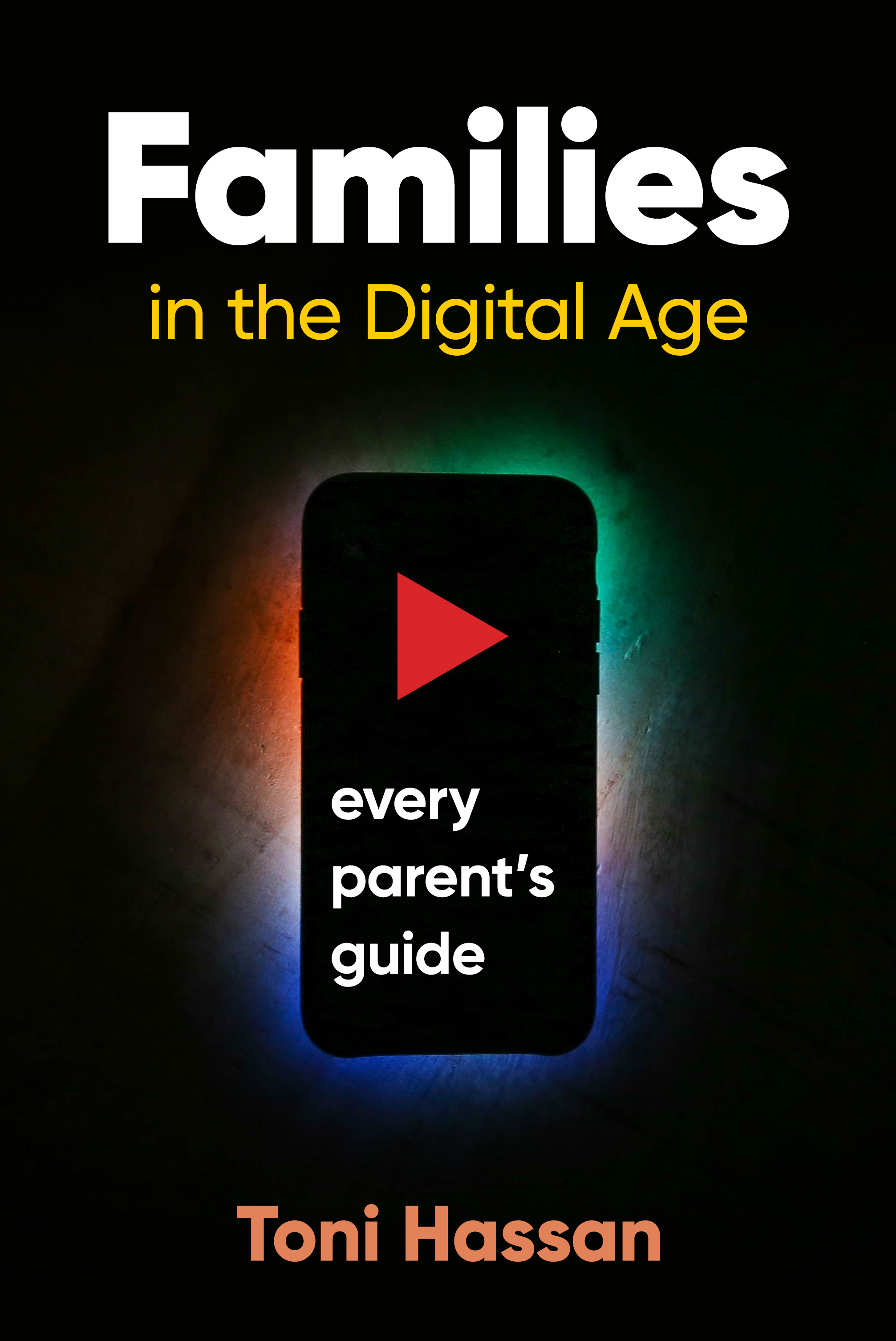
Recent Cover Design examples
A few recent cover designs, from high fantasy to Australian railway trips…
Four Covers for 2020
A small sample of recently cover drafts for WorkingType clients, featuring the usual interesting diversity of subject matter and tone…
5 Reasons Why Book Typography Matters More Than You Think
A Guest Post kindly supplied by Desiree Villena:
Everyone knows that, if you want your book to sell, you need to hire a great cover designer. But many people don’t think about how important your book’s interior design is, as well. I’ve seen too many books, both self-published and traditionally published, that have clearly skimped when it comes to formatting, and as a design nerd, it makes me so sad.
But there’s much more at stake than just hurting artistic souls — think of the practical considerations. You may not realize it, but typography can have a big effect on a reader’s reaction to your book, whether they consciously notice the fonts or not. So today, I’m going to break down the five most important reasons why book typography matters for every book — including yours.
1. Professionalism
While the cover is easily the first thing readers will notice when they’re deciding whether to pick up your book, the typography is the first thing they’ll notice once they open it up. So it’s important that you make a good impression. Seeing a professional cover and a sloppy interior is like meeting someone in person and realizing that their profile picture was a lie.
If you ever doubt the impact that a font can have on your professional reputation, consider this: would you be more inclined to trust someone whose resume was printed in Times New Roman, or Comic Sans?
Similarly, your book will be judged on what kind of font it’s printed in. Perhaps not consciously — not many people can point to a book and go, “Oh, that’s in Garamond,” or “That looks like Caslon” — but the wrong font will make something feel off about the book.
But what makes something the “wrong” font? That’s where the other factors come into play.
2. Genre expectations
This is one of those things that you’ve probably never consciously noticed before, but once you do, you can’t not notice it. Different genres tend to be published in different types of fonts, and you want your font to reflect the contents of the story as much as your cover and title do.
For example, a quick survey of my personal library shows me that speculative fiction uses a lot of Palatino, whereas YA contemporaries are often published in softer, more “playful” fonts like Century Book or Bembo. You can also never really go wrong with Garamond, the most “bookish” looking font of them all. But it’s not always necessarily the perfect font, either.
And don’t forget about typography on chapter headings! Age ranges and genres follow trends here, too, with YA and middle grade among the most creative, and literary fiction setting a high standard for refined understatement.
3. Readability
Of course all fonts are technically readable if they contain all the letters of the alphabet. Unlike handwriting, the letter A will appear the same no matter how tired you are when you hit the key on your keyboard. But the truth is some fonts are just easier to read than others. It’s why we usually publish books in serif fonts instead of sans-serif, and it’s why we make the letters bigger in kids’ books than in novels for adults.
Here, it’s important to consider function over form. Font size, line spacing, and margins are all key factors to making sure that the font you’ve chosen will read well to your target audience.
Some fonts just have a natural size they look best at, but will that make your book too slim or too chunky? If you’re targeting older readers, is the font too thin and “fussy” to be read without squinting? The more you take into account, the better your book will be.
4. Fatigue
Readability plays into this, but it’s important enough that I feel it’s worth a separate mention. Because one of the downsides of poor readability is that readers are likely to tire of reading your work sooner — or even develop eyestrain.
Let’s face it: a lot of things demand our attention these days. From work to families to keeping the house in order to the sweet siren song of social media, it can be hard to find time to read at all. The last thing you want to do is make your book cause physical discomfort. There’s nothing more likely to make people to put it down — and perhaps never pick it back up again.
Good typography, on the other hand, is comfortable on the eyes, and can play a surprisingly significant role in whether readers perceive your book as a slog or a joy to read. That’s why it’s crucial to choose your font wisely.
5. Reader mood
You know the genre expectations we talked about before? A big part of the reason those exist is because different fonts subconsciously convey different “moods.”
These are most noticeable in splashy fonts that you’d use more in titles than in text blocks — a futuristic sci-fi font, an elegant hand-lettering font — but even the fonts you’d format a whole book in can have an impact. Some are stuffy, some soothing, and some just kind of dull. It’s important for your designer to keep these differences in mind and understand how the font of the chapter headings works together with the font of the story, in order to create a professional product.
Remember: choosing good typography is a bit of an art, yes, but it’s also a marketing choice. And marketing is a subtle game. Everything from the layout of your local grocery store to the color of your laundry detergent bottle has an impact on people’s buying choices. Why should books be any different?
Desiree Villena is a writer with Reedsy, a marketplace that connects self-publishing authors with the world’s best editors, designers, and marketers. She's very passionate about helping aspiring authors reach their dreams, and enjoys reading and writing short stories in her spare time.
Recent Book Cover Designs
We’ve been busy designing new covers for lovely author and publisher clients, with a very broad range of subjects. Here are a few of them.
A New Series for Peter Ralph
Writer of financial thrillers Peter Ralph is embarking on a new series featuring Josh Kennelly, a character first introduced in Fog City Fraud. The first book, Deadly Bequests is “set in New Orleans and is a scam about the elderly getting fleeced via their wills.”. The second book is The Guardians . Josh “receives a crazy call from a veteran of the Afghanistan war claiming that his father has been kidnapped by a guardian. Reluctantly, Josh gets involved and discovers the guardianship industry where judges, guardians, lawyers, and doctors, look after themselves, but not their wards. The forces that he’s trying to expose are all-powerful. Has he bitten off more than he can chew?”
We designed all three books to have a consistent identity and repeated elements.
The Legacy of Douglas Grant — Book Cover
John Ramsland often writes about eminent Aboriginal Australians, and in Douglas Grant he has found a fascinating subject. Survivor of an appalling massacre as a baby, raised by Scottish immigrants, then a volunteer for the Western Front, Grant’s life deserves attention and respect. We let his photograph speak for itself, with a faint background of a World War I battle scene. Published by Brolga Publishing.
Italian Bel Canto — Book Cover
Joseph Talia writes about great singers and their teachers, and the science of singing. We populated the cover of his latest book with luminaries from that world. from Dame Joan Sutherland back to Rossini and Farinelli. And in the background, an amazing piece of art from Rococo master Giovanni Tiepolo. Published by Australian Academic Press.
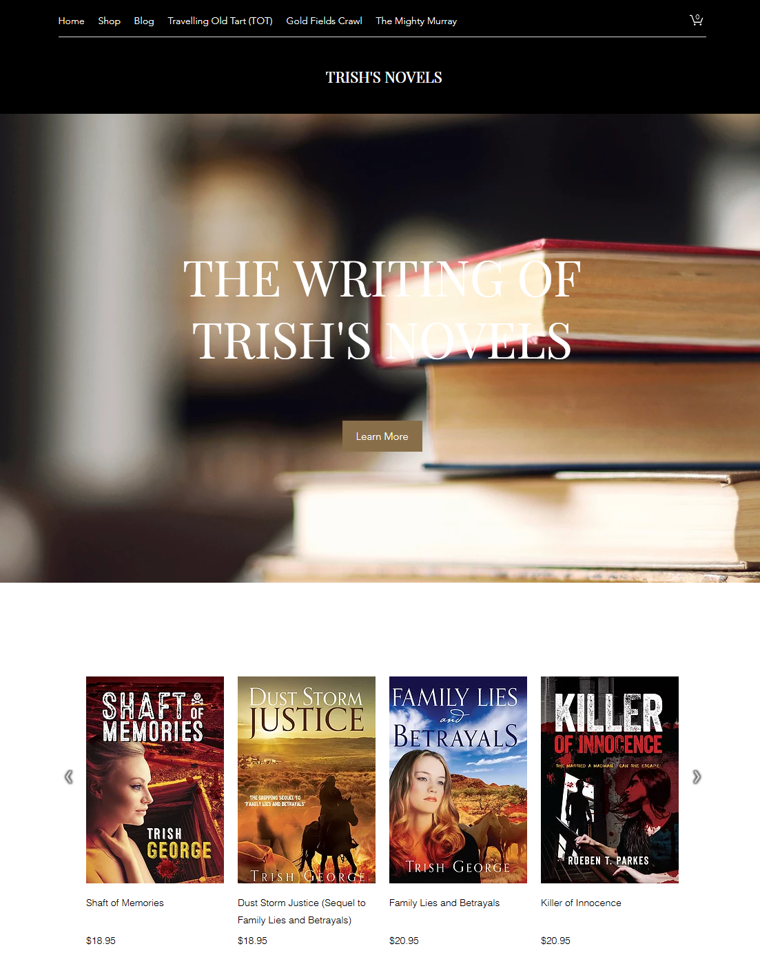
Author Trish George and her website
Independent author and outright character Trish George has an author website up, and it is quite well done. An inveterate traveler, Trish has been all over Australia and promoted her work along the way. Along with her works of fiction, she has also written several travel books and is quite a raconteur.
A Promotional Strategy for "Summer at Urchin's Bluff" by author Eliza Bennetts
On writing a series:
Writing in series is considered the way-to-go when it comes to romance. Romance readers are voracious! I attend the yearly RWA conferences and they often talk about the fact that some romance readers read 7-10 books a week! This means that when they find a set of characters or a world they enjoy, they want to keep reading.
As an author, it pays to have more books down the line to service this need. I was lucky to latch on to this pearl of wisdom while writing the first draft of Summer at Urchin's Bluff, so that allowed me to ensure there was scope to have a supporting character who will feature as the main character the next book, and so on for the following two books. I guess, in a way, writing in series is it's own form of promotion. Each book works to promote the next. Well, that's the plan anyhow!
My writing life:
I think like most of us, for me writing was always a hobby - something to get me out of my head when I was stressing about work or family or whatever. I've recently found myself with a little more time to write, and I'm loving it, but I'm yet to establish a routine around my writing. I've listened to podcasts and read books that say you should blank out some time each day to write (eg. 9 - noon). I should probably do that, but I'm loathe to, in case it sucks the fun out of it! I don't want it to feel like a chore, but I guess if I want to do this as a career, I might need to consider it. At the moment I write every day, but not at a specific time, or for a specified length of time.
Marketing and Promotion:
So, my plan with marketing is really to take it slow. I do plan to look at Facebook ads and Amazon ads (I have purchased the KDP Rocket software) for the promotion of Summer at Urchin's Bluff, but not in an extensive way. I figure once I have more books on my shelf, any money I invest in advertising will be that much more effective. I do plan to look at BookBub, but not for book one, or two for that matter. I know they're hard to get, so I might wait to start trying (maybe once all four books in the Seasons series are released). As far as social media goes, I'm only active on Facebook. I know it's better to be everywhere, but with kids and work, and the whole writing-the-books thing, I don't have the time to service a ton of social accounts. This is an area I need to become more confident in. Every time I'm about to post (even just on that one platform) I'm always thinking, 'is anyone going to care about this? Is it spamy?' (not a word, but you know what I mean). I do know that building a mailing list is super important, so I'm working on that but it's slow going. I'm okay with things taking a while to build. I want to be doing this in 20 years time, so being number 1 from day 1, with book 1 is not really my goal (I mean, I wouldn't be upset if it happened!). I guess what I'm saying is that everything I do around marketing and promotion, for me, needs to be about steadily building a readership.
Summer at Urchin's Bluff is a contemporary seasoned romance (seasoned is the term we use in the romance world for a heroine over 40). It is available for pre order now across most platforms.
Available from these outlets.
Sailor to Radio Lineman to CEO to Author — Jim Pratt and His Books
Scottish born James Pratt, the son of a coal miner, is a man from humble beginnings who rose to the top of his chosen profession. At the age of 15 he, (as he describes it), ran away to sea and joined the British Merchant Navy before settling in Australia at the young age of 18.
He worked as a radio lineman in outback Queensland for several years then moved into sales and marketing, then General Management. By the time of his retirement, he had reached the very top of his profession as a Telecommunications Executive.
He held several senior positions, including, Chairman of the globally renowned GSM Association, was the founding CEO of Peoples Telephone Company Limited, a substantial mobile telephone network operator in Hong Kong, (now China Mobile Hong Kong), a former Managing Director with Telstra and the President & CEO of GlobeTrac Inc. He served as a non-executive director on several boards until his retirement.
He honed his writing and communication skills on business reports and strategy papers and had numerous articles published in various global Telecommunications magazines.
Well travelled, he has been to almost 100 countries, meeting some of the most famous and influential people around the globe.
His first stop inside a departures lounge at any airport was always the bookstore where he would purchase a novel, usually an action thriller. He read almost everything by Le Carre, Ludlum, Forsyth, Cussler, Clancy, Harris and many more, most with enjoyment. However, over time, he concluded that he could write more entertaining stories than those he was now buying to read on those long flights and was finding it increasingly hard to find a book he could relax with and enjoy. So, upon retiring, he turned his hand to writing his first novel, Telekom, which he released several years ago with quite some success. He has just released his second novel, The Sleeper Project and had started work on his third, to be called, “Cassidy’s Conflict.”
Cover Designs — Irradiated White House and the Secret Life of Words
A sinister mushroom cloud, the White House gently glowing in the radioactive light, a menacing submarine — what more could a reader want?
Another radioactive cloud, skippy, Sanuel Johnson and a medieval scholar — the first time they have all appeared on one cover…
Covering the Grim Reaper...
Our client’s author wished to use an existing artwork. so we worked in two panels of text with the art just showing through, keeping it clean and letting the rather odd couple speak/rattle for themselves… Typefaces used include basic sans and Taberna Serif.
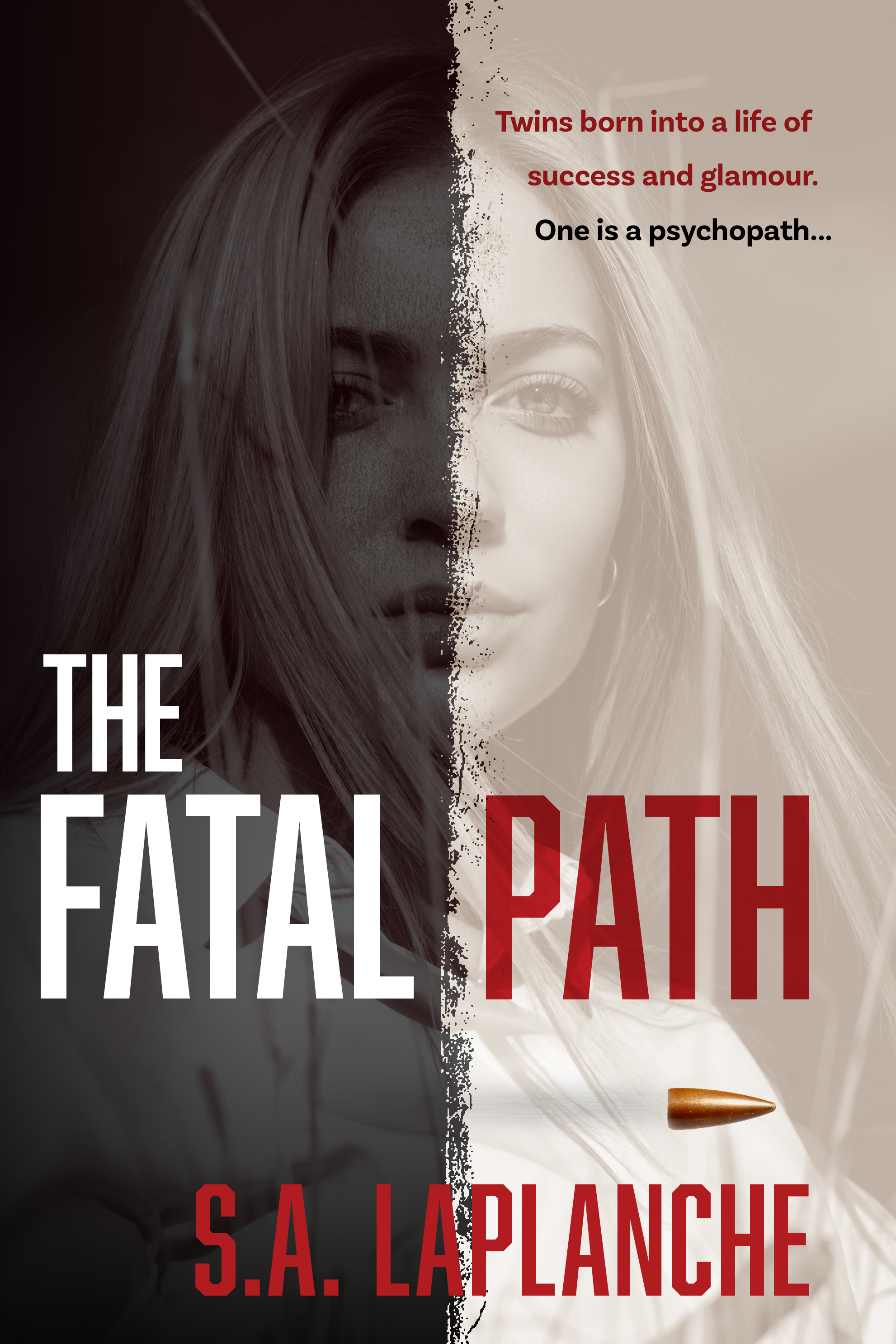
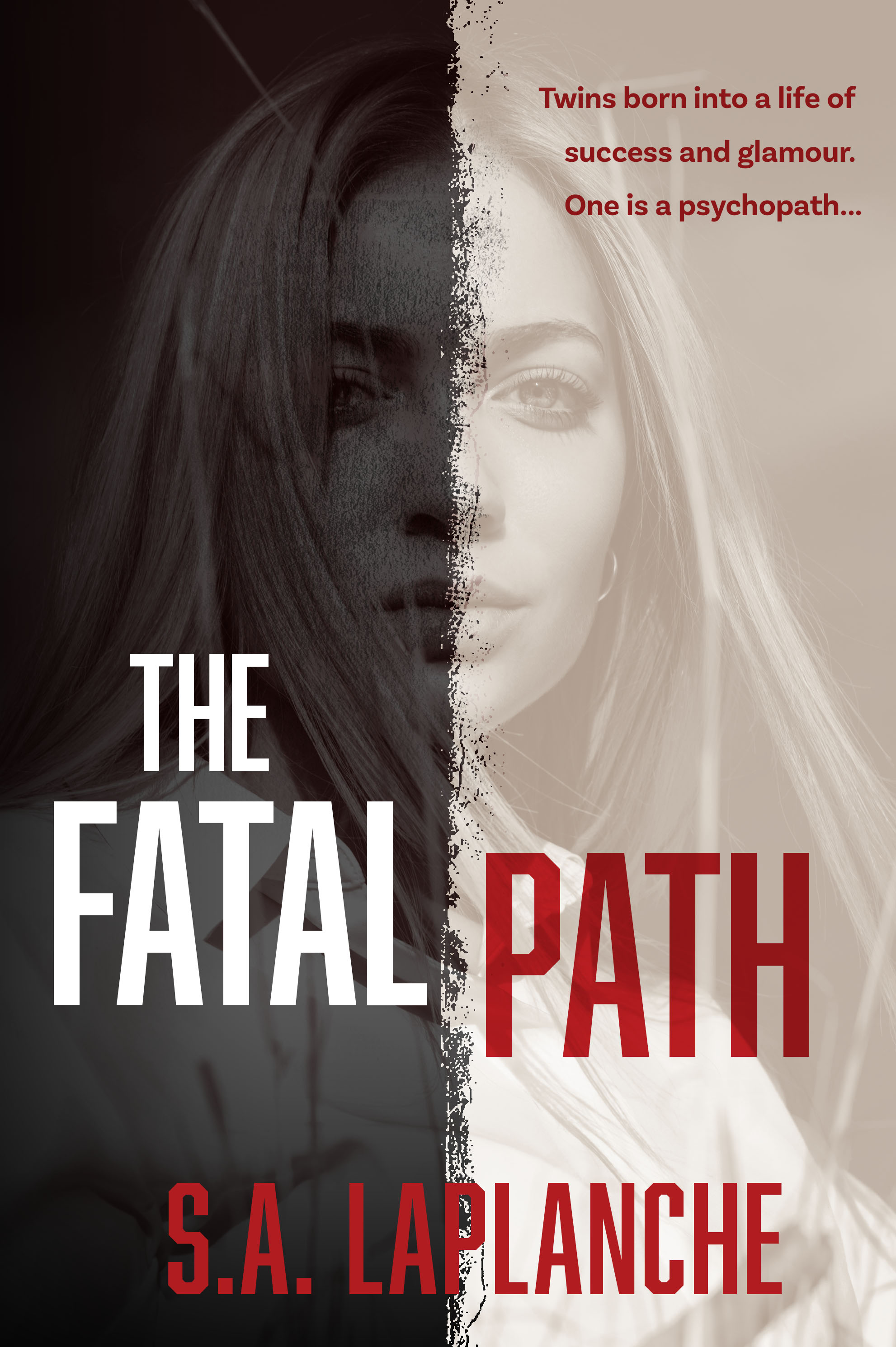
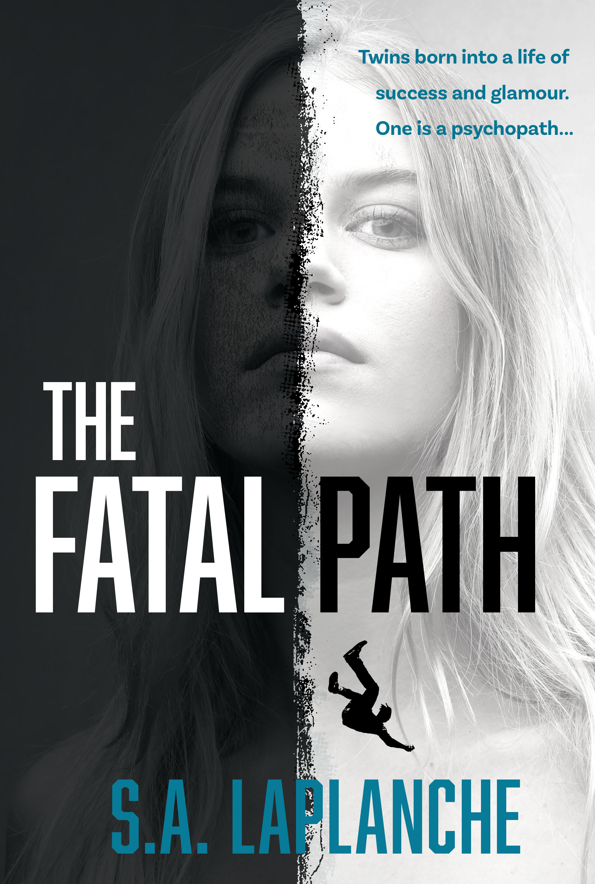
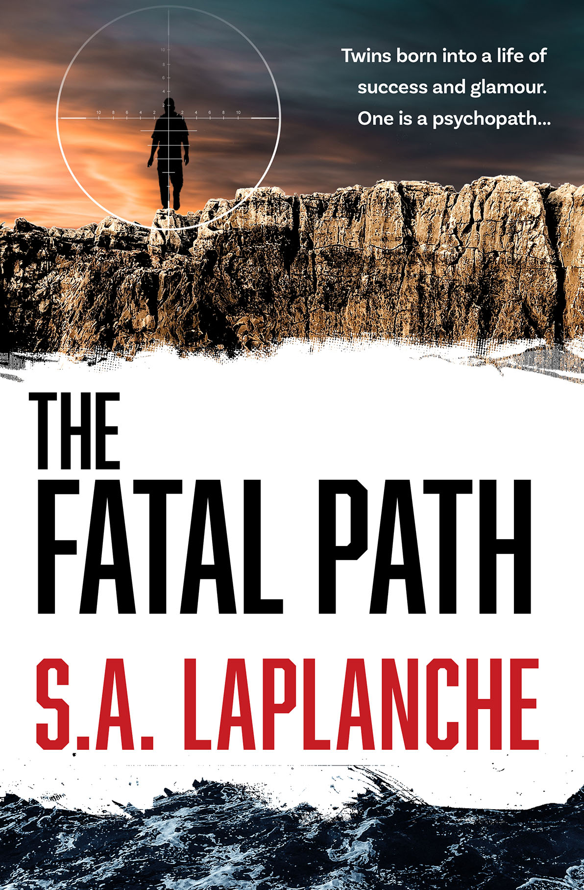
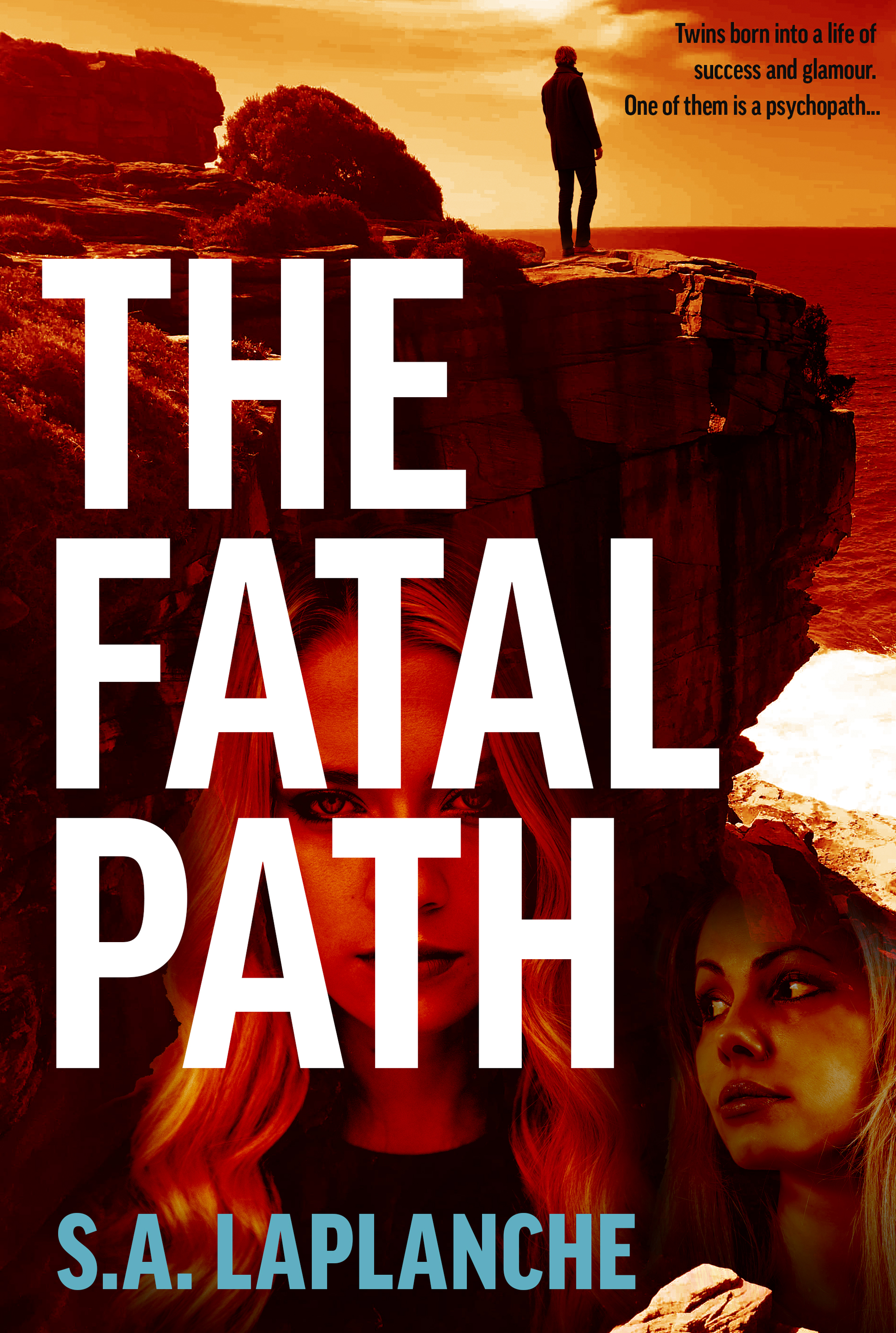
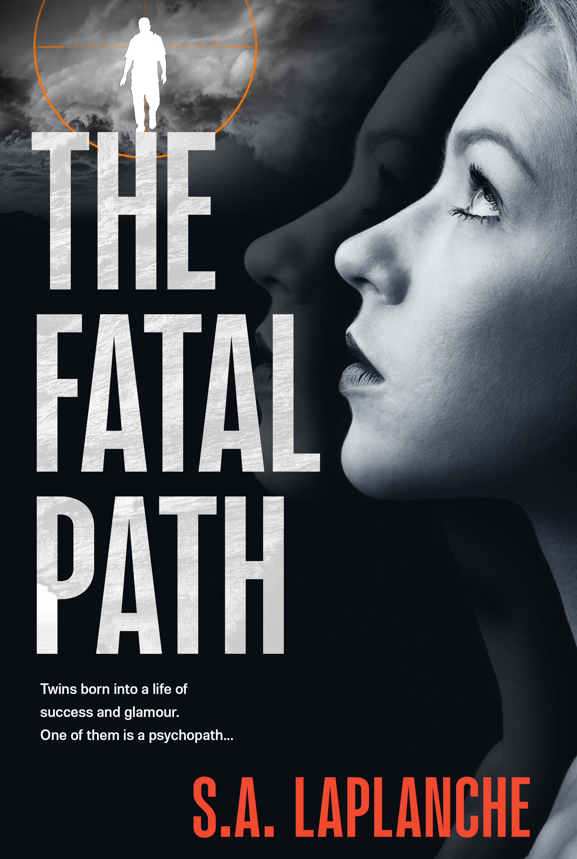
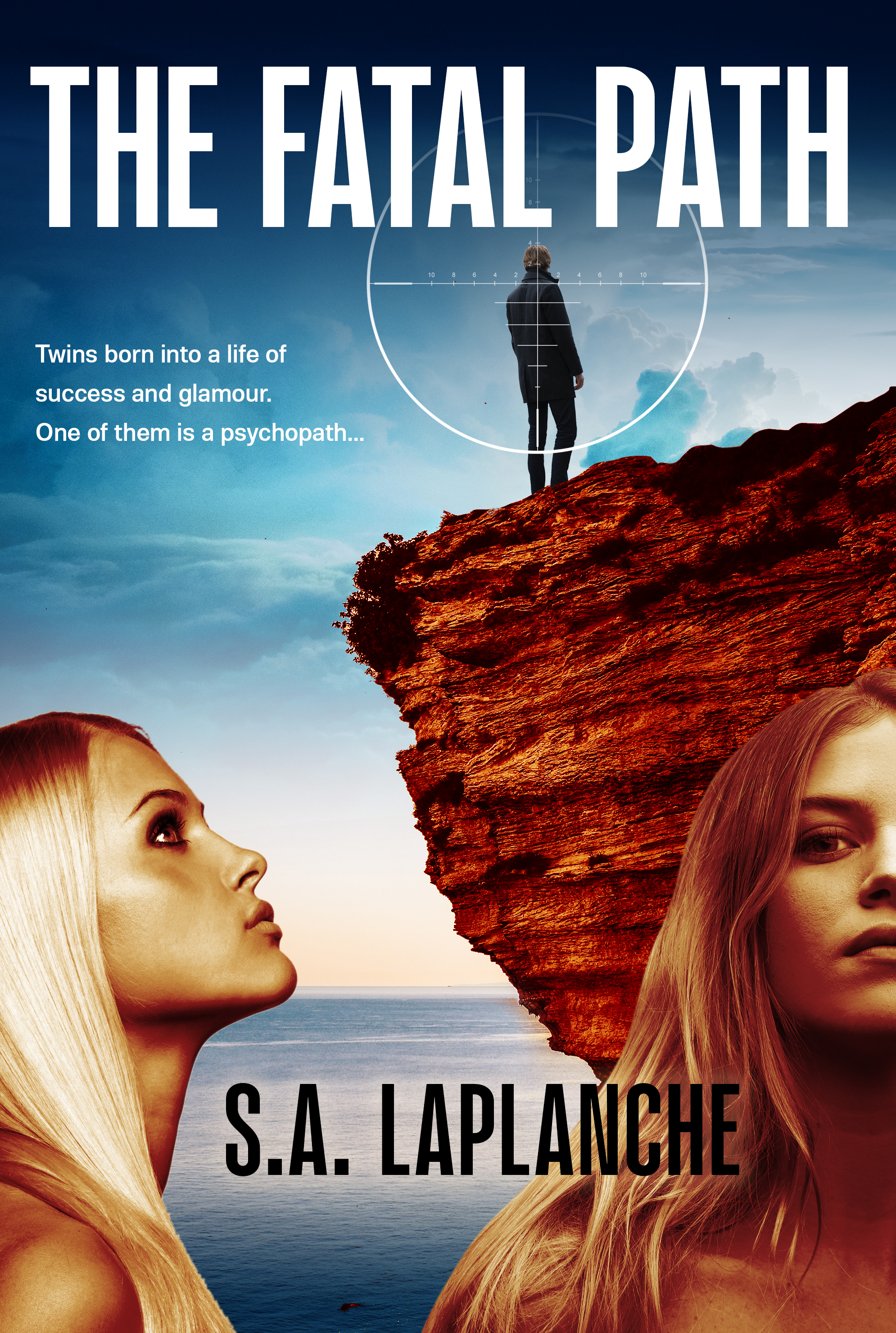
Fatal Path Cover — More Iterations
An update on an earlier post — two more iterations on this cover. Sometimes it is a long and winding road to a final cover…
Amazing Science Graphics from Eleanor Lutz
For beautiful, jaw-dropping science graphics, the quirkily named TableTop Whale is an essential destination. Maintained by Phd student Eleanor Lutz, the work is astonishingly good. Hopefully she will produce something in print so I can read it to my children…
Troubled Times in East Timor — Cover Design
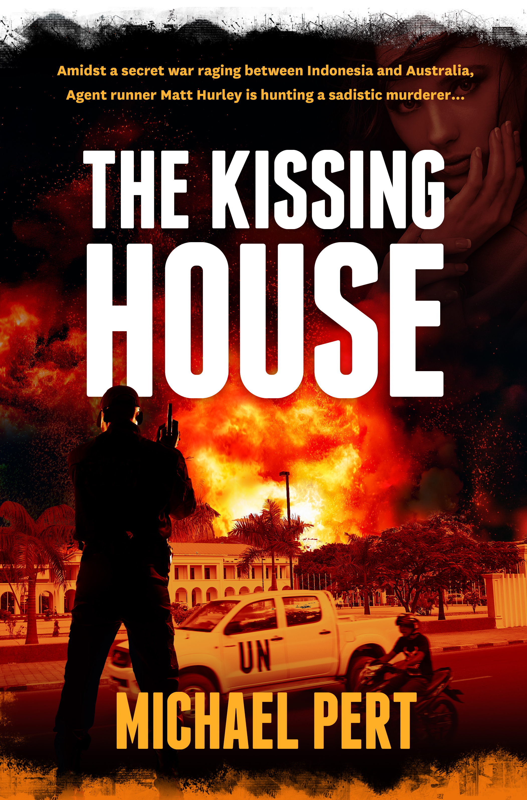
Michael Pert has written a taut, intelligent thriller based on Australia’s role in the troubled birth of East Timor. In the above draft cover, we blended images of Timor and a stark colour palette, and used the striking Franchise for the title typeface.
Cooking the Books
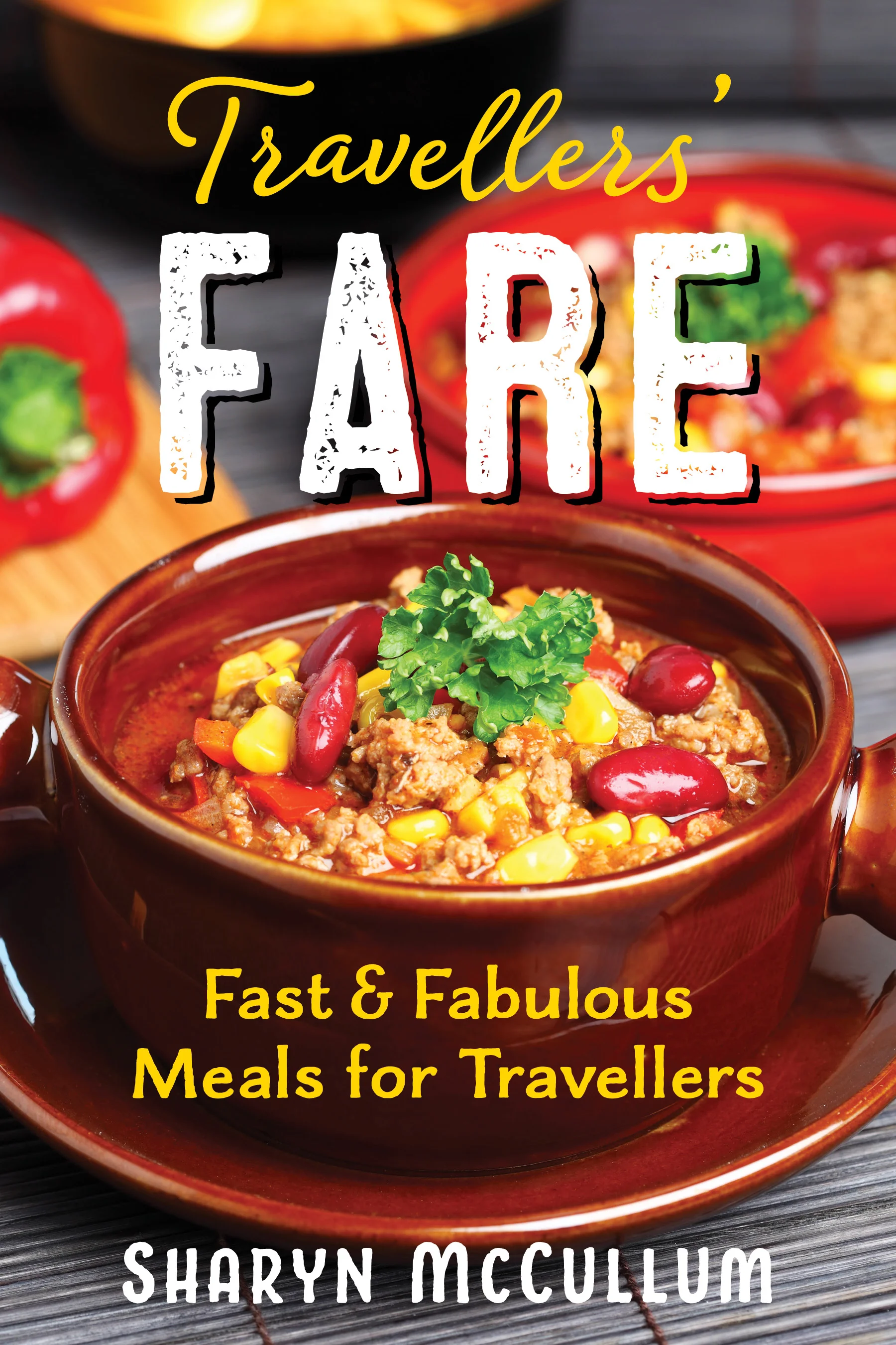
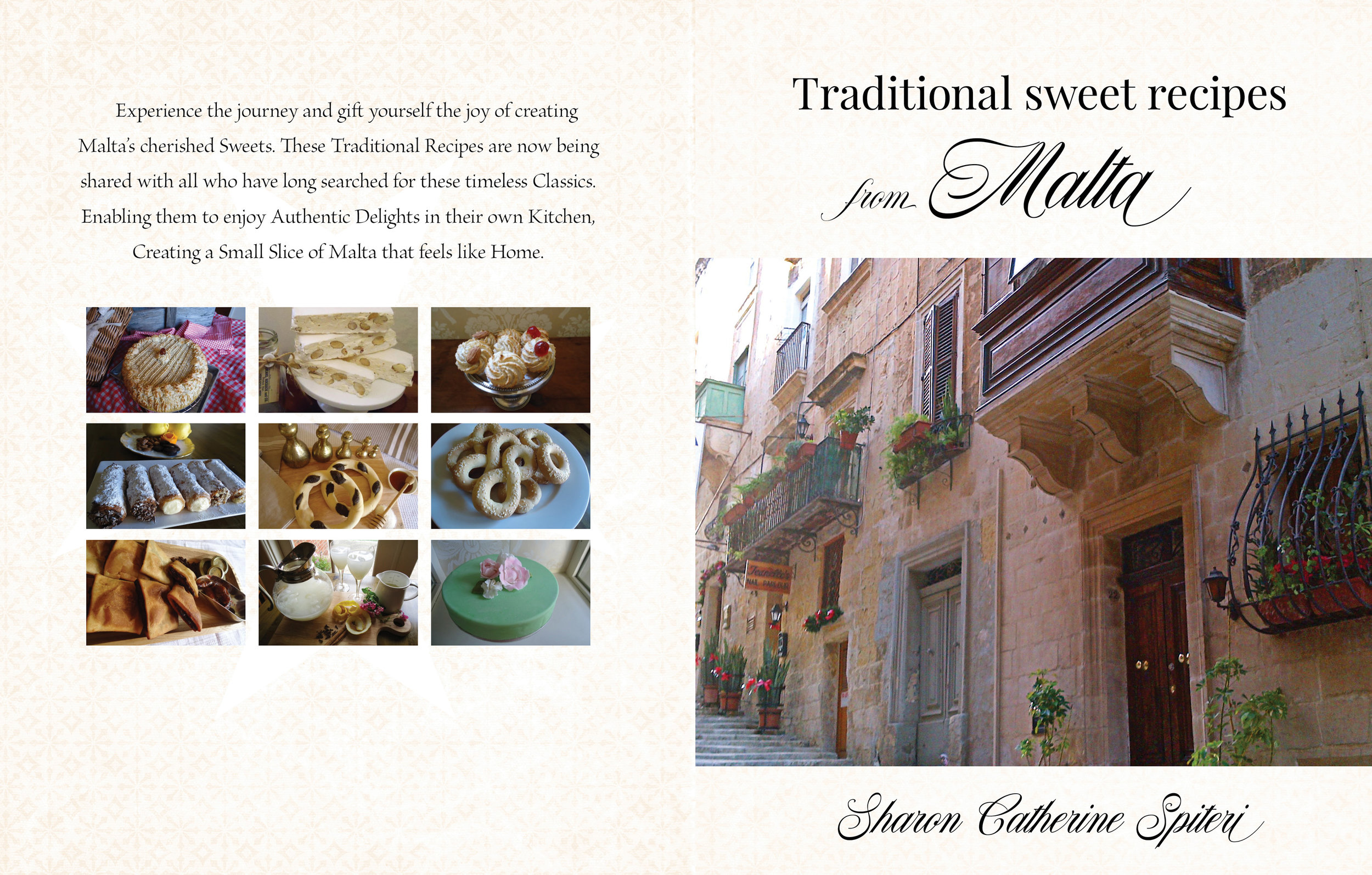
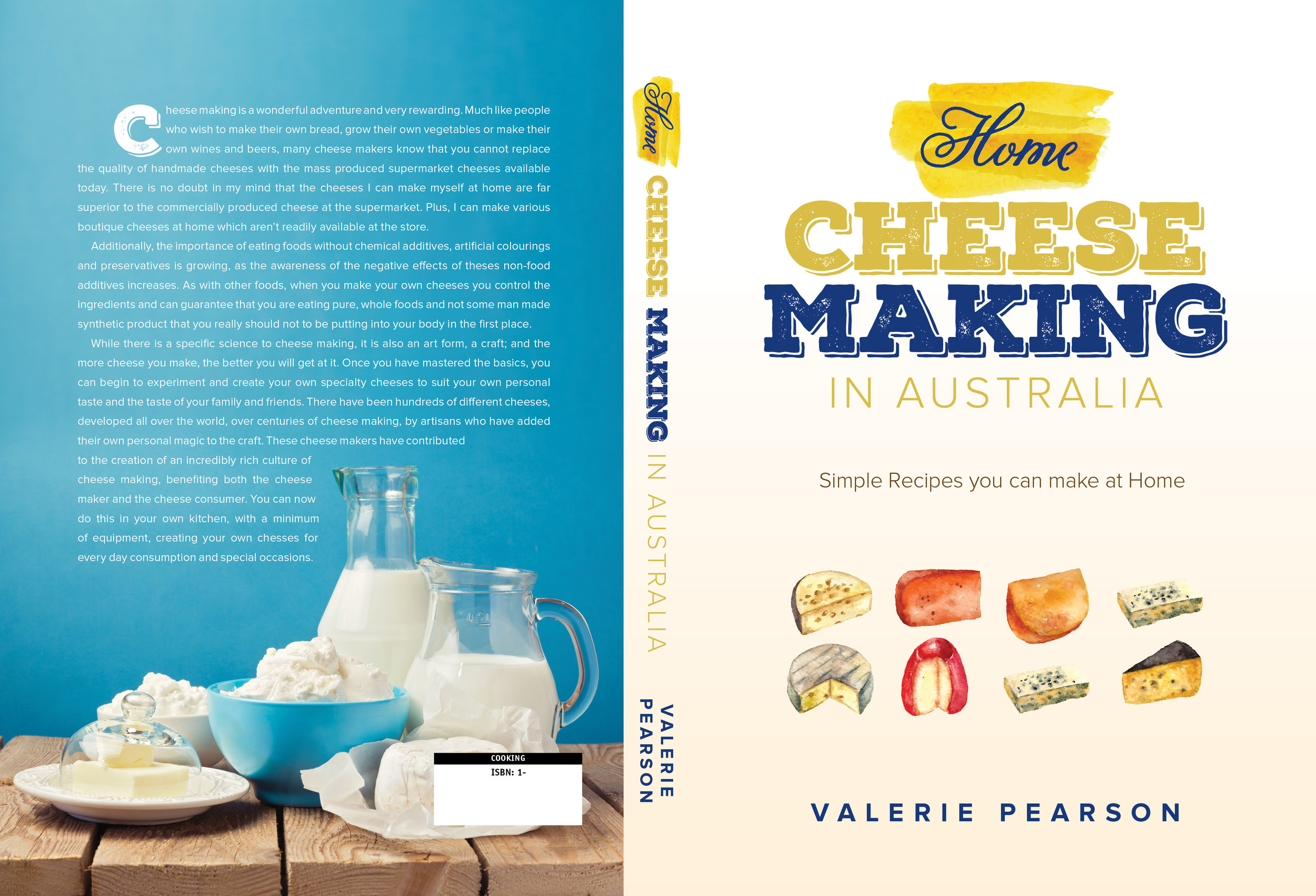
A small selection of colourful cookbook covers completed over the past few years. Anything involving food is always fun!
Three Cover Iterations: Twins, a rifle and a world of pain
Thrillers are an enjoyable design challenge — very bold use of highly condensed type, high contrast, extreme emotions and a certain cinematic touch. The Fatal Path is no exception to this general pattern. Here are three alternate versions of the same cover.
Custom Calligraphic Lettering and Illustrations
Wanissa Somsuphangsri is an extremely talented calligrapher and illustrator based in Melbourne. If you need some highly individualised and polished work, she might be the person for you. We’re currently putting together a cover for an author client who engaged Wanissa and the results are amazing — will post the full cover in due course. Wanissa is also a member of the Letterettes.
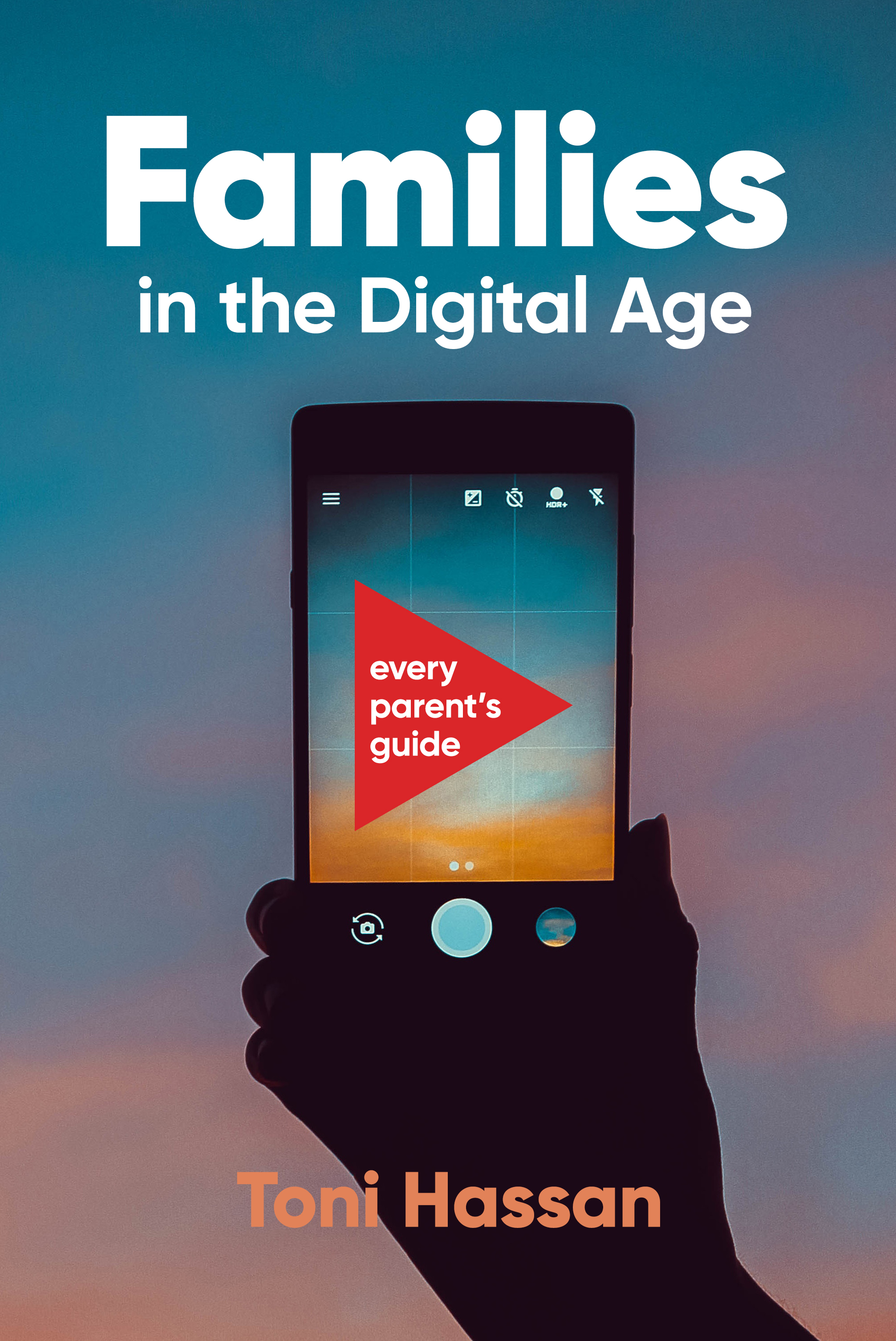
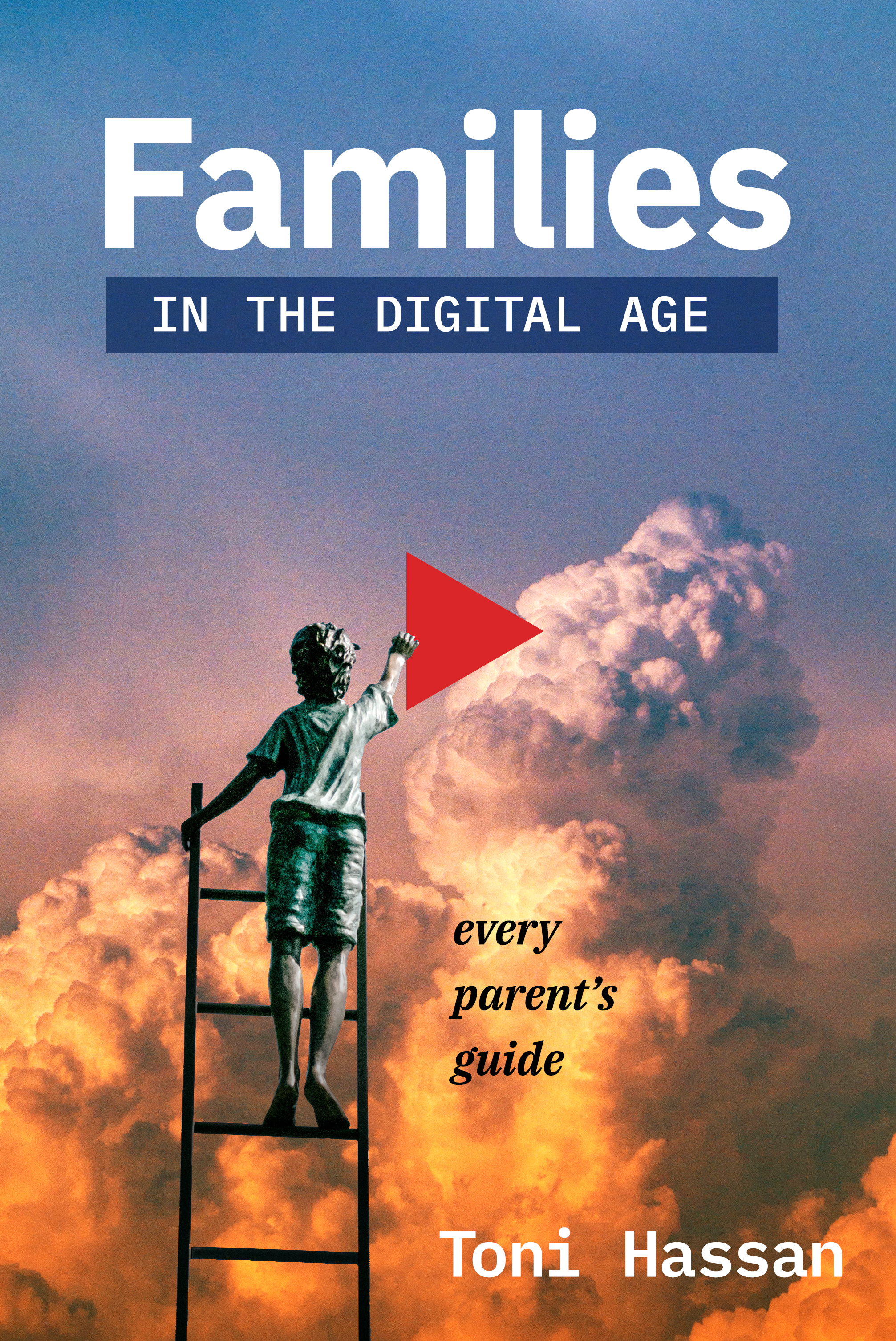
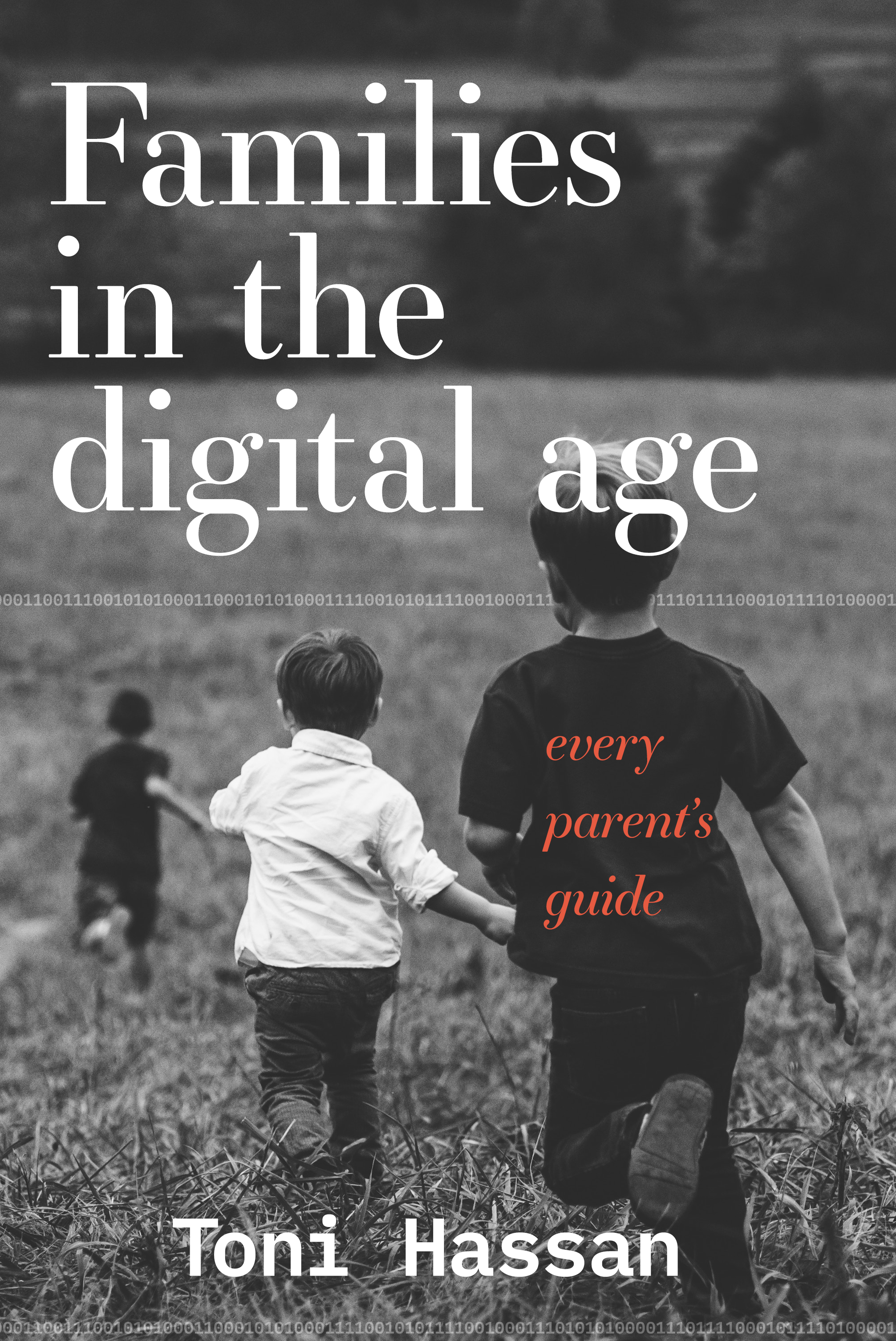
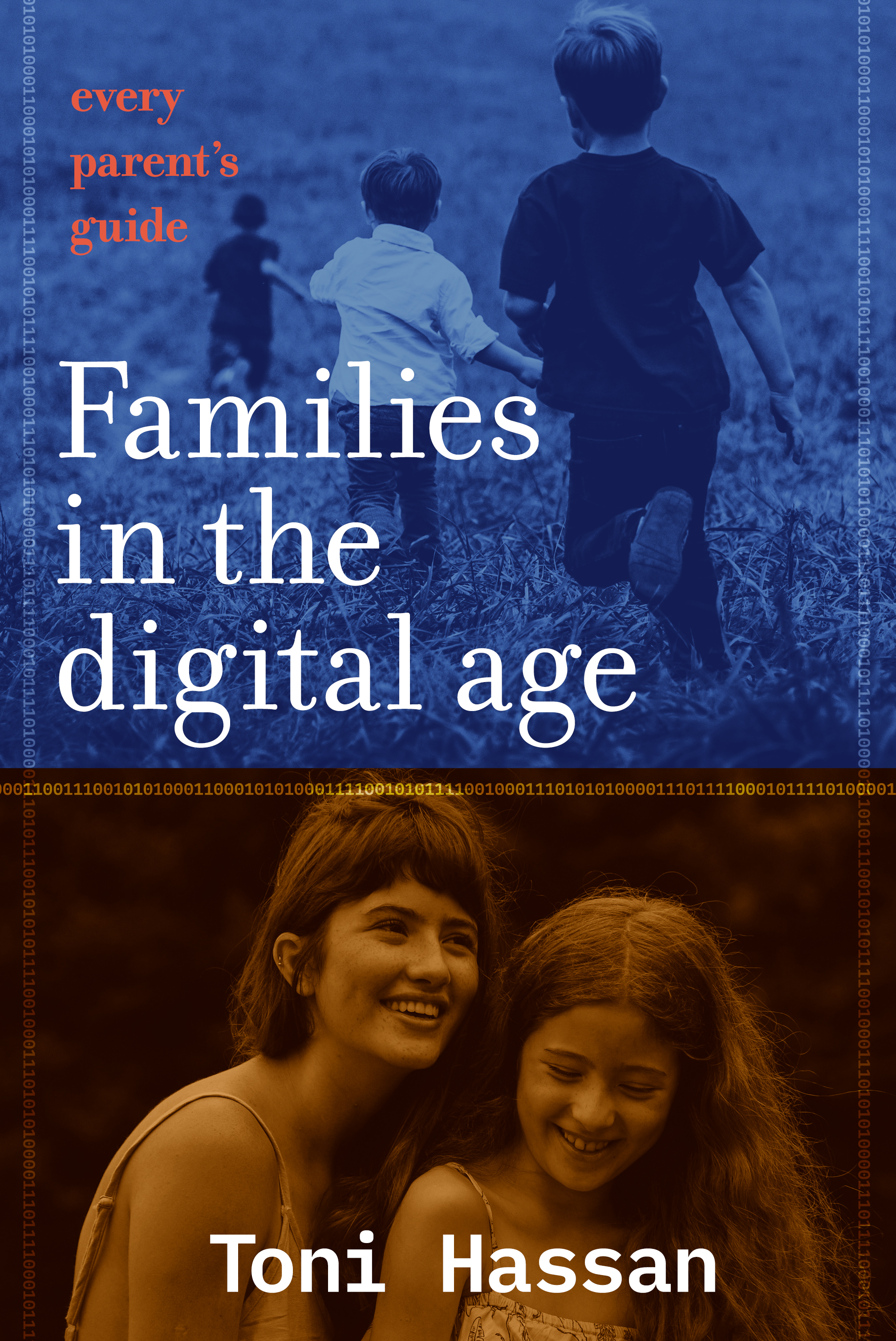
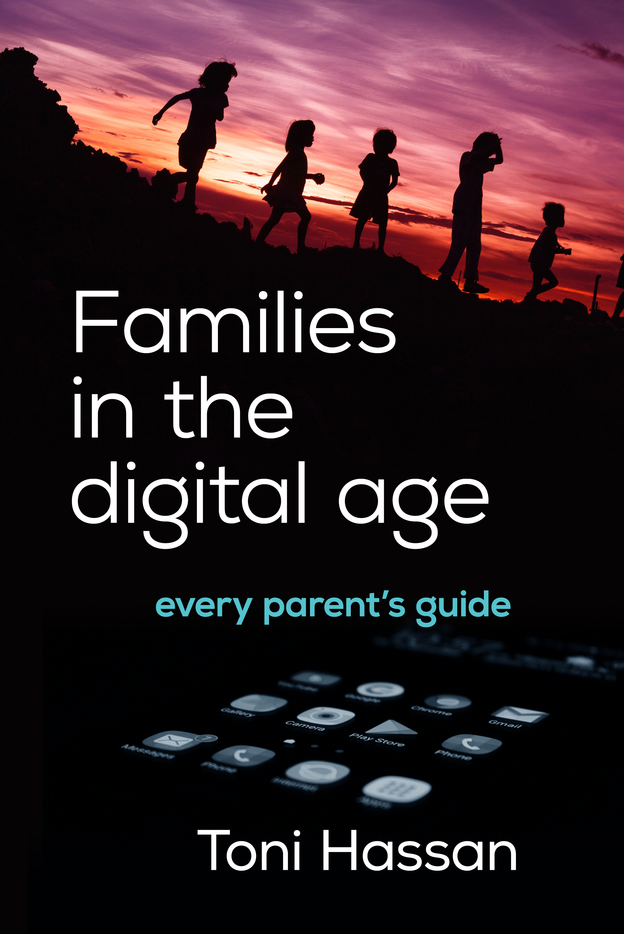
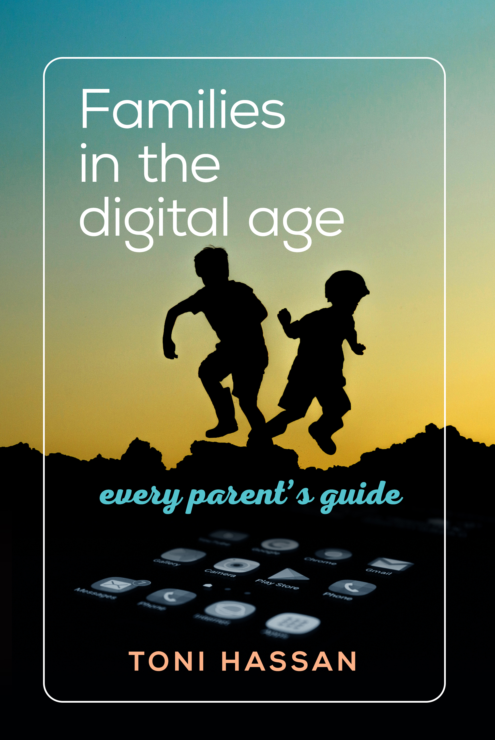
Concepts for a Cover — Parenting in the Digital Era
A few versions on the theme of ‘digital parenting’ — a thoughtful attempt to promote a rational balance between time on and off screen in a family context, and summarise the latest research on the topic. Published by Hybrid Publishers.


![July Seventeenth cover_front_05[5].jpg](https://images.squarespace-cdn.com/content/v1/51dc1c1ee4b0c7a76cdb8427/1583867516955-NAY2PXMY5LXUCFZ76WIJ/July+Seventeenth+cover_front_05%5B5%5D.jpg)


