Our client's novel featured a complicated confidence trick. Our cover imparted the idea of a game within a game, via a deck of cards and a recursive series of images. We aimed for a sophisticated, urbane feel, reflecting the general atmosphere of the novel. The title typeface is is the very elegant Requiem by Hoefler and Frere-Jones.
Adobe Acrobat keeps on truckin'
Ebook and web evangelists have plenty of unpleasant things to say about Adobe's Portable Document Format (PDF). They say it is proprietary, a semi-closed system and antithetical to the freewheeling nature of the web. This is partially true (though PDF documents can be viewed via plugins in most browsers). Yet PDFs are a peerless way of preserving the intricacies of a print design layout for other viewers (without adding an extra layer of cost). The PDF carries with it typefaces and graphics and recreates the original design on other machines with almost perfect fidelity. The postscript language used by PDFs is the universal language of printers the world over. It is true that for web purposes, html5 would be a friendlier and more open road. Combined with new font hosting services, web designers may be able to assemble typographically sophisticated documents that display equally well on all browsers and for all users. Even the rather clumsy ebook formats may become more graphically capable. For the moment, however, PDFs remain the format of choice for print designers wanting to put content online without using code.
Type Duos
For reasons that sometimes defy precise analysis, some typeface combinations work brilliantly, while others are distractingly incompatible. Harmony, or an interesting tension can lift a design and give it a distinctive voice. Fontfuse gives users the chance to nominate their own favourite combinations and view those selected by others. It's a promotional tool for a web fonts service offered by Extensis, but still potentially an interesting source of typographic inspiration.
Shortcuts / Tips for Gmail users
If you have abandoned your old, archaic email package for the cloud-based goodness that is gmail, you may benefit from learning gmail's shortcuts and efficiency enhancing options. Google has provided a page of resources for business users, but they apply equally to any user.
Full Colour Cover
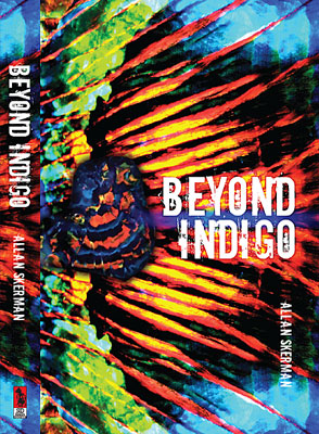
When "Beyond Indigo" was published twenty years ago, the author was unhappy with the book's cover, feeling it was conventional and stodgy. With a new publisher, he finally had the chance to remedy the errors of the past.
The book deals with an elderly opal miner and an extraordinary opal strike. We took full advantage of the dramatic colours of that gem. With a gem specimen overlaid against a close-up opal pattern, the composition might also be a wing, a sunset or a landscape — almost abstract, but concrete enough to tie the book to its subject matter.
Using Createspace
Along with ebooks, print-on-demand publishing is experiencing a period of rapid growth. The biggest publisher of POD in the english-speaking world is Createspace, a subsidiary of Amazon. Like all giants, Createspace is capable of both creation and destruction. It has helped make publishing easier and accessible. However, as both publisher and distributor, Amazon/Createspace has a worrying amount of control over dissemination of the printed word. As one blog commenter pointed out:
When an editor doesn’t like something you say, you find another editor or publisher. When one distributor doesn’t want to handle your book, you find another. And when one retail store refuses to place it on your shelves, other stores do and reap the profit. But Amazon plays all those roles and, even more important, it so dominates the market that some people think that if a book isn’t on Amazon, it isn’t in print.
Em and En Dashes
The typographically aware know that em dashes are preferable to hyphens in text, and en dashes are handy as range separators, but how to access them when emailing or posting to the web? Fortunately there is a handy shortcut. Instead of using -- or --- in lieu of the correct symbols, for em dashes paste — in the appropriate spot in your html editor or key in alt 0151 (on the numerical keyboard) in emails. En dashes are – for html or Alt 0150 for emails. Much more comprehensive discussions to be found here and here.
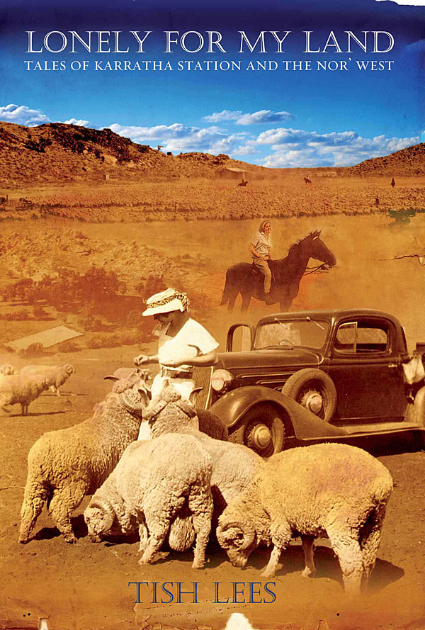
Lonely for My Land sells well
Tish Lees grew up on a remote and beautiful cattle station called Karratha. An accident of geology put her parents' station at the heart of Australia's iron export industry. Tish chronicles in her book a vanishing way of life. She wanted us to capture the feel of the WA outback, the dust and blue skies, and to integrate the best of her family snapshots. The result has sold extremely well and is into its third printing.
Typefaces in the Wild
Looking through online type libraries is easy enough, but making a selection is somewhat harder. Some typefaces may look promising in preview, but unsuitable when actually put into action. Fonts in Use bridges that gap, showing both designers (and clients) high quality design examples, and explaining why the particular typeface (or combination of typefaces) works in that specific context. The site features some of the workhorses of the type world: Franklin Gothic, Chapparal, Futura, Verlag and Trade Gothic, but no doubt the authors will add a deeper selection over time.
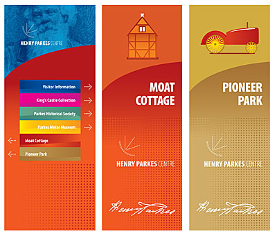
Sign in Progress
Our client is designing a tourist attraction combining historical displays and contemporary car and music collections. Our part in the project involves designing promotional and directional signage. We are aiming for a bright, contemporary look, using colour to identify each area of the complex.
No Times for Us
Why we do not use Times New Roman for (virtually) anything:
- TNR was designed for newspaper use, not modern offset print work or websites
- Its preeminent position as a system font on all PCs arose by historical accident (installed by corporate fiat), not through its superior virtues
- It is everywhere, like Arial. As such, it lacks a distinctive voice. Why not choose from a host of fine serif faces (Caslon, Fairfield, Garamond, Arno, Palatino, Warnock and so on) ?
Offices in the Future
We've posted before about shared office spaces. Workers who traffic in information -- particularly those in the programming and design world -- sometimes use office spaces in an itinerant fashion. They occasionally need a workstation, so rent a space for a few hours, then move on. Some programmers set up shop in cafés or in a park on a sunny day. The point being that in a wireless/mobile world, location doesn't matter as much as it once did. So why have an office at all? Why even have your own computer -- or at least a desktop PC? Perhaps the future will be a world littered with access points and increasingly capable mobile devices, with all data and most apps in the cloud. You log in to your work space, access your data storage, interact with co-workers remotely and so on. For some people that world is pretty much here. The rationale for dingy office cubicles finally starts to evaporate. Once corporates sniff the potential savings, the logic may become unassailable.
Signs of activity
Our client wanted a bright, friendly entrance sign for a neighbourhood house. We chose the recently released Sentinel typeface (Hoefler, Frere and Jones) for its readability and warmth. We needed to incorporate multiple logos without impacting on the overall readability of the sign. Also, one of the organisations was likely to vacate the premises before the other tenant, so we made it possible to remove/replace part of the sign without affecting the rest. Our sign came in two custom-cut pieces affixed to steel posts. The sign lettering and substrate is graffiti and sun resistant.
Beta than all the rest
Web based services are the bomb in 2011. Facebook continues to grow apace, Twitter prospers and Google seeks market dominance in every niche. Seeking web gold, new contenders rise up like weeds. How's a person supposed to keep track of all this creative entrepreneurial activity? Beta List is a good start -- a daily digest of digital startups, some deriviative, some weird, and some prescient. If something catches your attention, Beta List gives you the link to join the beta and become an uber early adopter.
Gmail one year on
After being tethered by habit for many years to the clunky mail client Outlook, moving my email to the cloud has proved a one way trip. Gmail positives abound:
- Most of my older emails from Outlook were successfully imported
- All emails sent and received have been retained
- tagging of emails is very simple
- the search function is very fast
- service has been constant, with no noticeable downtime
- threads make it extremely easy to see what has been said and done by whom and in what order
- I can access and modify all data remotely using an iphone app
- Project and contact managers can be integrated into the gmail interface, and leverage my data
- Group emails are easy and Google's contact manager integrates seamlessly
There's plenty more, but this gives a good taste. I'll keep looking for something even better, but for the moment the paid version of gmail represents extremely good value for money.
ebooks unbound
Chameleon Print Design is now able to offer ebook conversions to our publishing and author clients. We can supply either epub or Kindle (mobipub) files. This applies to any book we have designed in the past and also to PDFs or native layout files supplied by clients. Please note that at present the ebook formats are less graphically rich than their print counterparts and offer a more limited type selection.
Notable online image resources
It's a bit of a mystery how these people make money -- probably click/ad driven. The image resources they put up are steadily improving. Their product enables designers to gather, modify and combine source material at far lower cost, thus passing those savings on to our clients.
Indexers Rule
An index is a simple concept, but difficult to execute properly. Too often indexing is an afterthought, compiled without much planning. Authors and publishers sometimes begrudge the expenditure involved, but it is an investment in reader satisfaction. A well constructed index adds immeasurably to the value of a non-fiction book, making search and navigation simple and satisfying. An index automatically generated by a word processor or layout package is useless without the hand of an experienced indexer.
The Book Show on ABC Radio National recently ran an interesting program on the finer points of indexing.
If you are considering engaging an indexer, visit The Australian and New Zealand Society of Indexers and take advantage of their directory of available indexers. All people listed have completed the appropriate training.
Beautiful Faces of 2010
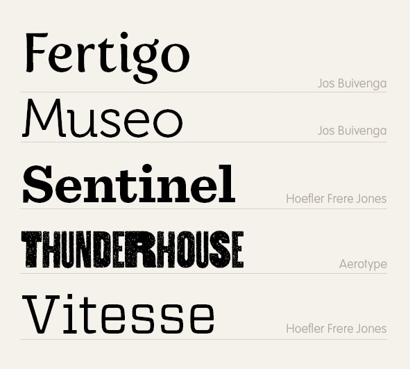
With unlimited resources, I'd buy pretty much every typeface released. In the real world, Fertigo, Museo, Sentinel, Thunderhouse and Vitesse were my favourite purchases... all available from www.myfonts.com
Currently using...
YouSendIt for sending large files
Dropbox for cloud-based file sharing
Backblaze for cloud-based backups
Chrome as my browser
Picasa Web Albums for image sharing
Twitter for brief updates of work practices
Paper.li for visualisation of Twitter feed
Cohuman for project and task management
Google Apps, encompassing:
- Gmail for all business email
- Docs for important business-wide apps, especially spreadsheets
- Calendar for appointments and recurrent info
LinkedIn for professional contacts
Squarespace for website hosting and construction
Skype for web based video calls