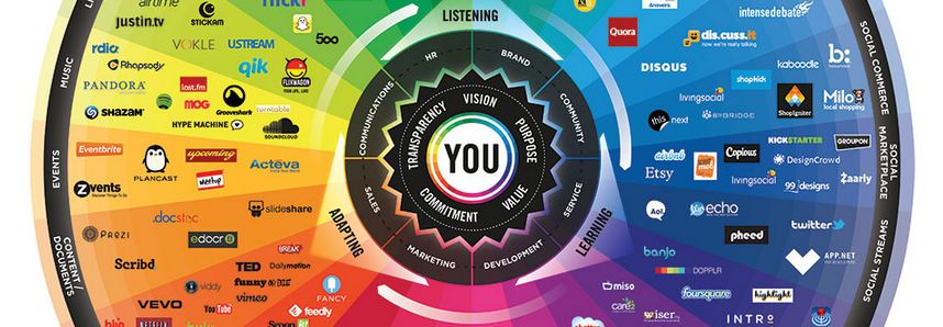
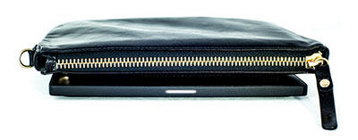
 If your app-overladen smartphone is fading by midday, this triple-funded Indiegogo project might be worth your attention. Its backers have embedded a phone charger in a trendy handbag (for ladies) or wallet (for those of the male persuasion). So the user charges the bag at home overnight, and by morning it has enough charge to take your exhausted smartphone from 0% to 100% not once but four times before finally giving up the ghost. A clever, well executed idea.
Mabo and Land Rights
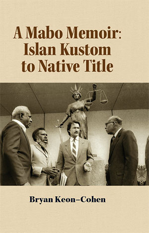 Bryan Keon-Cohen AM QC played a key role in the legal maneuverings that led to the High Court of Australia recognising the existence of native title in 1992. His intimate knowledge of that series of events has been brought to bear in Mabo in the Courts: Islander Tradition to Native Title: a Memoir. We assisted with the design and typesetting of this fascinating volume, and got a sense of the attention to detail and sheer persistence required to push through such a controversial reform. Dr Keon Cohen has created a website to cross-promote his book, and it has been favourably reviewed by various publications.
Blogging on the Run
 Patricia Bowmer maintains an active and engaging blog featuring almost essay length posts. The posts are contemplative and blend humour and observations on life and running with some well-chosen images. They are very much in keeping with her book Akilina, which she also promotes on the blog and an earlier memoir, In Pursuit of Joy. So the blog functions in at least three ways — to promote Patricia's books, to provide her existing readers and potential readers with additional content and maintain an ongoing link with them, and as a motivational tool to continue writing and thinking about issues important to her. An excellent model for authors wanting to build their own community and 'brand'.
Map Your Email Connections
 If you and gmail go back a ways, MIT have created a very interesting online tool. Immersion can show you who you communicated with, at what times, who introduced you to whom and how your various contacts are interrelated. Data is displayed as a web of connections, and clicking on the individual nodes/people drills down into their specific statistics. MIT do not scrape your email content, just the from, to, CC and timestamp fields, and that seems to be enough to generate some fascinating information.
Lorem Ipsum Hipster Zombie Brains
Designers are used to waiting for information. Blank spaces in layouts sometimes need to be filled with something, anything. Often they use Lorum Ipsum — pig Latin gibberish designed to simulate actual prose. Meet the Ipsums is a fresh take on Ipsum generation, with flavours including Zombie, Pommie, Gansta and Pirate. My favourite is Hipster:
Selvage Schlitz Brooklyn Williamsburg gastropub McSweeney's put a bird on it, forage ethnic iPhone. Cray american apparel shabby chic, cardigan before they sold out Carles disrupt thundercats bespoke DIY iPhone. 8-bit four loko Wes Anderson
So if a designer wants to put a smile on their client's face, or at least a look of complete bemusement, Meet the Ipsums might be their thing.
Behance Prosite Link
The acquisition of Behance by Adobe Systems creates some interesting creative synergies for Adobe CC users. Am currently trialling the Behance Prosite as a portfolio display option. As with everything Behance, it's all very clean and attractive. Chameleon Design's portfolio site is here.
Thinking About Your Website
Some interesting thoughts about planning for your new or updated website, and from an Australian perspective. Given the tendency of website implementation to stretch out to infinity, a little bit of forethought has the potential to save a lot of money and aggravation.
Text from your Desktop PC
If you spend much of your day in front of a computer, and also reply to innumerable texts on your mobile, Mighty Text provides a workable solution to bringing the two together. Sign up to the free service and "send & receive SMS and MMS from your computer or tablet, using your current Android phone number. Messages stay in sync with your phone's SMS inbox." Imagine typing texts on a full sized keyboard — as they say in the classics, OMG!
App dimensions for iPad and iPhone
A useful resource for newbies creating images for apps -- precise pixel dimensions for the screen components.
Quotes in the Cloud
This interesting service not only helps you to put together an attractive, potentially complex quote, it also enables you run some analytics on the customer response at the other end. How long did they spend reading your introduction, or scanning your folio? Did they look at your pricing page. Proposals can be sent as either html based or PDF.
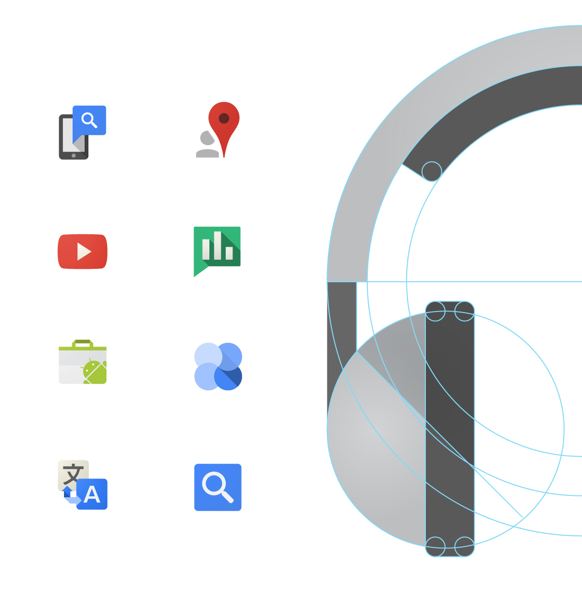
Flat is the New Black: How Google Designs Itself
Everything Social, all at Once
If social media makes your head hurt, here's an interesting way to conceptualise/categorise the whole field. Brian Solis has been renewing this impressive diagram each year since 2008. His diagram ranges far beyond Facebook and Twitter, encompassing photo sharing, crowdsourcing, business networking, location based services, social curation, service networks, social fitness and much more. Not only does it show a vast and increasingly influential array of services, it might help developers intent on trailblazing new subdomains within the social sphere.
Paper was Framed
An interesting attempt to make a case for paper, and to point out the environmental implications of an entirely digital world. Hint: massive storage and network requirements require huge real-world resources and significant energy consumption.
Arrival of Lila Rose
 Announcing the arrival of little Lila Rose on 22 April. Sister to Freya Madeline, whose own arrival on 9 June 2009 was one of this blog's first posts. Weighing it at just over 4000gms, Lila is growing fast after an event-filled first couple of weeks.
Things You Can Do With Paper
And cannot with digital media .... a very interesting rundown of all the tactile, sensual, innovative things that can be done with that supposedly outmoded medium: paper. Uses featured include lampshades, bar fitouts, chairs, cards, puzzles and much more.
Windows of New York
One man's attempt to chart a mundane aspect of New York architectural life, only quite beautiful when isolated in this way.
Switch Your Email Painlessly
If you've fallen out of love with your email client and want to try another service, TrueSwitch might be of interest. TrueSwitch automatically informs everyone in your contacts of your changed address, then forwards all of your email and contact data to your new account. Transfers between services partnering with TrueSwitch is free (Gmail, AOL and Outlook). For everyone else, a fairly reasonable $29.95. So, if you are one of the "90% of users [who] consider email interruption a barrier to switching to an ISP of their choice", procrastinate no longer.
Pretty Annual Reports Pay
In times of economic austerity, corporations are wont to produce spartan annual reports, symbolising their determination to live within their means. Recent research shows this might be a counterproductive approach. Even strictly numbers-oriented investment analysts are heavily influenced by well designed company material. The prettier the reports, the more likely analysts are to give a company a 'buy' rating. The takeaway line is that “People are not aware of the effect of aesthetics on their financial decisions.”
Cutting Edge Companies
From Fast Company, a compilation of companies intent on 'disrupting' their particular niche. Conspicuously absent from the list are Facebook and Twitter. The Fast Company website is an exemplar of the new trend of sites designed primarily for mobile. One day it will seem odd that an inferior viewing experience (tiny mobile phone screens) is driving the viewing experience for everyone else.
Trivia Made Sublime: Feltron 2012
Nicholas Felton is a designer obsessed with data. Currently he is working with Facebook on improving their visual experience (plenty of work for him there!). In his 'spare' time he collates a vast amount of data from his own life and annually publishes it as handsome and sought after book. The 2012 "Feltron Report" analyses his own travel, sleeping patterns, food intake, visitors and information consumption — nothing is too trivial or ephemeral. The project sounds narcissistic and unutterably boring, but such is Felton's skill at creating information graphics that it is weirdly fascinating. Viewing someone else's progress along their own mortal coil is touching and leads readers to reflect upon their own use of time.

