For those bypassing traditional publishers and going online with their ebook offerings, Mark Coker, the CEO of Smashwords has produced a handy promotional guide. Part of his collection of tips relates to promotion within Smashwords, and the other portion to online promotion in general. When you look at the vast volume of ebooks being uploaded every day, acquiring a bit of promotional nous is not optional, but absolutely essential. The Internet booksellers do not promote accidental discovery in the same way that physical bookstores did (and still do, at least in some places). And did we mention that the guide is free?
Calling All Publishers
Though facing an uncertain future, publishers are still the preferred point of entry for many authors. The prospect of completely going it alone is daunting for all but the most optimistic and entrepreneurial. The Australian Writers Marketplace is perhaps the most comprehensive and best known resource, but the Australian Publishers' Association Directory is also worth consulting. And if your tastes are more towards the independent, risk-taking end of the publishing spectrum, SPUNC (The Small Press Network) maintains an excellent web presence for smaller publishers. As always, check each publisher's submission policies.
Photoshop Forges On
Ancient by digital standards, Photoshop continues to reinvent inself. To see how the latest incarnation has changed from those which preceded it, download the temporarily free beta from Adobe, and check out an introductory tour from Lynda.com.
Chip Kidd Talks About Books
TED Talks tend to be equal parts inspiration and irritation. Inspiration for presenting talented scientists and creatives at the peak of their game, and irritation at a sometimes messianic and overblown tone. Chip Kidd is one of the most celebrated book designers in the USA, but his recent TED talk shed very little light on his design process, influences and interaction with authors. His stage mannerisms tended to distract from rather than accentuate his message. Nonetheless, he does have a particular talent for finding iconic images that seem to capture the essence of a book.
Old School Type Specimens
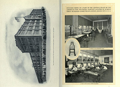 A long time ago, type was embodied rather than digital. Skilled craftsmen working for large companies laboriously designed and cut letters from metal and sold them across the world. The American Typefounders Company was one such outfit, and it regularly produced an exhaustive catalogue of their wares. Not only did the catalogue include hundreds of beautifully set sample pages of their type, it featured an extensive corporate introduction extolling the modernity of their facilities and sales outlets. It really was a 'gold mine for the progressive printer', digitised beautifully by The Internet Archive.
Poster Calling for Young Writers
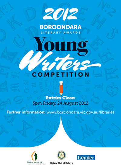 Our client requested a bold and attention-grabbing poster to attract entrants to their short story writing competition. The design needed to echo design elements used in an earlier anthology of short story winners (also designed by Chameleon). We used the flowing, high contrast Mrs Sheppards (designed by Alejandro Paul) in conjunction with the clean lines of Museo Sans. With a big block of solid colour and the sharp page turn curves at the base of the poster, we gave the poster enough muscle to communicate effectively.
Cassian Brown: Content is King
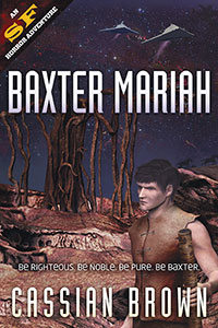 Author of two classy science fiction novels (covers designed by Chameleon), Cassian Brown has put together a website to showcase his work. Apart from excerpting an exciting sequence from Baxter Mariah, he links to the many ebook and print purveyors of his work, offers signed copies, a newsletter signup and biographical information. A next step might be to link to other writers and science-fiction oriented websites, to locate himself in the online sci-fi ecosystem. A link to his twitter account (EllameinePress) might also be useful.
Scrabble for Typophiles
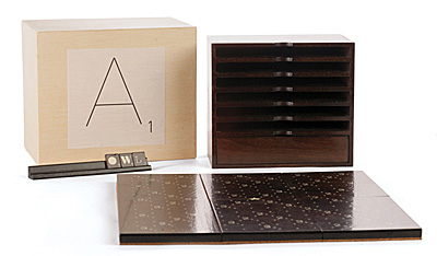 For lovers of design and typography — an elite Scrabble set to set you above the design-starved masses. Produced as a limited edition set, the board and tiles employ a variety of quality typefaces, are signed and numbered and constructed of stained walnut. Type lovers may find it difficult to concentrate on the game when so many typefaces await identification.
Photoshop Plugin is Just Their Type
A giant in the world of quality type, the FontShop can now tout its wares from inside Photoshop. Install their plugin, and you can preview any of the thousands of typefaces on offer. If you like what you see, click through to their online store, buy the typeface and start using it. Many are the ways a designer can be parted from their money.
100 Best Typefaces
It's a big call, but someone has to make it — Fontshop has listed the 100 typefaces it considers the 'best of all time'. Their ranking system includes both subjective and objective criteria, and takes into account sales figures. The top ten contain no surprises, indeed, the top twenty is pretty predictable. All the workhorse typefaces are there — Times, Helvetica, Univers, Garamond, Gill Sans, Frutiger and Franklin Gothic, so the list isn't a way of discovering new and interesting typefaces. It is more a ranking of those typefaces that have survived the vagaries of fashion and have been used over many decades (or centuries in some cases).
Roll Your Own Barcode
Authors considering self publishing sometimes may need to generate a barcode for the back of their book. Rather than pay someone else to create one (a process which essentially takes about ten seconds), why not do it yourself? This free browser-based barcode generator features the full range of barcode options and allows the user to save to tiff, EPS or PNG. If you feel like being a good netizen, users can donate a small amount as a gesture to the programmer.
Elephants as Myth
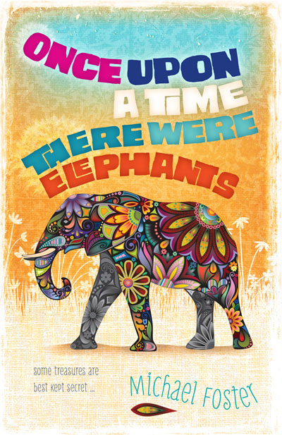 Our client had written a story set in a future earth where animals such as the elephant were long extinct and considered mythical. We wanted to depict the elephant of the title as a fabulous, almost imaginary beast, and as the book was aimed at younger readers, to give the type treatment and background a playful, energetic feel.
Author website for Amanda Stuart
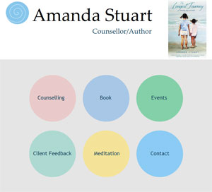 After recently writing The Longest Journey, Amanda Stuart wanted to showcase her book online. The website she commissioned is extremely clean and easy to navigate. As the book garners more attention, she will add reviews and reader comments. Possible enhancements might include a sample passage or chapter, a press release and a list of bookstores stocking her book.
Smartr for Gmail
Smartr is a powerful free extension for Google Chrome. It adds a sidebar to Gmail (this is where having a big screen is useful in keeping clutter at bay). The sidebar houses an enhanced contacts manager. When installed, Smartr goes through your contacts and gives you the option of adding your Facebook and Twitter accounts. When you click into an email or start to compose a new email, Smartr calls up everything it knows about the person who sent it or the person you are about to send it to, including recent tweets and facebook updates, photographs and other information. It also gives you a history of your email contact with that person and identifies other people you often email in association with them. Smartr surfaces quite a bit of information from within and outside Gmail in a very effective fashion, and could be very handy for businesses trying to leverage their existing contact lists.
Roman Zenith
 Roman sculptors were sometimes very honest in their depictions of the great and the good. They showed sunken cheeks, wrinkles and other flaws. We took advantage of this by using a Roman sculpture for the cover of "Roman Zenith". The stark contrasts and psychologically acute depiction make for a surprisingly modern feel. The subtle backdrop of the Pantheon makes the setting and era clear.
On the Face of it: three recent covers
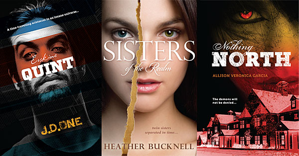
Our publisher client prefers us to design covers as a single unit -- back, front and spine all part of the same artwork. This encourages the use of large, bold images and prominent use of type. The three front covers featured here all focus on a single face challenging the viewer, a naturally strong composition.
Mind Blowing Bookshelf from Google
Google seems to have more projects than employees. A crew of hard core geeks at Google Data Arts have been experimenting with new ways to display data in your browser (works for both Chrome and Firefox). This animated globe shows Google searches by language, and a fascinating picture of global language dispersion it presents. English scattered widely over the globe, German confined entirely to Germany, Spanish dominating South America and French surprisingly rare in West Africa. Another animation displays 10,000 books in an ascending column -- a novel way to visually search a large number of works.
Symbolism in Type
Signs and symbols is a useful blog highlighting infographics/dingbat/wingding/symbol resources across the web. Almost everything linked to is free. In a world where much information is viewed via tiny phone screens, simple symbols help cut through the clutter and communicate effectively.
Sins of a Certain Type
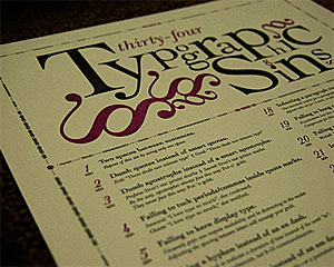 Just like grammar, typography attracts pedants. Some of their gripes are legitimate, while others seem rather trivial. One such perfectionist has put together all of his pet peeves on one poster. Ironically, the website showcasing this poster was rather hard to read, both in Chrome and Firefox.
Solve for X
Google may be growing up, but it still maintains an element of Silicon Valley utopianism. Solve for X is Google's attempt to bring together innotive thinkers to address global problems and thus generate potential solutions. Software engineers are a solutions-oriented bunch, so this initiative may make quite a lot of sense. It is certainly in alignment with the higher aspirations of Google's founders.
