 Our client stages a community festival once a year, and tries to appeal to everyone within the city boundaries. They wanted an open, friendly design with a sense of inclusiveness and place. We used the beautiful Mrs Shepperds (Alejandro Paul) for the flourishes of the title, and Archer (Hoefler, Frere-Jones) for the rest. Aerial images of the city helped give the design local context.
View Word Docs for free
Want to view Word docs accurately without the expense of buying the program? Microsoft thoughtfully provides a free Word viewer download. Very handy for those who use open source or browser based word processors that don't always display Word documents exactly the way originally intended. Like the free Adobe Acrobat viewer, the viewer does not provide any editing functionality.
Word
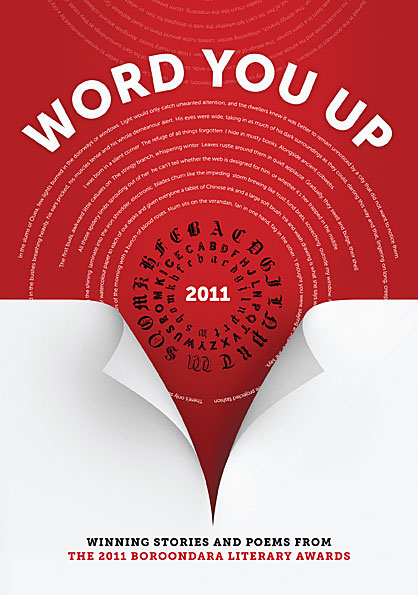 Our client wanted a high-impact type-based design. We used contrast, intense colour and a line of text from each of the stories featured in the anthology. The page curl gives a hint of depth and serves to direct attention from the title down to the subtitle. Typefaces used were Museo Sans and Museo Slab by Jos Buivenga.
Noun Project
 A simple idea, well executed: the Noun Project is a catalogue of symbols covering everything from the mundane to the sublime. They are available free of charge, and the web interface is as simple, clean and monochrome as the symbols themselves.
Lost Worlds of Graphic Design
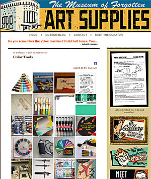 Personal computers and the Internet have opened up new worlds for millions of people, but they have also remade or destroyed dozens of professions and made hundreds of specialist skills obsolete. The Museum of Forgotten Art Supplies chronicles the items used by professionals in the graphic design and advertising industries. They seem very distant and quaint, but once they were essential tools for serious professionals, and the making of them was an entire industry in itself.
Lions and Lillies
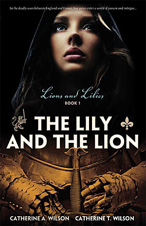 A well-written and tightly plotted historical drama, Lions and Lillies: Book 1 covers affairs of state and love during the Hundred Year War between England and France. We were tasked to design a cover that created a sense of the intensity of the story, and combined military and personal aspects. In other words, the entry to "a world of passion and intrigue". The authors have created an informative website to accompany the publication of their book.
Is it a Bird?
Science imitates nature and the result is art. German inventors have devised a rather beautiful mechanical bird that flaps, flies, soars and returns to land. It's interesting to contemplate humans one day flying in this way, but the lifting power required to get a human off the ground would probably be prohibitive. And the wingspan would be titanic. Armies around the world must be looking at this metal/composite bird as yet another potential surveillance robot.
Good Cover, Bad Cover
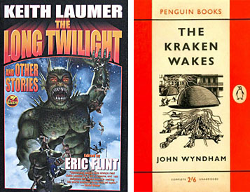 Science Fiction covers often provoke amusement amongst those who don't read Sci Fi. For those of us who do, we treasure the remarkable variety of cover art — from melodramatic pulp novels to high concept fiction and everything in between. The covers could be formulaic, but were often wildly inventive and even avant garde. After all, if you are writing about the future, you're not automatically bound by the constraints of the past. This website explores the often hilariously literal and overblown art of the less refined end of the genre, while this one catalogues Penguin's consistently high quality and restrained covers (mirroring the often high polish of the contents).
Dingbats want to be Free
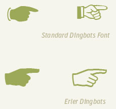 More than just an old-fashioned insult, dingbats are pictorial typefaces packed with symbols useful in a wide variety of design contexts. FontFont have released a sampler typeface (not the full complement of symbols, but a wide variety nonetheless) for free downloading. Erler Dingbats were first released some forty years ago and have now been updated for the digital era with new symbols. Each symbol has been designed to integrate with its fellows. In the usual way of European type, the result is slightly bloodless but eminently useable.
Anatomy of a Typeface
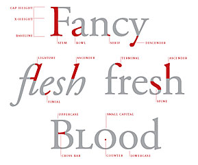 If you thought a stem belonged to a flower and a bowl was what you put the flower in, then visit Thinking with Type for a typographical education. The site is a well designed tour of type design, units of type measurement, classification and use, and hints on mixing typefaces, all written in plain English and elegantly illustrated. The site makes a good case for considering typography as the core of most graphic design, even on the web.
Pay With a Tweet
This product may be a bit of a head scratcher if you aren't an active twitter user, but it will make sense if you are. The idea is that you 'sell' a bit of digital merchandise, or access to a web service via the 'payment' of a pre-prepared tweet lauding your service and tweeted to all of the twitterer's followers. The twitterer is able to edit the message but not the url. The service is designed to create buzz for your digital wares — a bit like women paid to frequent bars and tout particular tipples. Given that Twitter users are supposed by many to be taste-makers, it might be a good idea to try and start a few ripples with that 'community'.
Give Your PDFs some Fizz
Soda PDF is a free PDF reader (in a crowded field) that renders a PDF as if it was a 3D magazine. One turns pages by 'pulling' the page across in a realistic simulation of an actual page turn. While emulating a print publication in such a literal way might seem retrograde, there is something satisying about the reading experience, and it is an aesthetically pleasing way to preview design work (particularly files destined for print). The effect renders very quickly and smoothly, and can be turned off if you want to go back to old fashioned flat viewing.
Still More Author promotional ideas
Richard Stamp, author of As the Sparks Fly Upwards has been very active and creative with the promotion of his book. He descibes some of his ideas below:
- I attend a local church which arsonists burned down three years ago. I have been selling books at $25 each and letting folk in the parish know that $5 for each book will go back into the rebuilding fund for all copies sold by them and within the parish. That way I get $20 a book back and the community benefits ....and buys more. The suggestion therefore is that authors find a local cause which they can support and which then recruits more sellers and acts as a vehicle for selling more books.
- I have designed a simple poster. I have emailed it to a hundred folk or so around the world asking them to get them put up on community, club and church notice boards etc. Eg There’s a town in Colorado in the USA which now has these flyers at the local gym, at the community hall and at the church. It all helps. I put the RRP on the ones for Australian use ... but left it off those sent to other countries where the cost would be differently expressed.
- I have used some of the old galley copies in this way; I have asked local places where people have to wait for a while if I can put a copy in their waiting room.
- I have put a stick-on label on the front cover which says. This book has been lent by the author to ease your waiting time. Please do not remove it. Copies of this book may be purchased from Collins ABC shops also at Dymocks and also at Bookmark on High Street. [all local bookshops] or direct from the author on ph 54353576
Since each chapter of my book is a story in itself this is ideal for folk to read one story or two while they wait. Thus their appetite might be sharpened and a desire to buy the book and finish reading it be engendered. Books are now at the local Foot Clinic, at a large local medical practice and also at the new lounge and waiting area at a local garage complex where people wait while work is done on their vehicle. More venues are planned.
These are additional measures to the usual personal give/away cards with the book’s details, interviews and reviews on radio and in local newspapers. Also I have visited various bookshops in the region [Bendigo and central Macedon ranges towns] and 7 bookshops now have it in stock.
Neat Freaks United
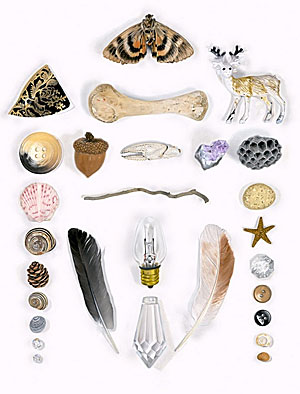 File under: people with way too much time on their hands, or: how to make your fetish into a business. Austin Radcliffe spends his days shooting and curating images of objects arranged in aesthetically pleasing ways. In some ways his obsession is quite old school — collectors have long organised their finds by all sorts of esoteric criteria. While the neat aspect will probably irk messy people, the various collations, coteries and concatenations are often quite pretty, fun, and interesting for the sheer variety of things revealed in the world.
Taking the cake
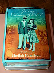 Books are sometimes destined to become food for silverfish, but a recent family history we designed ended up as party fare. Launched at her 92nd birthday party, Sheilah Hamilton's book dealt with her life and extended family. Her children arranged for the book cover to be printed in edible ink onto her cake, even down to the spine and simulated pages.
New Cloud Better than the Old Cloud?
Apple has finally moved into the Cloud in a big way, erasing memories of the half-baked MobileMe implementation (so bad that even Jobs was ashamed of it). If you are a natural born Mac user and only put up with Google apps because there weren't any viable cloud alternatives, here's your chance to switch back. Learn how to move your data from Google Apps to iCloud in this useful Lifehacker article.
So Social
If you are a heavy user of social media and want to analyse your impact and efficiency in that sphere, Lifehacker co-founder and coder extraordinaire Gina Trapani has a tool for you. Thinkup "archives and analyzes your interactions across social networks", and ensures that information that Twitter, Facebook and Google+ might treat as ephemeral is preserved for future use and examination. Read this article and marvel at the amazing power of intelligently interpreted data.
Type with soul
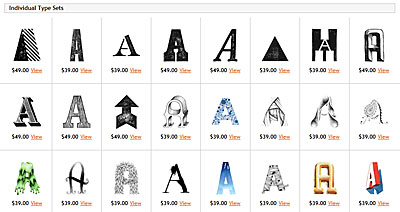 If precise typefaces with mathematically determined curves put together on a computer leave you a little cold, there is a tiny corner of the typosphere that is embracing a hand made alternative. The Organic Type features hand-drawn, painted, sketched, rubbed and eroded typefaces, achieving warm and charming effects impossible with standard type. Their typefaces cannot be installed via a font manager. Instead, each letter is supplied as a separate layered image file, and needs to be manually placed and kerned. Perfect for arresting and highly individual headers, and capable of heavy lifting in almost any design context.
The Past is a Foreign Country
 Looking backwards in time is to be constantly surprised. There's always so much that has been forgotten, and is genuinely strange and unfamiliar Seen in detail, eras often belie their stereotypes. How to be a Retronaut posts themed photo galleries chiefly from any decade of the last ten. Topics include Colour tourist photographs from the Soviet Union (1960s), Harlem Street Scenes (1930s), Pepsi advertisements (1950s), an Apple Gift Catalogue (1983), portraits taken in fake snow (Victorian England) and abandoned buildings of Detroit (2000s) and many, many more. The photographs and ephemera are often hard to contextualise and integrate, yet in an odd way, bring the past momentarily into the present.
The Information
 Our client provides an integrated service to people in the building trade. She wanted her documents to look attractive, but not overdesigned. Her clientele are mostly male and are looking for practical, no-nonsense assistance. Our solution involved generous amounts of white space, strong colours, clear imagery and bold, spare typography.
